| [ Team LiB ] |
|
Recipe 3.6 Create a Simple Bar Graph on a Report3.6.1 ProblemYou need to create a simple bar graph on a report. Microsoft Graph or the Office Web Components would probably work, but you're hoping for a simpler native Access solution. You need a bar for each row showing the relative score for each student. Can't you do this with the standard Access controls? 3.6.2 SolutionYou can place a rectangle control in the detail section of your report and set its width during the Format event that occurs as Access lays out each row of data. This solution shows how you can create a simple bar graph, setting the width of the rectangle control to be based on a numeric value in your data. Open and run the report rptGraph in 03-06.MDB (see Figure 3-12). This report shows a list of students and their scores, along with a bar whose width represents the value of the score. Figure 3-12. The sample report, rptGraph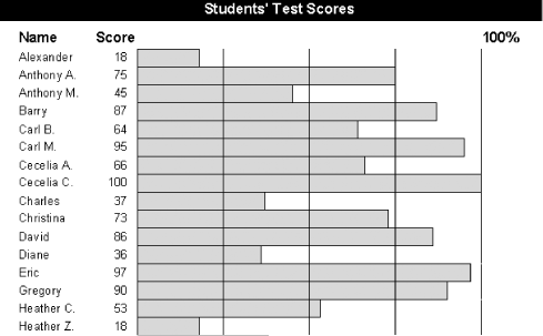 To create a bar graph like this one in your own applications, follow these steps:
Figure 3-13. rptGraph in design view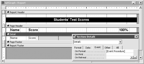
3.6.3 DiscussionAs Access lays out the report and prepares to print it, it formats each row of data for presentation. As it does this, it runs the VBA code attached to the OnFormat event property. In this case, for each row of data, you've told Access to set the width of the rectangle control based on the value in a numeric field. When it prints that row, the rectangle has a width proportional to the value in that numeric field. In the sample report, the maximum width of the rectangle is four inches. If a student has a score of 100%, you want the printed bar to be 4 inches wide. Therefore, the expression: Me.txtScore/100 * 4 evaluates to the number of inches wide that you'd like the bar to be. To set the width of the bar from the Format event, however, you'll need to specify the width in twips, not inches, because that's what Access expects. There are 20 twips in a point and 72 points in an inch, so there are 1,440 twips in an inch. To convert the number of inches to twips, multiply the calculated value by 1,440. The final expression in the sample report is: (Me.txtScore/100) * (1440 * 4) This expression will evaluate to be the width of the bar in twips, which is exactly what you need. If your report needs a scaling factor other than 100 or a maximum width other than 4, you'll need to adjust the expression accordingly. Though the method presented in this solution will work only for the simplest of cases, when it does work it does a great job. It's quick, it's simple, and it produces nice output. To achieve the effect you want, experiment with different shadings, border colors, and gaps between the rows. |
| [ Team LiB ] |
|