|
|
< Day Day Up > |
|
Recipe 1.2 Specifying Font Measurements and SizesProblemYou want to set the size of type used on a web page. SolutionSet the values of fonts using the font-size property: P {
font-size: 0.9em;
}DiscussionSetting the size of the font with percentages causes the browser to calculate the size of the font based on the size of the parent element. For example, if the font size for the body is set to 12 pixels and the font size for p element is set to 125%, the font size for the text in paragraphs is 15 pixels. You can use percentages, length units, and font-size keywords to set type size. Length units fall into two categories: absolute and relative. Absolute length units include the following:
A point, in terms of the CSS specification, is equal to 1/72nd of an inch and a pica is equal to 12 points. Because browser displays vary due to different operating systems and video settings, setting type in a fixed (or absolute) value doesn't make much sense. In fact, it's best to avoid absolute measurements for web documents, unless you're styling documents for fixed output. For example, when you create a style sheet to print a web document, absolute length units are preferred. For more on creating style sheets for printing, see Chapter 9. The CSS specification doesn't dictate how browser vendors should treat text when the font-size property is set to a value of zero. Therefore different browsers interpret the value unpredictably. For example, such text isn't visible in the Mozilla browser. In Internet Explorer for Macintosh and Safari, the text isn't hidden, but, rather, is displayed at the default value of the font size. The Opera browser displays the text at a smaller, but still legible, size. And Internet Explorer for Windows sets the type size to a small, illegible, but still visible line of text that appears to be equal to the size of 0.1em, as shown in Figure 1-4. If you want to make text invisible, use the CSS properties visibility or display instead of setting the size of fonts to zero. p {visibility: none}Figure 1-4. Internet Explorer for Windows showing illegible type when the font size is set to zero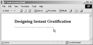 A negative length value, such as -25cm, for the font-size property isn't allowed. Relative units set the length of a property based on the value of another length property. Relative length units include the following:
Em units refer to the default font size set in the preference of the user's browser, while x-height refers to the height of the lowercase letter x in the font. Pixels consistently control the size of typography in a web document across most platforms and browsers. However, it's not a good idea to use pixels when designing for the following browsers:
If most visitors to your site use browsers other than Netscape Navigator 4.7x and Opera 5 for the Mac, you can safely use pixels to set the size of your type. The main issue in regard to setting type size in pixels isn't one of accurate sizing, but of accessibility. People with poor vision might want to resize the type to better read the document. However, if you use pixels to set the type on your web page, people using Internet Explorer for Windows will be unable to resize the type. Because Internet Explorer for Windows is the most popular browser on the planet, the use of pixels to set type size becomes a problem for most users who need to resize the type in their browsers. If you do require an absolute size measurement, pixels should be used rather than points, even though print designers are more accustomed to point measurements. The reason is that Macintosh and Windows operating systems render point sizes differently, but pixel size stays the same. If accessibility is a concern, switch to em units. In the Solution, we set the text in a paragraph to 0.9em units. This value is equivalent to setting the font size to 90% of the default font size set in the browser's preference. However, the use of em units raises another concern. This time the problem pertains to usability. Although you might be able to resize the type in a web page, if you set a font to a size that is smaller than the default text size of the browser (for example, to 0.7em), Internet Explorer for Windows will display small, almost illegible lines of text, as shown in Figure 1-5. So, the lesson here is: be careful with relative sizes, as it is easy to make text illegible. Figure 1-5. Almost illegible type set with em units This brings up the possibility of another solution: the use of font-size keywords. The CSS 2.1 specification has seven font keywords for absolute sizes that you can use to set type size (see Figure 1-6): xx-small, x-small, small, medium, large, x-large, xx-large. Figure 1-6. The font-size keywords on display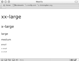 There are two other font-size keywords for relative measurements: larger and smaller. If a child element is set to larger, the browser can interpret the value of the parent's font-size value of small and increase the text inside the child element to medium. Font-size keywords provide two benefits: they make it easy to enlarge or reduce the size of the text in most browsers, and the font sizes in browsers never go smaller than nine pixels, ensuring that the text is legible. If you do set text to a small size, use a sans-serif font such as Verdana to increase the chances for legibility. The main drawback with font-size keywords is that Internet Explorer 4-5.5 sets the small value as the default setting instead of the recommended medium setting. Because of this decision, Internet Explorer actually maps all the font-size keywords to one level lower than other browsers. In other words, the value for xx-large in IE 4-5.5 is every other browser's x-large, x-large in IE is large in another browser, and so on. Another drawback is that in Netscape 4, the smaller sizes are sometimes illegible because they aren't rendered well by the browser. The workaround for these drawbacks is to first create a separate style sheet that contains the font-size keywords for the web document. Then use the @import method for associating a style sheet, as explained in Recipe 9.1 and as shown here (this step keeps Navigator 4 from rendering illegible type): <link href="/_assets/basic.css" media="all" rel="style sheet" /> <style type="text/css" media="screen"> @import url(/_assets/fontsize.css); </style> To keep Internet Explorer 5 and 5.5 for Windows from displaying the wrong sizes for the font-size keywords, use the voice-family workaround for delivering alternative values in Internet Explorer, as explained in Recipe 9.2 and as shown here: #content {
/*
font-size workaround for WinIE 5:
1) WinIE 5/5.5 value first:
*/
font-size: x-small;
voice-family: "\"}\"";
voice-family: inherit;
/*
2) Then the correct value next 2 times:
*/
font-size: small;
}
html>#content
font-size: small;
}See AlsoThe article "CSS Design: Size Matters," written by Todd Fahrner (an invited member to the W3C CSS Working Group) available at http://www.alistapart.com/articles/sizematters/; Recipe 10.1 for enlarging text to gain attention; the CSS 2.1 specification at http://www.w3.org/TR/CSS21/cascade.html#q1 for more on how a browser determines values; the CSS 2 specification for length units at http://www.w3.org/TR/REC-CSS2/syndata.html#length-units; the section "Font Size" in Chapter 5 of Cascading Style Sheets: The Definitive Guide (O'Reilly). |
|
|
< Day Day Up > |
|