|
|
< Day Day Up > |
|
Recipe 10.4 Leading the Eye with ContrastProblemYou want to create a sense of depth or motion through text. On a page containing four paragraphs that are almost identical, it's hard to know which paragraph to look at first (see Figure 10-5). If you change font size across columns in a particular direction (e.g., decrease the size left-to-right) you lead the reader's eye (see Figure 10-6). Figure 10-5. Four paragraphs that are almost identical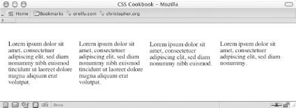 Figure 10-6. Changing the type size so that the reader's eye will scan from left to right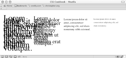 SolutionTo lead the reader's eye, change the type size by adding a CSS rule like this: /* Text size */
#layer4 {
font-size: .7em;
line-height: 20px;
}
#layer3 {
font-size: 1em;
line-height: 20px;
}
#layer2 {
font-size: 2em;
line-height: 10px;
}
#layer1 {
font-size: 3em;
line-height: 10px;
}DiscussionContrast occurs when there is an obvious difference between two elements. If there isn't any contrast on a page, the reader doesn't know what is important on the page. By manipulating an element's visual value, you can create contrast between two like elements. Some of those visual values include the following:
Properly marked content has an inherent style because the browser uses its own style sheet to render the content when another style sheet isn't present. Headings, such as the h1 element, are stylized in a large, bold font and are separated from the paragraphs (see Figure 10-7). This different font provides the contrast to help readers make sense of the document. Figure 10-7. Drawing the eye toward the headings by setting them in a larger, bold font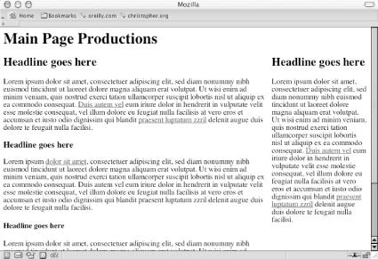 Without the cues that can be provided through a style sheet, the reader's eye wanders throughout a document. The layout shown in Figure 10-8 creates a sense of confusion because it doesn't provide the reader with a clear sense of direction as to what to read first. The headings and copy all share the same values for font, type size, and type color. Figure 10-8. The page shown in Figure 10-7, but without contrast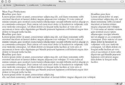 See Alsohttp://www.lighthouse.org/color_contrast.htm for creating more effective contrast; http://graphicdesign.about.com/library/weekly/aa012700a.htm for more on the basics of designing with contrast. |
|
|
< Day Day Up > |
|