|
|
< Day Day Up > |
|
10.2 PositioningThe idea behind positioning is fairly simple. It allows you to define exactly where element boxes will appear relative to where they would ordinarily beor relative to a parent element, another element, or even to the browser window itself. 10.2.1 Basic ConceptsBefore we delve into the various kinds of positioning, it's a good idea to look at what types exist and how they differ. We'll also need to define some basic ideas that are fundamental to understanding how positioning works. 10.2.1.1 Types of positioningYou can choose one of four different types of positioning, which affect how the element's box is generated, by using the position property.
The values of position have the following meanings:
Don't worry so much about the details right now, as we'll look at each of these kinds of positioning later in the chapter. Before we do that, we need to discuss containing blocks. 10.2.1.2 The containing blockWe discussed containing blocks in relation to floats earlier in the chapter. In that case, a float's containing block was defined to be the nearest block-level ancestor element. With positioning, the situation is not quite so simple. CSS2.1 defines the following behaviors:
An important point: elements can be positioned outside of their containing block. This is very similar to the way in which floated elements can use negative margins to float outside of their parent's content area. It also suggests that the term "containing block" should really be "positioning context," but since the specification uses "containing block," so will I. (I do try to minimize confusion. Really!) 10.2.1.3 Offset propertiesThree of the positioning schemes described in the previous sectionrelative, absolute, and fixeduse four distinct properties to describe the offset of a positioned element's sides with respect to its containing block. These four properties, which you will refer to as the offset properties, are a big part of what makes positioning work.
These properties describe an offset from the nearest side of the containing block (thus the term offset). For example, top describes how far the top margin edge of the positioned element should be placed from the top of its containing block. In the case of top, positive values move the top margin edge of the positioned element downward, while negative values move it above the top of its containing block. Similarly, left describes how far to the right (for positive values) or left (for negative values) the left margin edge of the positioned element is from the left edge of the containing block. Positive values will shift the margin edge of the positioned element to the right, and negative values will move it to the left. Another way to look at it is that positive values cause inward offsets, moving the edges toward the center of the containing block, and negative values cause outward offsets.
The implication of offsetting the margin edges of a positioned element is that everything about an elementmargins, borders, padding, and contentis moved in the process of positioning the element. Thus, it is possible to set margins, borders, and padding for a positioned element; these will be preserved and kept with the positioned element, and they will be contained within the area defined by the offset properties. It is important to remember that the offset properties define offset from the analogous side (e.g., left defines the offset from the left side) of the containing block, not from the upper-left corner of the containing block. This is why, for example, one way to fill up the lower-right corner of a containing block is to use these values: top: 50%; bottom: 0; left: 50%; right: 0; In this example, the outer left edge of the positioned element is placed halfway across the containing block. This is its offset from the left edge of the containing block. The outer right edge of the positioned element, however, is not offset from the right edge of the containing block, so the two are coincident. Similar reasoning holds true for the top and bottom of the positioned element: the outer top edge is placed halfway down the containing block, but the outer bottom edge is not moved up from the bottom. This leads to what's shown in Figure 10-26. Figure 10-26. Filling the lower-right quarter of the containing block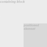
Note that the positioned element has a slightly different background color. In Figure 10-26, it has no margins, but if it did, they would create blank space between the borders and the offset edges. This would make the positioned element appear as though it did not completely fill the lower-right quarter of the containing block. In truth, it would fill the area, but it wouldn't be immediately apparent to the eye. Thus, the following two sets of styles would have approximately the same visual appearance, assuming that the containing block is 100em high by 100em wide: top: 50%; bottom: 0; left: 50%; right: 0; margin: 10em; top: 60%; bottom: 10%; left: 60%; right: 10%; margin: 0; Again, the similarity would be visual only in nature. By using negative values, it is possible to position an element outside its containing block. For example, the following values will lead to the result shown in Figure 10-27: top: -5em; bottom: 50%; left: 75%; right: -3em; Figure 10-27. Positioning an element outside its containing block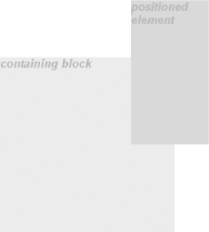 In addition to length and percentage values, the offset properties can also be set to auto, which is the default value. There is no single behavior for auto; it changes based on the type of positioning used. We'll explore how auto works later in the chapter, as we consider each of the positioning types in turn. 10.2.2 Width and HeightThere will be many cases when, having determined where you're going to position an element, you will want to declare how wide and how high that element should be. In addition, there will likely be conditions where you'll want to limit how high or wide a positioned element gets, not to mention cases where you want the browser to go ahead and automatically calculate the width, height, or both. 10.2.2.1 Setting width and heightIf you want to give your positioned element a specific width, then the obvious property to turn to is width. Similarly, height will let you declare a specific height for a positioned element. Although it is sometimes important to set the width and height of an element, it is not always necessary when positioning elements. For example, if the placement of the four sides of the element is described using top, right, bottom, and left, then the height and width of the element are implicitly determined by the offsets. Assume that you want an absolutely positioned element to fill the left half of its containing block, from top to bottom. You could use these values, with the result depicted in Figure 10-28: top: 0; bottom: 0; left: 0; right: 50%; Figure 10-28. Positioning and sizing an element using only the offset properties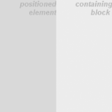 Since the default value of both width and height is auto, the result shown in Figure 10-28 is exactly the same as if you had used these values: top: 0; bottom: 0; left: 0; right: 50%; width: 50%; height: 100%; The presence of width and height in this example add nothing to the layout of the element. Of course, if you were to add padding, a border, or a margin to the element, then the presence of explicit values for height and width do make a difference: top: 0; bottom: 0; left: 0; right: 50%; width: 50%; height: 100%; padding: 2em; This will give you a positioned element that extends out of its containing block, as shown in Figure 10-29. Figure 10-29. Positioning an element partially outside its containing block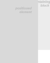 This happens because, as we've seen in earlier chapters, the padding is added to the content area, and the content area's size is determined by the values of height and width. In order to get the padding you want and still have the element fit into its containing block, you would either remove the height and width declarations, or else explicitly set them both to auto. 10.2.2.2 Limiting width and heightShould it become necessary or desirable, you can place limits on an element's width by using the following CSS2 properties, which I'll refer to as the min-max properties. An element's content area can be defined to have a minimum dimension using min-width and min-height.
Similarly, an element's dimensions can be limited using the properties max-width and max-height.
The names of these properties make them fairly self-explanatory. What's less obvious at first, but makes sense once you think about it, is that values for all these properties cannot be negative.
The following styles will force the positioned element to be at least 10em wide by 20em tall, as illustrated in Figure 10-30: top: 10%; bottom: 20%; left: 50%; right: 10%; min-width: 10em; min-height: 20em; Figure 10-30. Setting a minimum and maximum height for a positioned element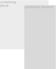 This isn't a very robust solution since it forces the element to be at least a certain size regardless of the size of its containing block. Here's a better one: top: 10%; bottom: auto; left: 50%; right: 10%; height: auto; min-width: 15em; Here you have a case where the element should be 40% as wide as the containing block but can never be less than 15em wide. You've also changed the bottom and height so that they're automatically determined. This will let the element be as tall as necessary to display its content, no matter how narrow it gets (never less than 15em, of course!).
You can turn this around to keep elements from getting too wide or tall by using max-width and max-height. Let's consider a situation where, for some reason, you want an element to have three-quarters the width of its containing block but to stop getting wider when it hits 400 pixels. The appropriate styles are: left: 0%; right: auto; width: 75%; max-width: 400px; One great advantage of the min-max properties is that they let you mix units with relative safety. You can use percentage-based sizes while setting length-based limits, or vice versa. It's worth mentioning that these min-max properties can be very useful in conjunction with floated elements as well. For example, you can allow a floated element's width to be relative to the width of its parent element (which is its containing block), while also making sure that the float's width never goes below 10em. The reverse approach is also possible: p.aside {float: left; width: 40em; max-width: 40%;}
This will set the float to be 40em wide, unless that would be more than 40% the width of the containing block, in which case the float will be narrowed.
10.2.3 Content Overflow and ClippingIf the content of an element is too much for the element's size, it will be in danger of overflowing the element itself. There are a few alternatives in such situations, and CSS2 lets you select between them. It also allows you to define a clipping region to determine the area of the element outside of which these sorts of things become an issue. 10.2.3.1 OverflowSo let's say that you have, for whatever reason, an element that has been pinned to a specific size, and the content doesn't fit. You can take control of the situation with the overflow property.
The default value of visible means that the element's content may be visible outside the element's box. Typically, this would lead to the content simply running outside its own element box but not altering the shape of that box. The following markup would result in Figure 10-31: div#sidebar {position: absolute; top: 0; left: 0; width: 25%; height: 7em;
background: #BBB; overflow: visible;}
Figure 10-31. Content visibly overflowing the element box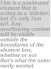 If overflow is set to scroll, the element's content is clippedthat is, cannot be seenat the edges of the element box, but there is some way to make the extra content available to the user. In a web browser, this could mean a scrollbar (or set of them) or another method of accessing the content without altering the shape of the element itself. One possibility is depicted in Figure 10-32, which could result from the following markup: div#sidebar {position: absolute; top: 0; left: 0; width: 15%; height: 7em;
overflow: scroll;}
Figure 10-32. Overflowing content made available via a scroll mechanism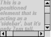 If scroll is used, the panning mechanisms (e.g., scrollbars) should always be rendered. To quote the specification, "this avoids any problem with scrollbars appearing or disappearing in a dynamic environment." Thus, even if the element has sufficient space to display all of its content, the scrollbars should still appear. In addition, when printing a page or otherwise displaying the document in a print medium, the content may be displayed as though the value of overflow were declared to be visible. If overflow is set to hidden, the element's content is clipped at the edges of the element box, but no scrolling interface should be provided to make the content outside the clipping region accessible to the user. Consider the following markup: div#sidebar {position: absolute; top: 0; left: 0; width: 15%; height: 7em;
overflow: hidden;}
In such an instance, the clipped content would not be accessible to the user. This would lead to a situation like that illustrated in Figure 10-33. Figure 10-33. Clipping content at the edges of the content area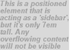 Finally, there is overflow: auto. This allows user agents to determine which behavior to use, although they are encouraged to provide a scrolling mechanism when necessary. This is a potentially useful way to use overflow since user agents could interpret it to mean "provide scrollbars only when needed." (They may not, but they certainly could and probably should.) 10.2.3.2 Content clippingIn situations where the content of an absolutely positioned element overflows its element box, and overflow has been set such that the content should be clipped, it is possible to alter the shape of the clipping region by using the property clip.
The default value, auto, means that the contents of the element should not be clipped. The other possibility is to define a clipping shape that is relative to the element's content area. This does not alter the shape of the content area, but instead alters the area in which content may be rendered.
This is done with the shape value rect(top, right, bottom, left). You could specify no change in the clipping region like this: clip: rect(0, auto, auto, 0); The syntax of rect is an interesting case. Technically, it can be rect(top, right, bottom, left)note the commasbut the CSS2 specification contains examples both with and without commas and defines it as accepting both versions. This text will stick to the comma version mostly because it makes things easier to read, and because it's what is preferred in CSS2.1. It is extremely important to note that the values for rect(...) are not side-offsets. They are, instead, distances from the upper-left corner of the element (or the upper-right, in right-to-left languages). Thus, a clipping rectangle that encloses a square 20 pixels by 20 pixels in the upper-left corner of the element would be defined as: rect(0, 20px, 20px, 0) The only values permitted with rect(...) are length values and auto, which is the same as setting the clipping edge to the appropriate content edge. Thus, the following two statements mean the same thing: clip: rect(auto, auto, 10px, 1em); clip: rect(0, 0, 10px, 1em); Because all the offsets in clip are from the top left corner, and percentages are not permitted, it is practically impossible to create a "centered" clipping area unless you know the dimensions of the element itself. Consider: div#sidebar {position: absolute; top: 0; bottom: 50%; right: 50%; left: 0;
clip: rect(1em,4em,6em,1em);}
Since there is no way to know how many ems tall or wide the element will be, there is no way to define a clipping rectanglewhich ends one em to the right, or one em belowthe content area of the element. The only way to know this is to set the height and width of the element itself: div#sidebar {position: absolute; top: 0; left: 0; width: 5em; height: 7em;
clip: rect(1em,4em,6em,1em);}
This would cause a result something like that shown in Figure 10-34, where a dashed line has been added to illustrate the edges of the clipping region. This line would not actually appear in a user agent attempting to render the document. Figure 10-34. Setting the clipping region for overflowing content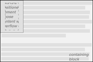 It is possible to set negative lengths, though, which will expand the clipping area outside the element's box. If you want to push the clipping area up and left by a quarter-inch, it would be done with the following styles (illustrated in Figure 10-35): clip: rect(-0.25in, auto, auto, -0.25in); Figure 10-35. Extending the clipping region outside the element box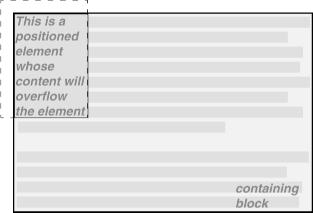 This doesn't do much good, as you can see. The clipping rectangle extends up and to the left, but since there isn't any content there, it doesn't make much difference. On the other hand, it might be okay to go beyond the bottom and right edges, but not the top or left. Figure 10-36 shows the results of these styles (and remember, the dashed lines are only for illustrative purposes!): div#sidebar {position: absolute; top: 0; left: 0; width: 5em; height: 7em;
clip: rect(0,6em,9em,0);}
Figure 10-36. Extending the clipping region below and to the right of the element box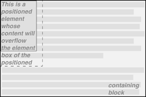 This extends the area in which content can be seen. However, it doesn't change the flow of the content, so the only visual effect is that more content can be seen below the element. The text does not flow out to the right because the width of its line boxes is still constrained by the width of the positioned element. If there had been an image wider than the positioned element, or preformatted text with a long line, this might have been visible to the right of the positioned element, up to the point where the clipping rectangle ends. The syntax of rect(...) is, as you may have already realized, rather unusual when compared to the rest of CSS. It is based on an early draft of the positioning section, which used the top-left-offset scheme. Internet Explorer implemented this before CSS2 was made a full Recommendation, and so came into conflict with a last-minute change that made rect(...) use side-offsets, just like the rest of CSS2. This was done, reasonably enough, to make positioning consistent with itself. By then, however, it was too late: there was an implementation in the marketplace, and rather than force Microsoft to change the browser and thus potentially break existing pages, the standard was changed to reflect implementation. Unfortunately, as we saw before, this means that it is impossible to set a consistent clipping rectangle in situations where the height and width are not precisely defined. Further compounding the problem is that rect(...) accepts only length units and auto. The addition of percentage units as valid rect(...) values would go a long way toward improving things, and hopefully a future version of CSS will add this capability.
10.2.4 Element VisibilityIn addition to all the clipping and overflowing, you can also control the visibility of an entire element.
This one is pretty easy. If an element is set to have visibility: visible, then it is, of course, visible. If an element is set to visibility: hidden, it is made "invisible" (to use the wording in the specification). In its invisible state, the element still affects the document's layout as though it were visible. In other words, the element is still there, you just can't see it. Note the difference between this and display: none. In the latter case, the element is not displayed and is also removed from the document altogether so that it doesn't have any effect on document layout. Figure 10-37 shows a document in which a paragraph has been set to hidden, based on the following styles and markup: em.trans {visibility: hidden; border: 3px solid gray; background: silver;
margin: 2em; padding: 1em;}
<p>
This is a paragraph that should be visible. Lorem ipsum, dolor sit amet,
<em class="trans">consectetuer adipiscing elit, sed diam nonummy nibh </em>
euismod tincidunt ut laoreet dolore magna aliquam erat volutpat.
</p>
Figure 10-37. Making elements invisible without suppressing their element boxes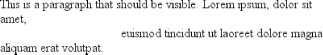 Everything visible about a hidden elementsuch as content, background, and borderswill be made invisible. Note that the space is still there because the element is still part of the document's layout. You just can't see it. Note too that it's possible to set the descendant element of a hidden element to be visible. This would cause the element to appear wherever it normally would, despite the fact that the ancestor (and possibly its siblings) is invisible. In order to do so, you would need to explicitly declare the descendant element visible, since visibility is inherited: p.clear {visibility: hidden;}
p.clear em {visibility: visible;}
As for visbility: collapse, this value is used in CSS table rendering, which is covered in the next chapter. According to the CSS2 specification, collapse has the same meaning as hidden if it is used on non-table elements. 10.2.5 Absolute PositioningSince most of the examples and figures in the previous sections are examples of absolute positioning, you're already halfway to an understanding of how it works. Most of what remains are the details of what happens when absolute positioning is invoked. 10.2.5.1 Containing blocks and absolutely positioned elementsWhen an element is positioned absolutely, it is completely removed from the document flow. It is then positioned with respect to its containing block, and its edges are placed using the offset properties (top, left, etc.). The positioned element does not flow around the content of other elements, nor does their content flow around the positioned element. This implies that an absolutely positioned element may overlap other elements or be overlapped by them. (You'll see how you can affect the overlapping order later in the chapter.) The containing block for an absolutely positioned element is the nearest ancestor element that has a position value other than static. It is common for an author to pick an element that will serve as the containing block for the absolutely positioned element and give it a position of relative with no offsets: p.contain {position: relative;}
Consider the example in Figure 10-38, which is an illustration of the following: p {margin: 2em;}
p.contain {position: relative;} /* establish a containing block*/
b {position: absolute; top: auto; right: 0; bottom: 0; left: auto;
width: 8em; height: 5em; border: 1px solid gray;}
<body>
<p>
This paragraph does <em>not</em> establish a containing block for any of its
descendant elements that are absolutely positioned. Therefore, the absolutely
positioned <b>boldface </b> element it contains will be positioned with
respect to the initial containing block.
</p>
<p class="contain">
Thanks to 'position: relative', this paragraph establishes a containing
block for any of its descendant elements that are absolutely positioned.
Since there is such an element-- <em>that is to say, <b>a boldfaced element
that is absolutely positioned,</b> placed with respect to its containing
block (the paragraph)</em>, it will appear within the element box generated
by the paragraph.
</p>
</body>
Figure 10-38. Using relative positioning to define containing blocks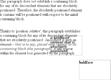 The b elements in both paragraphs have been absolutely positioned. The difference is in the containing block used for each one. The b element in the first paragraph is positioned with respect to the initial containing block because all of its ancestor elements have a position of static. The second paragraph, though, has been set to position: relative, so it establishes a containing block for its descendants. You've probably noted that in the second paragraph, the positioned element overlaps some of the text content of the paragraph. There is no way to avoid this, short of positioning the b element outside of the paragraph (by using a negative value for right or one of the other offset properties) or by specifying a padding for the paragraph that is wide enough to accommodate the positioned element. Also, since the b element has a transparent background, the paragraph's text shows through the positioned element. The only way to avoid this is to set a background for the positioned element, or else move it out of the paragraph entirely. You will sometimes want to ensure that the body element establishes a containing block for all its descendants, rather than allowing the user agent to pick an initial containing block. This is as simple as declaring: body {position: relative;}
In such a document, you could drop in an absolutely positioned paragraph, as follows, and get a result like that shown in Figure 10-39: <p style="position: absolute; top: 0; right: 25%; left: 25%; bottom: auto; width: 50%; height: auto; background: silver;">...</p> Figure 10-39. Positioning an element whose containing block is the root element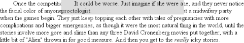 The paragraph is now positioned at the very beginning of the document, half as wide as the document's width and overwriting the first few elements. An important point to highlight is that when an element is absolutely positioned, it also establishes a containing block for its descendant elements. For example, you could absolutely position an element and then absolutely position one of its children, as shown in Figure 10-40, which was generated using the following styles and basic markup: div {position: relative; width: 100%; height: 10em;
border: 1px solid; background: #EEE;}
div.a {position: absolute; top: 0; right: 0; width: 15em; height: 100%;
margin-left: auto; background: #CCC;}
div.b {position: absolute; bottom: 0; left: 0; width: 10em; height: 50%;
margin-top: auto; background: #AAA;}
<div>
<div class="a">absolutely positioned element A
<div class="b">absolutely positioned element B</div>
</div>
containing block
</div>
Figure 10-40. Absolutely positioned elements establish containing blocks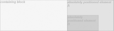 Remember that if the document is scrolled, the positioned elements will scroll right along with it. This is true of all absolutely positioned elements that are not descendants of fixed-position elements. It happens because, eventually, the elements are positioned in relation to something that's part of the normal flow. For example, if you absolutely position a table, and its containing block is the initial containing block, then it will scroll because the initial containing block is part of the normal flow. Similarly, even if you set up absolutely positioned elements nested four levels deep, the "outermost" of these elements is still positioned with respect to the initial containing block. Thus, it will scroll along with the initial containing block, and all its descendants will go along for the ride.
10.2.5.2 Placement and sizing of absolutely positioned elementsIt may seem odd to combine the concepts of placement and sizing, but it's a necessity with absolutely positioned elements because the specification binds them very closely together. This is not such a strange pairing upon reflection. Consider what happens if an element is positioned using all four offset properties, like so: #masthead h1 {position: absolute; top: 1em; left: 1em; right: 25%; bottom: 10px;
margin: 0; padding: 0; background: silver;}
Here, the height and width of the h1's element box is determined by the placement of its outer margin edges, as shown in Figure 10-41. Figure 10-41. Determining the height of an element based on the offset properties If the containing block were made taller, then the h1 would also become taller; if the containing block is narrowed, then the h1 would become narrower. If you were to add margins or padding to the h1, then that would have further effects on the calculated height and width of the h1. But what if you do all that and then also try to set an explicit height and width: #masthead h1 {position: absolute; top: 0; left: 1em; right: 10%; bottom: 0;
margin: 0; padding: 0; height: 1em; width: 50%; background: silver;}
Something has to give because it's incredibly unlikely that all those values will be accurate. In fact, the containing block would have to be exactly two-and-a-half times as wide as the h1's computed value for font-size for all of the shown values to be accurate. Any other width would mean at least one value is wrong and has to be ignored. Figuring out which one depends on a number of factors, and the factors change depending on whether an element is replaced or nonreplaced. For that matter, consider the following: #masthead h1 {position: absolute; top: auto; left: auto;}
What should the result be? As it happens, the answer is not "reset the values to zero." We'll see the actual answer in the next section. 10.2.5.3 Auto-edgesWhen absolutely positioning an element, there is a special behavior that applies when any of the offset properties other than bottom are set to auto. Let's take top as an example. Consider the following: <p> When we consider the effect of positioning, it quickly becomes clear that authors can do a great deal of damage to layout, just as they can do very interesting things.<span style="position: absolute; top: auto; left: 0;">[4]</span> This is usually the case with useful technologies: the sword always has at least two edges, both of them sharp. </p> What should happen? For left, it's easy: the left edge of the element should be placed against the left edge of its containing block (which you can assume to be the initial containing block). For top, however, something much more interesting happens. The top of the positioned element should line up with the place where its top would have been if it were not positioned at all. In other words, imagine where the span would have been placed if its position value were static; this is its static positionwhere its top edge should be calculated to sit. CSS2.1 has this to say:
Therefore, you should get the result shown in Figure 10-42. Figure 10-42. Absolutely positioning an element consistently with its "static" position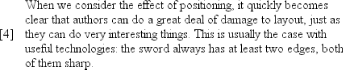 The "[4]" sits just outside the paragraph's content because the initial containing block's left edge is to the left of the paragraph's left edge. The same basic rules hold true for left and right being set to auto. In those cases, the left (or right) edge of a positioned element lines up with the spot where the edge would have been placed if the element weren't positioned. So let's modify our previous example so that both top and left are set to auto: <p> When we consider the effect of positioning, it quickly becomes clear that authors can do a great deal of damage to layout, just as they can do very interesting things.<span style="position: absolute; top: auto; left: auto;">[4]</span> This is usually the case with useful technologies: the sword always has at least two edges, both of them sharp. </p> This would have the result shown in Figure 10-43. Figure 10-43. Absolutely positioning an element consistently with its "static" position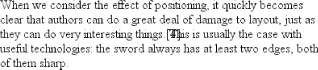 The "[4]" now sits right where it would have were it not positioned. Note that, since it is positioned, its normal-flow space is closed up. This causes the positioned element to overlap with the normal-flow content.
This auto-placement works only in certain situations, generally wherever there are few constraints on the other dimensions of a positioned element. Our previous example could be auto-placed because it had no constraints on its height or width, as well as no constraints on the placement of the bottom and right edges. But suppose, for some reason, there had been such constraints? Consider: <p> When we consider the effect of positioning, it quickly becomes clear that authors can do a great deal of damage to layout, just as they can do very interesting things.<span style="position: absolute; top: auto; left: auto; right: 0; bottom: 0; height: 2em; width: 5em;">[4]</span> This is usually the case with useful technologies: the sword always has at least two edges, both of them sharp. </p> It is not possible to satisfy all of those values. Determining what happens is the subject of the next section. 10.2.5.4 Placing and sizing nonreplaced elementsIn general, the size and placement of an element depends on its containing block. The values of its various properties (width, right, padding-left, and so on) affect the situation, but the foundation is the containing block. Consider the width and horizontal placement of a positioned element. It can be represented as an equation which states that left + margin-left + border-left-width + padding-left + width + padding-right + border-right-width + margin-right + right = the width of the containing block. This calculation is fairly reasonable. It's basically the equation that determines how block-level elements in the normal flow are sized, except it adds left and right to the mix. So how do all these interact? There are a series of rules to work through. First, if left, width, and right are all set to auto, then you get the result seen in the previous section: the left edge is placed at its static position, assuming a left-to-right language. In right-to-left languages, the right edge is placed at its static position. The width of the element is set to be "shrink to fit," which means the element's content area is made only as wide as necessary to contain the content. This is rather like the way table cells behave. The non-static-position property (right in left-to-right languages, left in right-to-left) is set to take up the remaining distance. For example: <div style="position: relative; width: 25em; border: 1px dotted;"> An absolutely positioned element can have its content <span style="position: absolute; top: 0; left: 0; right: auto; width: auto; background: silver;">shrink-wrapped</span> thanks to the way positioning rules work. </div> This has the result shown in Figure 10-44. Figure 10-44. The "shrink-to-fit" behavior of absolutely positioned elements The top of the element is placed against the top of its containing block (the div, in this case) and the width of the element is just as much as is needed to contain the content. The remaining distance from the right edge of the element to the right edge of the containing block becomes the computed value of right. Now suppose that only the left and right margins are set to auto, not left, width, and right, as in this example: <div style="position: relative; width: 25em; border: 1px dotted;"> An absolutely positioned element can have its content <span style="position: absolute; top: 0; left: 1em; right: 1em; width: 10em; margin: 0 auto; background: silver;">shrink-wrapped</span> thanks to the way positioning rules work. </div> What happens here is that the left and right margins, which are both auto, are set to be equal. This will effectively center the element, as shown in Figure 10-45. Figure 10-45. Horizontally centering an absolutely positioned element with auto margins This is basically the same as auto-margin centering in the normal flow. So let's make the margins something other than auto: <div style="position: relative; width: 25em; border: 1px dotted;"> An absolutely positioned element can have its content <span style="position: absolute; top: 0; left: 1em; right: 1em; width: 10em; margin-left: 1em; margin-right: 1em; background: silver;">shrink-wrapped</span> thanks to the way positioning rules work. </div> Now you have a problem. The positioned span's properties add up to only 14em, whereas the containing block is 25em wide. That's an 11-em deficit you have to make up somewhere. The rules state that, in this case, the user agent ignores the value for right (in left-to-right languages; otherwise, it ignores left) and solves for it. In other words, the result will be the same as if you'd declared: <span style="position: absolute; top: 0; left: 1em; right: 15em; width: 10em; margin-left: 1em; margin-right: 1em; background: silver;">shrink-wrapped</span> This has the result shown in Figure 10-46. Figure 10-46. Ignoring the value for right in an overconstrained situation If one of the margins had been left as auto, then that would have been changed instead. Suppose you change the styles to state: <span style="position: absolute; top: 0; left: 1em; right: 1em; width: 10em; margin-left: 1em; margin-right: auto; background: silver;">shrink-wrapped</span> The visual result would be the same as that in Figure 10-46, only it would be attained by computing the right margin to 14em instead of overriding the value assigned to the property right. If, on the other hand, you made the left margin auto, then it would be reset, as illustrated in Figure 10-47: <span style="position: absolute; top: 0; left: 1em; right: 1em; width: 10em; margin-left: auto; margin-right: 1em; background: silver;">shrink-wrapped</span> Figure 10-47. Ignoring the value for margin-right in an overconstrained situation In general, if only one of the properties is set to auto, then it will be modified to satisfy the equation given earlier in the section. Given the following styles, the element's width would expand to whatever size is needed instead of "shrink-wrapping" the content: <span style="position: absolute; top: 0; left: 1em; right: 1em; width: auto; margin-left: 1em; margin-right: 1em; background: silver;">shrink-wrapped</span> So far we've really only examined behavior along the horizontal axis, but very similar rules hold true along the vertical axis. If you take the previous discussion and rotate it 90 degrees, as it were, you get almost the same behavior. For example, the following markup results in Figure 10-48: <div style="position: relative; width: 30em; height: 10em; border: 1px solid;"> <div style="position: absolute; left: 0; width: 30%; background: #CCC; top: 0;"> element A </div> <div style="position: absolute; left: 35%; width: 30%; background: #AAA; top: 0; height: 50%;"> element B </div> <div style="position: absolute; left: 70%; width: 30%; background: #CCC; height: 50%; bottom: 0;"> element C </div> </div> Figure 10-48. Vertical layout behavior for absolutely positioned elements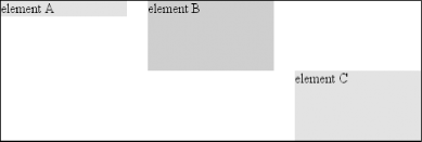 In the first case, the height of the element was shrink-wrapped to the content. In the second, the unspecified property (bottom) was set to make up the distance between the bottom of the positioned element and the bottom of its containing block. In the third case, it was top that was unspecified and therefore made up the difference. For that matter, auto-margins can lead to vertical centering. Given the following styles, the absolutely positioned div will be vertically centered within its containing block, as shown in Figure 10-49: <div style="position: relative; width: 10em; height: 10em; border: 1px solid;"> <div style="position: absolute; left: 0; width: 100%; background: #CCC; top: 0; height: 5em; bottom: 0; margin: auto 0;"> element D </div> </div> Figure 10-49. Vertically centering an absolutely positioned element with auto margins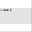 There are two small variations to point out. In horizontal layout, either right or left can be placed according to the static position if their values are auto. In vertical layout, only top can take on the static position; bottom, for whatever reason, cannot.
Also, if an absolutely positioned element's size is overconstrained in the vertical direction, bottom is ignored. Thus, in the following situation, the declared value of bottom would be overridden by the calculated value of 5em: <div style="position: relative; width: 10em; height: 10em; border: 1px solid;"> <div style="position: absolute; left: 0; width: 100%; background: #CCC; top: 0; height: 5em; bottom: 0; margin: 0;"> element D </div> </div> There is no provision for top to be ignored if the properties are overconstrained. 10.2.5.5 Placing and sizing replaced elementsPositioning rules are different for nonreplaced elements than they are for replaced elements. This is because replaced elements have an intrinsic height and width, and therefore are not altered unless explicitly changed by the author. Thus, there is no concept of "shrink to fit" in the positioning of replaced elements. The behaviors that go into placing and sizing replaced elements is most easily expressed by a series of rules to be taken one after the other. These state:
This leads to the same basic behaviors we saw with absolutely positioned nonreplaced elements, as long as you assume that there is an explicit width for the nonreplaced element. Therefore, the following two elements will have the same width and placement, assuming the image's intrinsic width is 100 pixels (see Figure 10-50): <div style="position: relative; width: 300px;"> <img src="frown.gif" alt="a frowny face" style="position: absolute; top: 0; left: 50px; margin: 0;"> <div style="position: absolute; top: 0; left: 50px; width: 100px; height: 100px; margin: 0;"> it's a div! </div> </div> Figure 10-50. Absolutely positioning a replaced element As with nonreplaced elements, if the values are overconstrained, the user agent is supposed to ignore the value for right in left-to-right languages and left in right-to-left languages. Thus, in the following example, the declared value for right is overridden with a computed value of 50px: <div style="position: relative; width: 300px;">
<img src="frown.gif" alt="a frowny face"
style="position: absolute; top: 0; left: 50px; right: 125px; width: 200px;
margin: 0;">
</div>
Similarly, layout along the vertical axis is governed by a series of rules that state:
As with nonreplaced elements, if the values are overconstrained, then the user agent is supposed to ignore the value for bottom. Thus, the following markup would have the results shown in Figure 10-51: <div style="position: relative; height: 200px; width: 200px; border: 1px solid;"> <img src="one.gif" alt="one" width="25" height="25" style="position: absolute; top: 0; left: 0; margin: 0;"> <img src="two.gif" alt="two" width="25" height="25" style="position: absolute; top: 0; left: 60px; margin: 10px 0; bottom: 4377px;"> <img src="three.gif" alt=" three" width="25" height="25" style="position: absolute; left: 0; width: 100px; margin: 10px; bottom: 0;"> <img src="four.gif" alt=" four" width="25" height="25" style="position: absolute; top: 0; height: 100px; right: 0; width: 50px;"> <img src="five.gif" alt="five" width="25" height="25" style="position: absolute; top: 0; left: 0; bottom: 0; right: 0; margin: auto;"> </div> Figure 10-51. Stretching replaced elements through positioning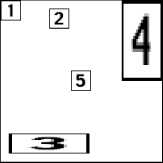 10.2.5.6 Placement on the z-axisWith all of the positioning going on, there will inevitably be a situation where two elements will try to exist in the same place, visually speaking. Obviously, one of them will have to overlap the otherbut how does one control which element comes out "on top"? This is where the property z-index comes in.
z-index lets you alter the way in which elements overlap each other. It takes its name from the coordinate system in which side-to-side is the x-axis and top-to-bottom is the y-axis. In such a case, the third axisthat which runs from front to back, or if you prefer, further away from the useris termed the z-axis. Thus, elements are given values along this axis and are represented using z-index. Figure 10-52 illustrates this system. Figure 10-52. A conceptual view of z-index stacking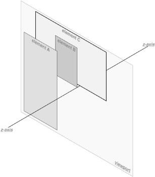 In this coordinate system, an element with a high z-index value is closer to the reader than those with lower z-index values. This will cause the high-value element to overlap the others, as illustrated in Figure 10-53, which is a "head-on" view of Figure 10-52. This is referred to as stacking. Figure 10-53. How the elements are stacked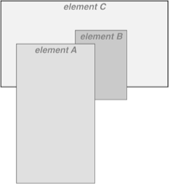 Any integer can be used as a value for z-index, including negative numbers. Assigning an element a negative z-index will move it further away from the reader; that is, it will be moved lower in the stack. Consider the following styles, illustrated in Figure 10-54: p#first {position: absolute; top: 0; left: 0;
width: 20%; height: 10em; z-index: 8;}
p#second {position: absolute; top: 0; left: 10%;
width: 30%; height: 5em; z-index: 4;}
p#third {position: absolute; top: 15%; left: 5%;
width: 15%; height: 10em; z-index: 1;}
p#fourth {position: absolute; top: 10%; left: 15%;
width: 40%; height: 10em; z-index: 0;}
Figure 10-54. Stacked elements can overlap each other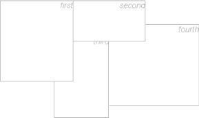 Each of the elements is positioned according to its styles, but the usual order of stacking is altered by the z-index values. Assuming the paragraphs were in numeric order, then a reasonable stacking order would have been, from lowest to highest, p#first, p#second, p#third, p#fourth. This would have put p#first behind the other three elements and p#fourth in front of the others. Now, thanks to z-index, the stacking order is under your control. As the previous example demonstrates, there is no particular need to have the z-index values be contiguous. You can assign any integer of any size. If you want to be fairly certain that an element stayed in front of everything else, you might use a rule along the lines of z-index: 100000. This would work as expected in most casesalthough if you ever declared another element's z-index to be 100001 (or higher), it would appear in front. Once you assign an element a value for z-axis (other than auto), that element establishes its own local stacking context. This means that all of the element's descendants have their own stacking order, relative to the ancestor element. This is very similar to the way that elements establish new containing blocks. Given the following styles, you would see something like Figure 10-55: p {border: 1px solid; background: #DDD; margin: 0;}
b {background: #808080;}
em {background: #BBB;}
#one {position: absolute; top: 0; left: 0; width: 50%; height: 10em;
z-index: 10;}
#two {position: absolute; top: 5em; left: 25%; width: 50%; height: 10em;
z-index: 7;}
#three {position: absolute; top: 11em; left: 0; width: 50%; height: 10em;
z-index: 1;}
#one b {position: absolute; right: -5em; top: 4em; width: 20em;
z-index: -404;}
#two b {position: absolute; right: -3em; top: auto;
z-index: 36;}
#two em {position: absolute; bottom: -0.75em; left: 7em; right: -2em;
z-index: -42;}
#three b {position: absolute; left: 3em; top: 3.5em; width: 25em;
z-index: 23;}
Figure 10-55. Positioned elements establish local stacking contexts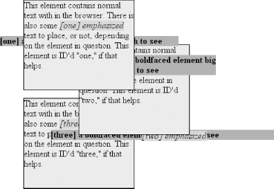 Note where the b and em elements fall in the stacking order. Each of them is correctly positioned with respect to its parent element, of course. However, pay close attention to the children of p#two. While the b element is in front of its parent, and the em is behind, both of them are in front of p#three! This is because the z-index values of 36 and -42 are relative to p#two but not to the document in general. In a sense, p#two and all of its children share a z-index of 7, while having their own mini-z-index within the context of p#two. Put another way, it's as though the b element has a z-index of 7,36 while the em's value is 7,-42. These are merely implied conceptual values; they don't conform to anything in the specification. However, such a system helps to illustrate how the overall stacking order is determined. Consider: p#one 10 p#one b 10,-404 p#two b 7,36 p#two 7 p#two em 7,-42 p#three b 1,23 p#three 1 This conceptual framework precisely describes the order in which these elements would be stacked. While the descendants of an element can be above or below that element in the stacking order, they are all grouped together with their ancestor. It is also the case that an element that establishes a stacking context for its descendants is placed at the 0 position of that context's z-axis. Thus, you could extend the framework to say: p#one 10,0 p#one b 10,-404 p#two b 7,36 p#two 7,0 p#two em 7,-42 p#three b 1,23 p#three 1,0 There remains one more value to examine. The specification has this to say about the default value, auto:
Thus, any element with z-index: auto can be treated as though it is set to z-index: 0. Now, however, you may wonder what happens to elements with a negative z-index value that are part of the initial containing block's stacking context. For example, ask yourself what should happen given the following: <body> <p style="position: absolute; z-index: -1;">Where am I?</p> </body> Given the rules of stacking, the body element should be at the same stacking as its parent's box, so take that to be 0. It does not establish a new stacking context, so the absolutely positioned p element is placed in the same stacking context as the body element (that of the initial containing block). In other words, the paragraph is placed behind the body element. If the body has a nontransparent background, the paragraph will disappear. That was a possible result in CSS2, at any rate. In CSS2.1, the stacking rules have been changed so that an element can never be stacked below the background of its stacking context. In other words, consider the case where the body element establishes a containing block for its descendants (if it were relatively positioned, for example). An absolutely positioned element that is descended from the body element can never be stacked below the body's background, although it can be stacked below the body's content. As of this writing, Mozilla and related browsers completely hide the paragraph even if you set both the body and html elements to have transparent backgrounds. This happens in error. Other user agents, like Internet Explorer, place the paragraph above the body's background even if it has one. According to CSS2.1, that's the correct behavior. The upshot is that negative z-index values can lead to unpredictable results, so use them with caution. 10.2.6 Fixed PositioningAs implied in the previous section, fixed positioning is just like absolute positioning, except the containing block of a fixed element is the viewport. In this case, the element is totally removed from the document's flow and does not have a position relative to any part of the document. Fixed positioning can be exploited in a number of interesting ways. First off, it's possible to create frame-style interfaces using fixed positioning. Consider Figure 10-56, which shows a very common layout scheme. Figure 10-56. Emulating frames with fixed positioning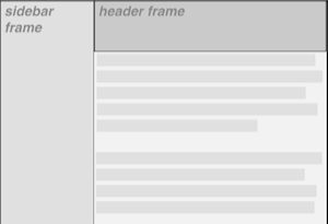 This could be done using the following styles: div#header {position: fixed; top: 0; bottom: 80%; left: 20%; right: 0;
background: gray;}
div#sidebar {position: fixed; top: 0; bottom: 0; left: 0; right: 80%;
background: silver;}
This will fix the header and sidebar to the top and side of the viewport, where they will remain regardless of how the document is scrolled. The drawback here, though, is that the rest of the document will be overlapped by the fixed elements. Therefore, the rest of the content should probably be contained in its own div and employ the following: div#main {position: absolute; top: 20%; bottom: 0; left: 20%; right: 0;
overflow: scroll; background: white;}
It would even be possible to create small gaps between the three positioned divs by adding some appropriate margins, demonstrated in Figure 10-57: body {background: black; color: silver;} /* colors for safety's sake */
div#header {position: fixed; top: 0; bottom: 80%; left: 20%; right: 0;
background: gray; margin-bottom: 2px; color: yellow;}
div#sidebar {position: fixed; top: 0; bottom: 0; left: 0; right: 80%;
background: silver; margin-right: 2px; color: maroon;}
div#main {position: absolute; top: 20%; bottom: 0; left: 20%; right: 0;
overflow: auto; background: white; color: black;}
Figure 10-57. Separating the "frames" with margins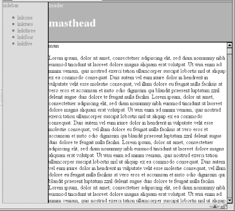 Given such a case, a tiled image could be applied to the body background. This image would show through the gaps created by the margins, which could certainly be widened if the author saw fit. Another use for fixed positioning is to place a "persistent" element on the screen, like a short list of links. You could create a persistent footer with copyright and other information as follows: div#footer {position: fixed; bottom: 0; width: 100%; height: auto;}
This would place the footer at the bottom of the viewport and leave it there no matter how much the document is scrolled. The major drawback of fixed positioning is that Internet Explorer for Windows doesn't support it. There are workarounds that use JavaScript to introduce some support in IE/Win, but they are not always acceptable to authors because the display is much less smooth than full fixed-position support should be. Another possibility is to absolutely position the element in IE/Win but use fixed positioning in more advanced browsers, although this will not work for all layouts.
10.2.7 Relative PositioningThe simplest of the positioning schemes to understand is relative positioning. In this scheme, a positioned element is shifted by use of the offset properties. However, this can have some interesting consequences. On the surface, it seems simple enough. Suppose you want to shift an image up and to the left. Figure 10-58 shows you the result of these styles: img {position: relative; top: -20px; left: -20px;}
Figure 10-58. A relatively positioned element All you've done here is offset the image's top edge 20 pixels upward and offset the left edge 20 pixels to the left. However, notice the blank space where the image would have been, had it not been positioned. This happened because when an element is relatively positioned, it's shifted from its normal place, but the space it would have occupied doesn't disappear. Consider the results of the following styles, which are depicted in Figure 10-59: em {position: relative; top: 8em; color: gray;}
Figure 10-59. A relatively positioned element As you can see, the paragraph has some blank space in it. This is where the em element would have been, and the layout of the em element in its new position exactly mirrors the space it left behind. Of course, it's also possible to shift a relatively positioned element to overlap other content. For example, the following styles and markup are illustrated in Figure 10-60: img.slide {position: relative; left: 30px;}
<p>
In this paragraph, we will find that there is an image that has been pushed to
the right. It will therefore <img src="star.gif" alt="A star!" class="slide">
overlap content nearby, assuming that it is not the last element in its line box.
</p>
Figure 10-60. Relatively positioned elements can overlap other content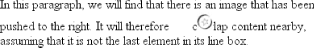 As we saw in previous sections, when you relatively position an element, it immediately establishes a new containing block for any of its children. This containing block corresponds to the place where the element has been positioned. There is one interesting wrinkle to relative positioning. What happens when a relatively positioned element is overconstrained? For example: strong {position: relative; top: 10px; bottom: 20px;}
Here you have values that call for two very different behaviors. If you consider only top: 10px, then the element should be shifted downward 10 pixels, but bottom: 20px clearly calls for the element to be shifted upward 20 pixels. The original CSS2 specification does not say what should happen in this case. CSS2.1 states that when it comes to overconstrained relative positioning, one value is reset to be the negative of the other. Thus, bottom would always equal -top. This means that the previous example would be treated as though it had been: strong {position: relative; top: 10px; bottom: -10px;}
Thus, the strong element will be shifted downward 10 pixels. The specification also makes allowances for writing directions. In relative positioning, right always equals -left in left-to-right languages, but in right-to-left languages, this is reversed: left would always equal -right. |
|
|
< Day Day Up > |
|
