|
|
< Day Day Up > |
|
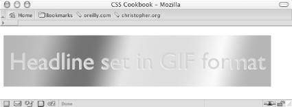
Recipe 10.6 Combining Different Image FormatsProblemYou want to combine two different image formats into one presentation. For example, you want to combine GIF and JPEG images into one graphical presentation as shown in Figure 10-11. Figure 10-11. Two different image formats combined into one SolutionPlace an image inside a block-level element such as a div or h2: <h2><img src="headline_text.gif" alt="Headline image set in GIF format" /></h2> Using an image-editing program, separate the elements of the image into separate file formats (see Figure 10-12). Figure 10-12. Two images that will be used to create one image Name one of the images the same as the image referred to in the src attribute for the img element. Place the other image in the background of the block-level element to merge both images into one presentation. h2 {
background-image: url(headline_bkgd.jpg);
background-repeat: none;
width: 587px;
height: 113px;
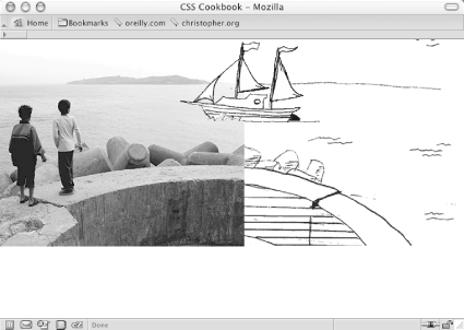
}DiscussionThe two prevailing image formats on the Web are GIF and JPEG. Both compress images in different ways. Typically, images with flat areas of color compress better in the GIF format, while JPEG images are better for photos or images that contain fine color gradations. In the example shown in Figures Figure 10-1 and Figure 10-2, the file size of the two separate images added together is actually less than the file size of the final, combined image. This occurs because part of the image would work against the compression scheme of one file format. If you saved the presentation as one GIF, the photographic portions of the image would create an inflated file size. And if you saved the image as a JPEG, the areas of flat color would inflate the size. By splitting up the images into different formats that leverage their respective compression schemes, you reduce file sizes overall. Although the method in this Solution uses background properties in CSS, you can accomplish the same effect by positioning block elements that contain inline images. For example, in Figure 10-13 you can see that the line art of the boat was overlaid on the photograph of the two children. Figure 10-13. Intricate combination of different image formats To make this method work, wrap the image elements in block-level div elements, as shown in the following HTML code: <!DOCTYPE html PUBLIC "-//W3C//DTD XHTML 1.0 Transitional//EN"
"http://www.w3.org/TR/xhtml1/DTD/xhtml1-transitional.dtd">
<html xmlns="http://www.w3.org/1999/xhtml">
<head>
<title>CSS Cookbook</title>
</head>
<body>
<img src="kids.jpg" width="360" height="304" alt="kids
playing" />
<div id="boat"><img src="boat.gif" width="207" height="123"
alt="boat" /></div>
<div id="water"><img src="landscape.gif" width="315"
height="323"
alt="landscape" /></div>
</body>
</html>Then, through CSS, set the position of the elements to absolute. By setting the position to absolute, you take the elements out of the normal flow of the web page, and instead you assign values to the left, top, and z-index properties to determine their new placements: #boat {
position:absolute;
width:207px;
height:123px;
z-index:2;
left: 264px;
top: 0;
}
#water {
position:absolute;
width:315px;
height:323px;
z-index:1;
left: 359px;
top: -20px;
}The left and top properties indicate the placement of the images within their nearest positioned ancestor element or the initial containing block. In this case, it's the initial containing block to the div elements. Furthermore, the body element's margin has a value of 0, meaning that the origin point is in the upper left corner of the browser's viewport. body {
margin: 0;
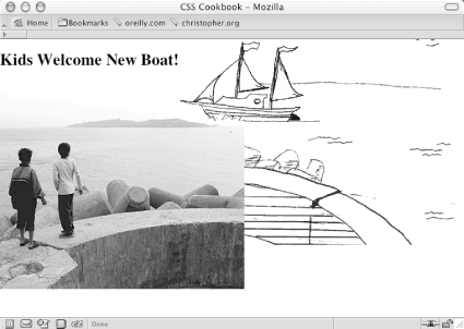
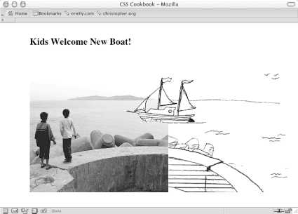
}Even though this method works, if the web document is later modified, exact positioning becomes a design liability. For example, adding a simple headline above the images in the HTML results in the anomaly shown in Figure 10-14: <h2>Kids Welcome New Boat!</h2> <img src="kids.jpg" width="360" height="304" alt="kids playing" /> <div id="boat"><img src="boat.gif" width="207" height="123" alt="boat" /></div> <div id="water"><img src="landscape.gif" width="315" height="323" alt="landscape" /></div> Figure 10-14. Presentation breaks with addition of heading Because the image of the children has not been positioned with absolute, it moves down the flow of the document. The other image stays in place because it has been positioned within the initial containing block and is still in the same place it was before the headline was added. By using the background-positioning method within block-level elements, you can create a self-containing module. Then, when content is added to and removed from the web page, the presentation remains whole, as seen in Figure 10-15 and shown in the following code: Figure 10-15. A different approach to combining images <!DOCTYPE html PUBLIC "-//W3C//DTD XHTML 1.0 Transitional//EN"
"http://www.w3.org/TR/xhtml1/DTD/xhtml1-transitional.dtd">
<html xmlns="http://www.w3.org/1999/xhtml">
<head>
<title>CSS Cookbook</title>
<style type="text/css">
body {
margin: 5% 10% 0 10%;
}
#content {
background-image: url(landscape.gif);
background-repeat: no-repeat;
background-position: bottom right;
height: 400px;
width: 674px;
}
h2 {
margin: 0;
padding: 0;
background-image: url(kids.jpg);
background-repeat: no-repeat;
background-position: bottom left;
height: 400px;
width: 600px;
}
#boat {
background-image: url(boat.gif);
background-repeat: no-repeat;
display: block;
width: 207px;
height: 123px;
margin-left: 250px;
margin-top: 75px;
}
</style>
</head>
<body>
<div id="content">
<h2>Kids Welcome New Boat!
<span id="boat">
</span>
</h2>
</div>
</body>
</html>See AlsoRecipe 10.2 on creating unexpected incongruity between two elements; Recipe 10.3 on combining unlike elements. |
|
|
< Day Day Up > |
|