|
|
< Day Day Up > |
|
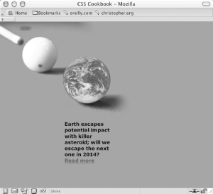
Recipe 10.2 Creating Unexpected IncongruityProblemYou need to grab the reader's attention by using two elements that don't seem to fit together. SolutionPlace one element visually inside the other. In the web page shown in Figure 10-2, which covers Earth's close call with an asteroid, an image of Earth from space was placed over an image of a game of pool. Figure 10-2. An image of Earth placed over an image depicting a game of pool The HTML for this page is simple: <h2><span class="no">Earth News</span></h2> <p>Earth escapes potential impact with killer asteroid; will we escape the next one in 2014? <a href="more.html">Read more</a></p> For the CSS, place the photo depicting the game of pool into the body element and position it in the upper left corner. Then use the image replacement technique discussed in Recipe 3-10 to place the photo of Earth for h2: <style type="text/css">
body {
background-color: #009E69;
margin: 0;
background-image: url(billiard.jpg);
background-repeat: no-repeat;
}
h2 {
background-image: url(earth.gif);
position:absolute;
width:126px;
height:126px;
z-index:1;
left: 166px;
top: 69px;
}
.no {
display: none;
}
p {
width: 120px;
margin: 260px 100px 0 170px;
font-family: Verdana, sans-serif;
font-size: small;
font-weight: bold;
}
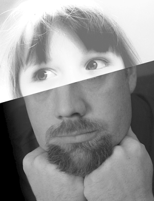
</style>DiscussionA great way to grab attention is to show something that is unexpected. Cleverly combining two different elements into one image can force viewers to pay attention to the image (as seen in Figure 10-3), or it can simply underscore the purpose of the content. Figure 10-3. Photos of a child and man are combined This example used two imagesone of a pool cue and cue ball, and the other of Earth. The former image was placed as the background image for the body element. The image of Earth was placed in the background of h2 and was moved by setting the position to absolute. Then it was composited over the pool image. See AlsoRecipe 10.3 on combining unlike elements; Recipe 10.6 on combining different image formats. |
|
|
< Day Day Up > |
|