|
|
< Day Day Up > |
|
Recipe 5.7 Sample Design: A Login FormLogin forms are all over the Web. For instance, you need a login and a password to check your email on the Web, order books from Amazon.com, and even pay that parking ticket online. Only a few components of a login form are visible to the user: the input field's Submit button and labels as well as the username and password fields themselves. Here is the markup of the form to be stylized (Figure 5-12 shows the input field without styles applied): <form action="login.php" method="post"> <label for="uname">Username</label> <input type="text" name="uname" id="uname" value="" /><br /> <label for="pword">Password</label> <input type="text" name="pword" id="pword" value="" /> <br /> <input type="submit" name="Submit" value="Submit" /> </form> Figure 5-12. The login form without styles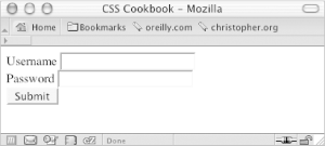 First, add a character after the text in the label element. Use the :after pseudo-class property to autogenerate the character: label:after {
content: ": ";
}Next, to make the labels stick out from the form fields, change the background color of the labels and the weight of the font. Through CSS, change the labels so that they have a gray background and black text set in bold type (see Figure 5-13): label {
background-color: gray;
color: black;
font-weight: bold;
}Figure 5-13. Styles for color applied to the label elements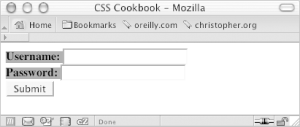 Now, place some padding around the text and change the text to uppercase (see Figure 5-14): label {
background-color: gray;
color: black;
font-weight: bold;
padding: 4px;
text-transform: uppercase;
}Figure 5-14. Text transformed to uppercase letters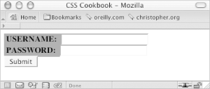 As you can see, the labels need to be toned down because they compete for attention with the input fields. To reduce their visual impact, shrink the size of the text while keeping the weight of the font set to bold. Also, set the typeface of the labels to Verdana, which renders legibly even in small sizes (see Figure 5-15): label {
background-color: gray;
color: black;
font-weight: bold;
padding: 4px;
text-transform: uppercase;
font-family: Verdana, Arial, Helvetica, sans-serif;
font-size: xx-small;
}Figure 5-15. The text refined in the label element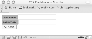 Now it's time to style the input fields. Because the form has two types of input fields, differentiate them by placing a class attribute in the Submit button. This technique enables you to style the input fields and the Submit button differently. If you didn't do this, styles that are intended just for the form fields would also be applied to the Submit button. Using the class selector, you can override or change the properties intended for one element so that they aren't applied to all elements: <input type="submit" name="Submit" value="Submit" class="buttonSubmit" /> To bring in some whitespace around the form elements, set the input fields to display as block-level elements and apply a margin to the bottom (see Figure 5-16): input {
display: block;
margin-bottom: 1.25em;
}Figure 5-16. The input elements sliding under the labels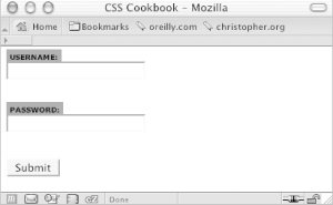 Next, extend the width of the input box to 150 pixels and place a one-pixel border around the box so that the default bevel rendering that occurs in most browsers goes away. Indicate a slight depth to the page by adding a two-pixel border on the right and bottom of the input box (see Figure 5-17): input {
display: block;
margin-bottom: 1.25em;
width: 150px;
border: solid black;
border-width: 1px 2px 2px 1px;
}Figure 5-17. The modified input fields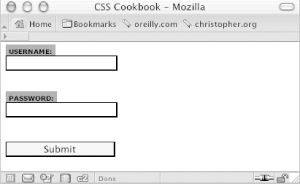 With the main input fields in place, now it's time to apply styles to the Submit button. Because you don't want the Submit button to look like the regular input text fields, use a class selector. Start by changing the size and position of the Submit button. First, shrink the width of the button by 75 pixels (which is one-half the size of the input fields). Then slide the button to the right by setting the left side margin to 75 pixels (see Figure 5-18): .buttonSubmit {
width: 75px;
margin-left: 75px;
}Figure 5-18. The refined Submit button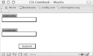 Next, change the Submit button's background to green with a green border, and convert the text to uppercase by using the text-transform property (see Figure 5-19): .buttonSubmit {
width: 75px;
margin-left: 75px;
color: green;
text-transform: uppercase;
border: 1px solid green;
}Figure 5-19. The green Submit button in uppercase letters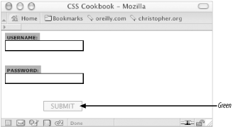 To add the final touch, hide the br element from the display because the br introduces extra whitespace to the form. Figure 5-20 shows the result. br {
display: none;
}Figure 5-20. The login form styles finalized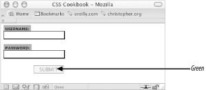 |
|
|
< Day Day Up > |
|