|
|
< Day Day Up > |
|
Recipe 5.8 Sample Design: A Registration FormFor some forms you might want to place the form elements into a two-column table, with the labels in one column and the fields in the other. Example 5-1 provides the code. Figure 5-21 shows the form and tables without styles applied. Example 5-1. Stylized long form<form action="registration.cfm" method="post">
<table cellspacing="0">
<tr class="header">
<th colspan="2">Account Information</th>
</tr>
<tr class="required">
<th scope="row">Login Name*</th>
<td><input name="uname" type="text" size="12"
maxlength="12" /></td>
</tr>
<tr class="required">
<th scope="row">Password*</th>
<td><input name="pword" type="text" size="12"
maxlength="12" /></td>
</tr>
<tr class="required">
<th scope="row">Confirm Password* </th>
<td><input name="pword2" type="text" size="12"
maxlength="12" /></td>
</tr>
<tr class="required">
<th scope="row">Email Address*</th>
<td><input name="email" type="text" /></td>
</tr>
<tr class="required">
<th scope="row">Confirm Email*</th>
<td><input type="text" name="email2" /></td>
</tr>
<tr class="header">
<th colspan="2">Contact Information</th>
</tr>
<tr class="required">
<th scope="row">First Name* </th>
<td><input name="fname" type="text" size="11" /></td>
</tr>
<tr class="required">
<th scope="row">Last Name* </th>
<td><input name="lname" type="text" size="11" /></td>
</tr>
<tr class="required">
<th scope="row">Address 1*</th>
<td><input name="address1" type="text" size="11" /></td>
</tr>
<tr>
<th scope="row">Address 2 </th>
<td><input type="text" name="address2" /></td>
</tr>
<tr class="required">
<th scope="row">City* </th>
<td><input type="text" name="city" /></td>
</tr>
<tr class="required">
<th scope="row">State or Province*</th>
<td><select name="state">
<option selected="selected"
disabled="disabled">Select...</option>
<option value="alabama">Alabama</option>
</select></td>
</tr>
<tr class="required">
<th scope="row">Zip*</th>
<td><input name="zipcode" type="text" id="zipcode"
size="5" maxlength="5" /></td>
</tr>
<tr class="required">
<th scope="row">Country*</th>
<td><input type="text" name="country" /></td>
</tr>
<tr class="required">
<th scope="row">Gender*</th>
<td> <input type="radio" name="sex" value="female" />
Female
<input type="radio" name="sex" value="male" />
Male </td>
</tr>
<tr class="header">
<th colspan="2">Misc. Information</th>
</tr>
<tr>
<th scope="row"> Annual Household Income </th>
<td>
<select name="income" size="1" >
<option selected="selected" disabled="disabled">
Select...</option>
<option value="notsay">I'd rather not say</option>
</select> </td>
</tr>
<tr>
<th scope="row">Interests</th>
<td><input name="interests" type="checkbox"
value="shopping-fashion" />
Shopping/fashion
<input name="interests" type="checkbox"
value="sports" />
Sports
<input name="interests" type="checkbox"
value="travel" />
Travel</td>
</tr>
<tr>
<th scope="row">Eye Color</th>
<td><input name="eye" type="checkbox" value="red" />
Red
<input name="eye" type="checkbox" value="green" />
Green
<input name="eye" type="checkbox" value="brown" />
Brown
<input name="eye" type="checkbox" value="blue" />
Blue Gold</td>
</tr>
</table>
<input type="submit" name="Submit" value="Submit"
id="buttonSubmit" />
<input type="reset" name="Submit2" value="Reset"
id="buttonReset" />
</form>Figure 5-21. The form and table without styles applied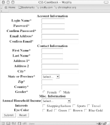 The first element to style is the table element. Set the border model as well as the text color and border around the table itself (see Figure 5-22): table {
border-collapse: collapse;
color: black;
border: 1px solid black;
}Figure 5-22. A border placed around the table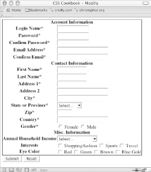 Next, tackle the table header cells, which are located in the left column (see Figure 5-23). The table header cells is set to a width of 200 pixels, while the content inside the cell is aligned to the left, set to Verdana and sized to 0.7 em units: th {
width: 200px;
text-align: right;
vertical-align: top;
border-top: 1px solid black;
font-family: Verdana;
font-size: 0.7em;
}Figure 5-23. Refined table header cells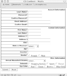 Adjust the padding of the header cells (see Figure 5-24): th {
width: 200px;
text-align: right;
vertical-align: top;
border-top: 1px solid black;
font-family: Verdana;
font-size: 0.7em;
padding-right: 12px;
padding-top: 0.75em;
padding-bottom: 0.75em;
}Figure 5-24. Padding applied to the table header cells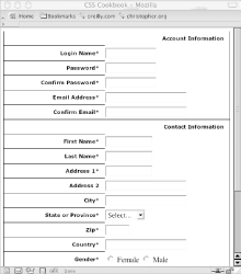 Next, apply styles to the right table cells. To underscore the difference between the left and right columns, convert the right table cell background to black. Also, set a gray border to the left to soften the transition when reading the rows left to right (see Figure 5-25): td {
vertical-align: middle;
background-color: black;
border-bottom: 1px solid white;
color: white;
border-left: 4px solid gray;
padding: 4px;
font-family: Verdana;
font-size: .7em;
}Figure 5-25. The stylized right column table cells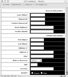 Certain fields are required to execute the registration, so change the color of the text labels for those fields. This change in color will indicate at a glance which fields are required (see Figure 5-26): .required {
color: red;
}Figure 5-26. The required fields marked with red text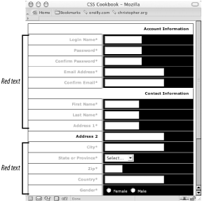 Note that the CSS rule states that the color is red, but for printing purposes the color will come out a shade of gray. Adjust the form headers that indicate the different sections of the form by making the text uppercase and slightly larger than the other text in the form (see Figure 5-27): .header th {
text-align: left;
text-transform: uppercase;
font-size: .9em;
}Figure 5-27. The refined form section headers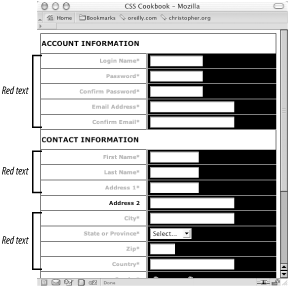 Slide the form headers so that they rest on top of the second column. To determine where to place the headers, add the size of the left column (200 pixels), the padding of the right column (4 pixels), the width of the border on the left of the right column (4 pixels), and the padding of the right column (12 pixels): .header th {
text-align: left;
text-transform: uppercase;
font-size: .9em;
padding-left: 220px;
}Then add a touch of visual appeal by applying thicker borders to the top and bottom of the header (see Figure 5-28): .header th {
text-align: left;
text-transform: uppercase;
font-size: .9em;
padding-left: 220px;
border-bottom: 2px solid gray;
border-top: 2px solid black;
}Figure 5-28. Padding added to the section headers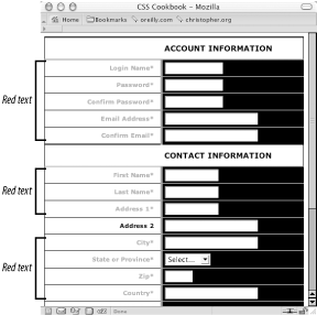 For the finishing touch, move the Submit and Reset buttons so that they fall under the form fields, just like the section headings, by assigning the left side of the margin to be 220 pixels (see Figure 5-29): #buttonSubmit {
margin-left: 220px;
margin-top: 4px;
}Figure 5-29. The Submit and Reset buttons moved into place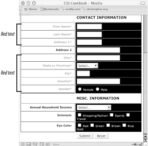 |
|
|
< Day Day Up > |
|