|
|
< Day Day Up > |
|
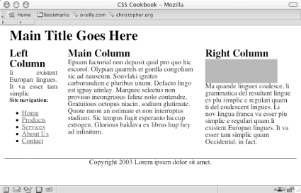
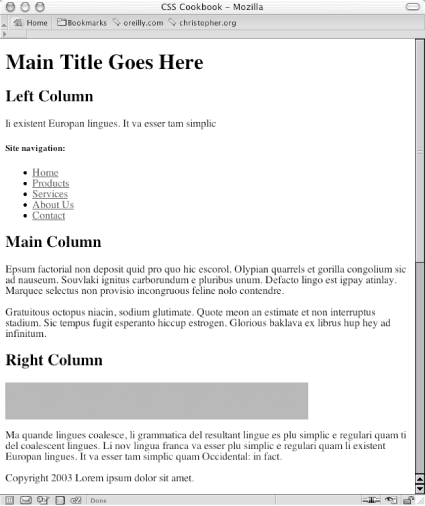
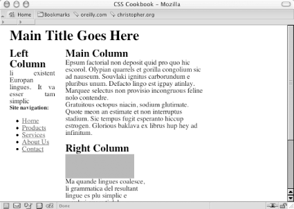
Recipe 7.5 Creating a Flexible Multicolumn Layout with FloatsProblemYou want to create a three-column layout with columns that resize to the width of the browser, as shown in Figure 7-10. Figure 7-10. Three-column layout achieved through CSS SolutionFirst, mark up the content with div elements using the id attributes that contain appropriate values representing their placement on the page (see Figure 7-11): <div id="header"> [...] </div> <div id="columnLeft"> [...] </div> <div id="columnMain"> [...] </div> <div id="columnRight"> [...] </div> <div id="footer"> [...] </div> Figure 7-11. The default rendering of the page Next, set each column to float to the left, making sure that the width is a percentage. All three values of the columns should equal 100% (see Figure 7-12): #columnRight {
width: 33%;
float: left;
background: white;
padding-bottom: 1em;
}
#columnLeft {
width: 20%;
float:left;
background: white;
padding-bottom: 1em;
text-align: justify;
}
#columnMain {
width:47%;
float:left;
background: white;
padding-bottom: 1em;
}
#footer {
clear: both;
padding-bottom: 1em;
border-top: 1px solid #333;
text-align: center;
}Figure 7-12. An increased width for the main column forcing the right column to wrap underneath DiscussionThis technique works because all columns are set to float to the left and their widths aren't larger than 100%. Setting the floats to the right can flip the columns, but the result is the same. Be sure to apply margins and padding to the elements within the columns (unless you account for their widths when sizing the columns). If you don't, the columns will expand beyond 100%, forcing one or more columns to wrap underneath each other, as shown in Figure 7-12. See AlsoRecipe 7.6 on creating a three-column layout with fixed-width columns; http://www.realworldstyle.com/nn4_3col_header.html for information on creating a three-column layout with one flexible- column and two fixed-width columns. |
|
|
< Day Day Up > |
|