|
|
< Day Day Up > |
|
Recipe 8.4 Sample Design: A Printer-Friendly Page with CSSIn this sample design, you will transform an existing web document (as shown in Figure 8-3) to make it more suitable for print. Although CSS has changed the way we design for the Web, it also has allowed developers to change the way they provide printer-friendly versions of their documents. Instead of having to create separate pages or write scripts, you can use CSS to create a printer-friendly document as soon as the user hits the Print button. The HTML for the page isn't in the book because the miracle of CSS lets us change the presentation without having to change the HTML. Figure 8-3. Web page stylized for screen delivery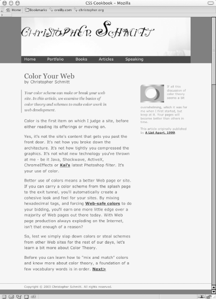 When creating a style sheet for print, you actually use a web browser. This enables you to see quickly how the CSS rules affect the display of the document (just like for media delivery), but it's also easier on the environment and you save money by not wasting ink in the printer. So, comment out the style sheet used for the screen in order to create new CSS rules: <!-- Hide screen media CSS while working on print CSS --> <!-- link href="adv.css" type="text/css" rel="stylesheet" media="screen" --> <style type="text/css"> /* Print CSS rules go here */ </style> Setting the Page for Black-and-White PrintingApply the first CSS rule to the body element. In this rule, set the background color to white and set the type to black: body {
background-color: white;
color: black;
}Next, set the typeface for the page to a serif font. Reading text online in sans-serif is easier on the eyes, but in print media the serif font is still the choice for reading passages of text. For a later fallback choice, you might want to go with the Times typeface for print documents since it's installed on most (if not all) computers, and it's a workhorse of a font. In case your users don't have Times installed, supply alternatives as well: body {
background-color: white;
color: black;
font-family: Garamond, Times, "Times New Roman", serif;
}Now you want to get rid of navigation-related links and other page elements you don't want to see in the final printout. This includes the main navigation bar below the main header, as well as internal anchors in the page itself. If you have a page with ad banners, it might be a good idea to hide those as well (see Figure 8-4): #navigation, hr, body>div>a, #blipvert {
display: none;
}Figure 8-4. Hiding the navigation bar and other elements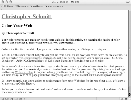 Designing the Main HeadingBecause you are dealing with black and gray type on a white page, you have few options when it comes to designing how the main heading for the page should look. However, using what you have at your disposal, it's nonetheless easy to create a masthead that calls attention to itself. First, set the background to black and the text to white: #header h1 {
color: white;
background-color: black;
}Because you want people to actually read the header, you want the text to be white to create enough contrast. In this instance, the main header also acts as a homing deviceit is a link to the home page. Therefore, the color of the heading is dictated by the style rules set for the links. To remedy this situation, add a separate rule: #header h1 {
background-color: black;
}
#header h1 a {
color: white;
}Now that the text is visible, stylize it a bit so that it stands out. Your goal is to center the text, increase the size of the text, and make all the letters uppercase: #header h1 {
background-color: black;
font-size: 24pt;
text-align: center;
text-transform: uppercase;
}Although this looks good, you can improve it by changing the typeface to sans-serif (so that it sticks out from the rest of the text in the document) and by adding some padding around the top and bottom of the heading (see Figure 8-5): #header h1 {
background-color: black;
font-size: 24pt;
text-align: center;
font-family: Helvetica, Verdana, Arial, sans-serif;
padding: 7pt;
text-transform: uppercase;
}Figure 8-5. Stylizing the main header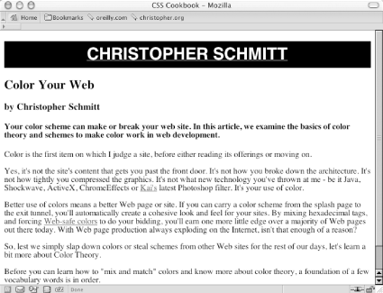 Styling the Article Header and BylineFor the article title and byline, create a more dramatic approach by zeroing out the margins and padding of both the h2 and h3 elements: #content h2 {
padding: 0;
margin: 0;
}
#content h3 {
padding: 0;
margin: 0 ;
}Then increase the font size for the article title and create a thin hairline rule below it. Next, align the byline to the right and set the type style to italic (see Figure 8-6): #content h2 {
padding: 0;
margin: 0;
font-size: 20pt;
border-bottom: 1px solid black;
}
#content h3 {
padding: 0;
margin: 0;
text-align: right;
font-style: italic;
}Figure 8-6. Designing the article header and byline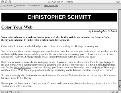 Gaining Attention Through the TeaserNext up is the content in the h4 element. Because this content serves as a teaser for the article, it should be visually distinctive from the article text. To accomplish that, set the background to 30% black, change the typeface to sans-serif, and put in some padding (see Figure 8-7): #content h4 {
font-family: Helvetica, Verdana, Arial, sans-serif;
border-top: 3pt solid black;
background-color: #BCBEC0;
padding: 12pt;
margin: 0;
}Figure 8-7. Setting up the article teaser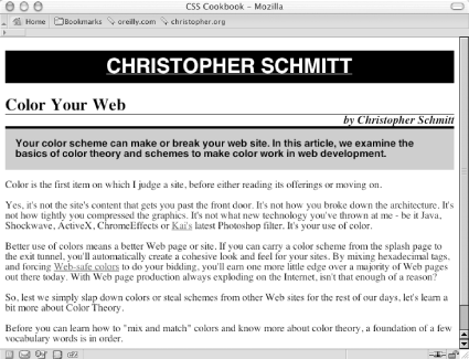 As for the content of the article, leave the text pretty much as it is except for two points of interest: leading, covered here, and links, covered in the next section. Remember that in the body element, the font for the entire page is set with the serif typeface, and through inheritance that typeface style is picked up in the paragraph elements as well. However, you may want to space out the lines, or increase the leading, of the text in the paragraph. To do this, change the line-height property: #content p {
line-height: 18pt;
}Displaying the URLsAny links in the article become useless when printed. To make them beneficial to the reader when the page is printed, make sure all URLs from the links are displayed. To do that, set up a CSS rule to display the URLs after every link in the content division of the document. Also, for visual effect, remove the default underline of the links, make sure the font-weight is bold, and set the color to gray (see Figure 8-8): #content a:after {
content: " <" attr(href) "> ";
font-family: courier, monospace;
font-weight: normal;
}
a {
text-decoration: none;
font-weight: bold;
color: #626466;
}Figure 8-8. Adjusting the links and leading in the content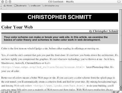 Finishing with the FooterAt this point you're ready to work your way down the page to the footer that contains the copyright notice. Because the main header is in a sans-serif typeface, balance the page by centering the copyright notice, create a line rule through the border-top property, and set the typeface to sans-serif as well: #footer {
border-top: 1px solid #000;
text-align: center;
font-family: Helvetica, Verdana, Arial, sans-serif;
}With the print CSS finished, copy the CSS rules and put them into an external style sheet called print.css. Then, uncomment out the CSS for screen media and associate the print CSS through the link element: <link href="adv.css" type="text/css" rel="stylesheet" media="screen" /> <link href="print.css" type="text/css" rel="stylesheet" media="print" /> |
|
|
< Day Day Up > |
|