|
|
< Day Day Up > |
|
14.2 Paged MediaIn CSS terms, a paged medium is any medium where a document's presentation is handled as a series of discrete "pages." This is different than the screen, which is a continuous medium: documents are presented as a single, scrollable "page." An analog example of a continuous medium is a papyrus scroll. Printed material, such as books, magazines, and laser printouts, are all paged media. So too are slideshows, where a series of slides are shown one at a time. Each slide is a "page" in CSS terms. 14.2.1 Print StylesEven in the "paperless future," the most commonly encountered paged medium is a printout of some documenta web page, a word-processing document, a spreadsheet, or something else that has been committed to the thin wafers of a dead tree. Authors can do a number of things to make printouts of their documents more pleasing for the user, from affecting page-breaking to creating styles meant specifically for print. Note that print styles would also be applied to document display in a "print preview" mode. Thus, it's possible in some circumstances to see print styles on a monitor. 14.2.1.1 Differences between screen and printBeyond the obvious physical differences, there are a number of stylistic differences between screen and print design. The most basic involves font choices. Most designers will tell you that sans-serif fonts are best suited for screen design, but serif fonts are more readable in print. Thus, you might set up a print style sheet that uses Times instead of Verdana for the text in your document. Another major difference involves font sizing. If you've spent any time at all doing web design, you've probably heard again and again (and again) that points are a horrible choice for font sizing on the Web. This is basically true, especially if you want your text to be consistently sized between browsers and operating systems. However, print design is not web design any more than web design is print design. Using points, or even centimeters or picas, is perfectly okay in print design because printing devices know the physical size of their output area. If a printer has been loaded with 8.5 x 11 inch paper, then it knows it has a printing area that will fit within the edges of a piece of paper. It also knows how many dots there are in an inch, since it knows the dots-per-inch (dpi) it's capable of generating. This means that it can cope with physical-world length units like points. Therefore, many a print style sheet has started with: body {font: 12pt "Times New Roman", "TimesNR", Times, serif;}
It's so traditional, it just might bring a tear of joy to the eye of a graphic artist reading over your shoulder. But make sure he understands that points are acceptable only because of the nature of the print mediumthey're still not good for web design. Alternatively, the lack of backgrounds in most printouts might bring a tear of frustration to that designer's eye. In order to save users ink, most web browsers are pre-configured not to print background colors and images. If the user wants to see those backgrounds in the printout, he has to change an option somewhere in the preferences. CSS can't do anything to force the printing of backgrounds. However, you can use a print style sheet to make backgrounds unnecessary. For example, you might include this rule in your print style sheet: * {color: black !important; background: white !important;}
This will ensure that all of your elements will print out as black text and remove any backgrounds you might have assigned in an all-medium style sheet. Since this is how most users' printers will render the page anyway, you're better off setting up your print styles along the same lines. It also makes sure that if you have a web design that puts yellow text on a dark gray background, a user with a color printer won't get yellow text on a white piece of paper.
One other difference between paged media and continuous media is that multicolumn layouts are even harder to use in paged media. Suppose you have an article where the text has been formatted as two columns. In a printout, the left side of each page will contain the first column, and the right side the second. This would force the user to read the left side of every page, then go back to the beginning of the printout and read the right side of every page. This is annoying enough on the Web, but on paper it's much worse. The obvious solution is to use CSS for laying out your two columns (by floating them, perhaps) and then writing a print style sheet that restores the content to a single column. Thus, you might write something like this for the screen style sheet: div#leftcol {float: left; width: 45%;}
div#rightcol {float: right; width: 45%;}
Then in your print style sheet, you would write: div#leftcol, div#rightcol {float: none; width: auto;}
If CSS had a way to do multicolumn flowed layout, none of this would be necessary. Sadly, although proposals have circulated for years, there is nothing as of this writing. We could spend an entire chapter on the details of print design, but that really isn't the purpose of this book. Let's start exploring the details of paged-media CSS and leave the design discussions for another book. 14.2.1.2 Defining the page sizeIn much the same way as it defines the element box, CSS2 defines a page box that describes the components of a page. A page box is composed of basically two regions:
The page box model is illustrated in Figure 14-1. Figure 14-1. The page box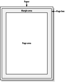 In CSS2, it was possible to define the size of the page box as well as the margins. In CSS2.1, authors can set only the size of the margin area. In both cases, the @page rule is the method by which settings are made. Here's a simple example: @page {size: 7.5in 10in; margin: 0.5in;}
This is a CSS2 rule, as it uses the property size, which was not included in CSS2.1 due to a lack of implementation support.
This property is used to define the size of the page area. The value landscape is meant to cause the layout to be rotated 90-degrees, whereas portrait is the normal orientation for Western-language printing. Thus, an author could cause a document to be printed "sideways" by declaring: @page {size: landscape;}
size is not part of CSS2.1, which means that, as of its writing, no two interoperable implementations of size are known to exist. So browser support is likely to be poor. CSS2.1 does include the ability to style the margin area of the page box, which is likely to work a bit more reliably. If you want to make sure that only a small bit at the center of every 8.5 x 11 inch page would print, you could write: @page {margin: 3.75in;}
This would leave a printing area 1-inch wide by 3.5-inches tall. What's really interesting about the page box is that it doesn't have any relationship to fonts, so you can't use the length units em and ex to describe either the margin area or the page area. Only percentages and "ruler" units like inches, centimeters, or points are permitted in this context. 14.2.1.3 Selecting page typesCSS2 offers the ability to create different page types using named @page rules. Let's say you have a document on astronomy that is several pages long, and in the middle of it, there is a fairly wide table containing a list of the physical characteristics of all the moons of Saturn. You want to print out the text in portrait mode, but the table needs to be landscape. Here's how you'd start: @page normal {size: portrait; margin: 1in;}
@page rotate {size: landscape; margin: 0.5in;}
Now you just need to apply these page types as needed. The table of Saturn's moons has an id of moon-data, so you write the following rules: body {page: normal;}
table#moon-data {page: rotate;}
This would cause the table to be printed landscape, but the rest of the document to be in portrait orientation. The property page, another outcast in CSS2.1, is what makes this possible.
As you can see from looking at the value definition, the whole reason page exists is to let you assign named page types to various elements in your document. There are more generic page types that you can address through special pseudo-classes, and even better, this is something that is defined in both CSS2 and CSS2.1. :first lets you apply special styles to the first page in the document. For example, you might want to give the first page a larger top margin than other pages. Here's how: @page {margin: 3cm;}
@page :first {margin-top: 6cm;}
This will yield a 3-centimeter margin on all pages, with the exception of a 6-centimeter top margin on the first page. The effect will be something like that shown in Figure 14-2. Figure 14-2. Specially styling the first page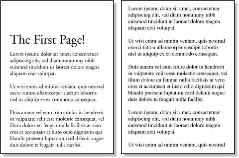 In addition to styling the first page, you can also style left and right pages, emulating the pages to the left and right of a book's spine. You can style these differently using :left and :right. For example: @page :left {margin-left: 3cm; margin-right: 5cm;}
@page :right {margin-left: 5cm; margin-right: 3cm;}
These rules will have the effect of putting larger margins "between" the content of the left and right pages, on the sides where the spine of a book would be. This is a common practice when pages are to be bound together into a book of some type. You can see the result of the previous rules in Figure 14-3. Figure 14-3. Styling left and right pages differently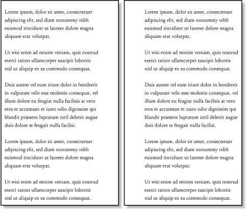 14.2.1.4 Page-breakingIn a paged medium, it's a good idea to exert some influence over how page breaks are placed. You can affect page breaking using the properties page-break-before and page-break-after, both of which accept the same set of values.
The default value of auto simply means that a page break is not forced to come before or after an element. This is the same as any normal printout. always causes a page break to be placed before (or after) the styled element. For example, assume you have a situation where the page title is an h1 element, and the section titles are all h2 elements. You might want a page break right before the beginning of each section of a document and after the document title. This would result in the following rules, illustrated in Figure 14-4: h1 {page-break-after: always;}
h2 {page-break-before: always;}
Figure 14-4. Inserting page breaks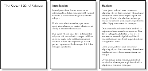 If you want the document title to be centered in its page, of course, you would add rules to that effect. Since you don't, you just get a very straightforward rendering of each page. The values left and right operate in the same manner as always, except they further define the type of page on which printing can resume. Consider the following: h2 {page-break-before: left;}
This will force every h2 element to be preceded by enough page breaks so that the h2 will be printed at the top of a left pagethat is, a page surface that would appear to the left of a spine if the output were bound. In double-sided printing, this would mean printing on the "back" of a piece of paper. So let's assume that, in printing, the element just before an h2 is printed on a right page. The previous rule would cause a single page break to be inserted before the h2, thus pushing it to the next page. If the next h2 is preceded by an element on a left page, however, the h2 would be preceded by two page breaks, thus placing it at the top of the next left page. The right page between the two would be intentionally left blank. The value right has the same basic effect, except it forces an element to be printed at the top of a right page, preceded by either one or two page breaks. The companion to always is avoid, which directs the user agent to do its best to avoid placing a page break either before or after an element. To extend the previous example, suppose you have subsections whose titles are h3 elements. You want to keep these titles together with the text that follows them, so you want to avoid a page break following an h3 whenever possible: h3 {page-break-after: avoid;}
Note, though, that the value is called avoid, not never. There is no way to absolutely guarantee that a page break will never be inserted before or after a given element. Consider the following: img {height: 9.5in; width: 8in; page-break-before: avoid;}
h4 {page-break-after: avoid;}
h4 + img {height: 10.5in;}
Now, suppose further that you have a situation where an h4 is placed between two images, and its height calculates to be half an inch. Each image will have to be printed on a separate page, but there are only two places the h4 can go: at the bottom of the page holding the first element, or on the page after it. If it's placed after the first image, then it has to be followed by a page break, since there's no room for the second image to follow it, as shown in Figure 14-5. Figure 14-5. Necessary page breaking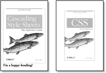 On the other hand, if the h4 is placed on a new page following the first image, then there won't be room on that same page for the second image. So, again, there will be a page break after the h4. And, in either case, at least one image, if not both, will be preceded by a page break. There's only so much the user agent can do, given a situation like this one. Obviously, situations such as these are rare, but they can happenfor example, in a case where a document contains nothing but tables preceded by headings. There may be cases where tables print in such a way that they force a heading element to be followed by a page break, even though the author requested such break placement be avoided. The same sorts of issues can arise with the other page-break property, page-break-inside. Its possible values are more limited than those of its cousins.
With page-break-inside, you pretty much have one option other than the default: you can request that a user agent try to avoid placing page breaks within an element. If you have a series of "aside" divisions, and you don't want them broken across two pages, you could declare: div#aside {page-break-inside: avoid;}
Again, this is a suggestion more than an actual rule. If an aside turns out to be longer than a page, obviously the user agent can't help but place a page break inside the element. 14.2.1.5 Orphans and widowsIn an effort to provide finer influence over page-breaking, CSS2 defines two properties common to both traditional print typography and desktop publishing: widows and orphans.
These properties have similar aims but approach them from different angles. The value of widows defines the minimum number of line boxes found in an element that can be placed at the top of a page without forcing a page break to come before the element. orphans has the same effect in reverse: it gives the minimum number of line boxes that can appear at the bottom of a page without forcing a page break before the element. Let's take widows as an example. Suppose you declare: p {widows: 4;}
This means that any paragraph can have no fewer than four line boxes appear at the top of a page. If the layout of the document would lead to fewer line boxes, then the entire paragraph is placed at the top of the page. Consider the situation shown in Figure 14-6. Cover up the top part of the figure with your hand, so only the second page is visible. Notice that there are two line boxes there, from the end of a paragraph that started on the previous page. Given the default widows value of 2, this is an acceptable rendering. However, if the value were 3 or higher, the entire paragraph would appear at the top of the second page as a single block. This would require that a page break be inserted before the paragraph in question. Figure 14-6. Counting the widows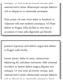 Refer back to Figure 14-6, and this time cover up the second page with your hand. Notice the four line boxes at the bottom of the page, at the beginning of the last paragraph. This is fine as long as the value of orphans is 4 or less. If it were 5 or higher, then the paragraph would again be preceded by a page break and be laid out as a single block at the top of the second page. Of course, both orphans and widows must be satisfied. If an author declared the following, then most paragraphs would be without an interior page break: p {widows: 30; orphans: 30;}
It would take a pretty lengthy paragraph to allow an interior page break given those values. Of course, if the intent is to prevent interior breaking, then that intent would be better expressed as: p {page-break-inside: avoid;}
14.2.1.6 Page-breaking behaviorBecause CSS2 allows for some odd page-breaking styles, it defines a set of behaviors regarding allowed page breaks and "best" page breaks. These behaviors serve to guide user agents in how they should handle page-breaking in various circumstances. There are really only two generic places where page breaks are permitted. The first of these is between two block-level boxes. If a page break falls between two block boxes, then the margin-bottom value of the element before the page break is reset to 0, as is the margin-top of the element following the page break. However, there are two rules that affect whether a page break can fall between two element boxes:
Figure 14-7 illustrates all the possible page-break placements between elements in a hypothetical document. Forced page breaks are represented as a filled square, whereas potential (unforced) page breaks are shown as an open square. Figure 14-7. Potential page-break placement between block boxes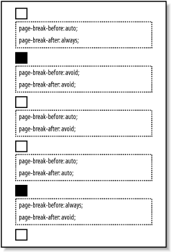 Second, page breaks are allowed between two line boxes inside a block-level box. This, too, is governed by a pair of rules:
In both cases, the second of the two rules controlling page-break placement is ignored if no page-break placement can satisfy all the rules. Thus, given a situation where an element has been given page-break-inside: avoid but the element is longer than a full page, a page break will be permitted inside the element, between two line boxes. In other words, the second rule regarding page-break placement between line boxes is ignored. If ignoring the second rule in each pair of rules still does not yield good page-break placement, then other rules can also be ignored. In such a situation, the user agent is likely to ignore all page-break property values and proceed as if they were all auto, although this approach is not defined (or required) by the CSS specification. In addition to the previously explored rules, CSS2 defines a set of "best" page-breaking behaviors:
These recommendations aren't required of user agents, but they offer logical guidance that should lead to ideal page-breaking behaviors. 14.2.1.7 Repeated elementsA very common desire in paged media is the ability to have a "running head." This is an element that appears on every page, such as the document's title or the author's name. This is possible in CSS2 by using a fixed-position element. For example: div#runhead {position: fixed; top: 0; right: 0;}
This will place any div with an id of runhead at the top right corner of every page box when the document is output to a paged medium. The same rule would place the element in the top right corner of the viewport in a continuous medium, such as a web browser. Any element positioned in this way will appear on every page. It is not possible to "copy" an element to become a repeated element. Thus, given the following, the h1 element will appear as a running head on every page, including the first one: h1 {position: fixed; top: 0; width: 100%; text-align: center;
font-size: 80%; border-bottom: 1px solid gray;}
The drawback is that the h1 element, being positioned on the first page, cannot be printed as anything except the running head. 14.2.1.8 Elements outside the pageAll this talk of positioning elements in a paged medium leads to an interesting question: what happens if an element is positioned outside the page box? You don't even need positioning to create such a situation. Think about a pre element that contains a line with 411 characters. This is likely to be wider than any standard piece of paper, and so the element will be wider than the page box. What will happen then? As it turns out, CSS2 doesn't say exactly what user agents should do, so it's up to each to come up with a solution. For a very wide pre element, the user agent might simply clip the element to the page box and throw away the rest of the content. It could also generate extra pages to display the "leftover" part of the element. There are a few general recommendations for handling content outside the page box, and two that are really important. First, content should be allowed to protrude slightly from a page box in order to allow "bleeding." This implies that no extra page would be generated for the portions of such content that exceed the page box. Second, user agents are cautioned not to generate large numbers of empty pages for the sole purpose of honoring positioning information. Consider: h1 {position: absolute; top: 1500in;}
Assuming that the page boxes are 10 inches high, the user agent would have to precede an h1 with 150 page breaks (and thus 150 blank pages) just to honor that rule. Instead, a user agent might choose to skip the blank pages and just output the last one, which actually contains the h1 element. The other two recommendations state that user agents should not position elements in strange places just to avoid rendering them, and that content placed outside a page box can be rendered in any of a number of ways. (Some elements of CSS are useful and intriguing, but some seem to cheerily state the obvious.) 14.2.2 Projection StylesAside from printed pages, the other common paged medium is projection, which describes information that's being projected onto a large screen, suitable for viewing by a large crowd. Microsoft PowerPoint is one of the most well-known projection-medium editors today. As of this writing, only one user agent supports projection-medium CSS: Opera for Windows. This capability is called "OperaShow," and it allows authors to take any HTML document and turn it into a slideshow. We'll take a look at the basics of this capability, since it may appear in other user agents in the future. 14.2.2.1 Setting up slidesIf you're taking a single document and breaking it up into a series of slides, you need a way to define the boundaries between each slide. This is done using the page-break properties. Whether you use page-break-before or page-break-after will depend largely on how your document is constructed. As an example, consider the HTML document shown in Figure 14-8. There is a series of h2 elements, each followed by an unordered list. This forms the "outline view" for your slideshow. Figure 14-8. A slideshow outline using simple HTML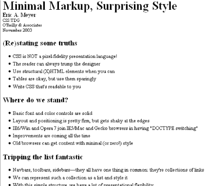 Now all you need to do is break up the document into slides. Since every slide starts with an h2 element, you can simply declare: h2 {page-break-before: always;}
This will ensure that every page (that is, every slide) will start with an h2 element. Since the title of each slide is represented by an h2, this is just fine: every slide will have an h2 as its first element. You can see the rendering of the third slide in Figure 14-9. Figure 14-9. A slide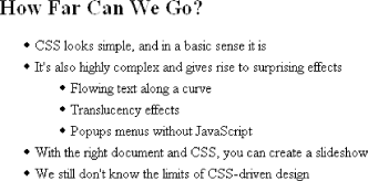 Of course, the slide looks pretty plain because you've done nothing to make it look good; you've simply defined where page breaks are to be inserted. Given the outline as it's currently set up, you could also have defined slide boundaries by inserting page breaks after the lists, instead of before the h2 elements: ul {page-break-after: always;}
This method would work just fine, as long as your outline never includes nested lists. If there is a chance of having unordered lists nested within the "top-level" lists, then you'd either need to go back to putting page breaks before h2 elements, or else add a second rule to prevent page-breaking: ul {page-break-after: always;}
ul ul {page-break-after: auto;}
14.2.2.2 Positioning elementsWhen you position elements, their initial containing block will be the page box in which they are placed. Thus, if you want the title of every slide to actually appear on the bottom of the slide, you would write something like: h2 {page-break-before: always; position: absolute; bottom: 0; right: 0;}
This would place any h2 element at the bottom right corner of the page box (slide) in which it appears. Of course, it's possible to position elements with respect to other elements instead of the page box. See Chapter 10 for details on positioning. A fixed-position element, on the other hand, will appear in every page box in the slideshow, just as in the print medium. This means that you can take a single element, like the document title, and put it on every slide, like this: h1 {position: fixed; top: 0; right: 0; font-size: 80%;}
This technique can be used to create running footers, graphical sidebars for every slide, and so on. 14.2.2.3 Considerations for projectionIt's often said that web designs should be flexible and able to adapt to any resolutionand that's certainly true in most cases. However, projection styling is not web styling, so it often makes sense for a projection style sheet to be created with a specific resolution in mind. As an example, most projectors (as of this writing) default to a resolution of 1024 x 768. If you know you'll be projecting at that size, it makes sense to set up your CSS for that exact size. Font sizing, element placement, and so forth can all be tuned to create the best visual experience for the target resolution. For that matter, you might create different style sheets for different resolutions: one for 800 x 600, another for 1024 x 768, and a third for 1280 x 1024, just to cover the most common bases. Figure 14-10 shows a slide at 1024 x 768. Figure 14-10. A fully styled slide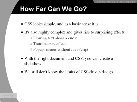 Another thing to bear in mind is that projected documents are generally more readable for the audience if they employ high-contrast colors. This is particularly true since some projector bulbs aren't as bright as others, and dimmer bulbs call for even higher contrast. This also highlights (no pun intended) the fact that you have even less of a guarantee of color fidelity in projection situations than in normal web design (and that's not saying much). |
|
|
< Day Day Up > |
|