| [ Team LiB ] |
|
5.4 Types of Web ControlsWeb controls fall into eight categories: input, display, action, selection, databound, rich, validation, and mobile. 5.4.1 Input ControlsInput controls let the user enter text data into the application. ASP.NET supports only one input web control: the TextBox. The TextBox behaves like a single-line or multiline edit control, depending on the value of its TextMode property. Its simplified syntax is as follows: <asp:textbox id="SingleText" text="Single Line TextBox" runat="server" /> <asp:textbox id="PasswordText" text="Password" textmode="Password" runat="server" /> <asp:textbox id="MultiText" text="Multiline TextBox" textmode="Multiline" runat="server" /> The TextBox control can then be accessed programmatically with a code fragment like: SingleText.Text = "Hello ASP.NET"
PasswordText.Attributes("Value") = "New Password"
MultiText.Text = "Multiline TextBox can hold many lines of text"
Note that the text of a TextBox control using the Password text mode cannot be set directly using the Text property, but can be set using the attributes collection as shown in the preceding code snippet (though this is not recommended, since it results in the password being rendered to the client in plain text). The appearance of input controls when rendered to the browser is shown in Figure 5-1. The code used to generate this figure is shown in Example 5-5. Figure 5-1. Rendering of input controls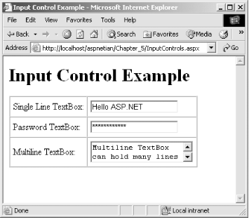 Example 5-5. InputControls.aspx<%@ Page Language="vb" %>
<html>
<head>
<title>Input Control Example</title>
<script runat="server">
Sub Page_Load( )
SingleText.Text = "Hello ASP.NET"
PasswordText.Attributes("Value") = "New Password"
MultiText.Text = "Multiline TextBox can hold many lines of text"
End Sub
</script>
</head>
<body>
<h1>Input Control Example</h1>
<form runat="server">
<table border="1" cellpadding="5" cellspacing="0">
<tr>
<td>
Single Line TextBox:
</td>
<td>
<asp:textbox id="SingleText"
text="Single Line TextBox"
runat="server" />
</td>
</tr>
<tr>
<td>
Password TextBox:
</td>
<td>
<asp:textbox id="PasswordText"
text="Password"
textmode="Password"
runat="server" />
</td>
</tr>
<tr>
<td>
Multiline TextBox:
</td>
<td>
<asp:textbox id="MultiText"
text="Multiline TextBox"
textmode="Multiline"
runat="server" />
</td>
</tr>
</table>
</form>
</body>
</html>
5.4.2 Display ControlsDisplay controls simply render text or images to the browser. Table 5-1 lists the display controls ASP.NET supports.
The syntax of these web controls is as follows: <asp:label id="MyLabel"
text="This is a Label Control"
borderstyle="solid"
bordercolor="Green"
runat="Server" />
<asp:image id="MyImage"
imageurl="aspnet.gif"
runat="Server" />
<asp:panel id="MyPanel"
backcolor="lightblue"
bordercolor="Green"
borderwidth="1" >
<asp:label id="MyLabel2"
text="Static Text within the Panel"
runat="Server"/>
<br>
<asp:textbox id="PanelTB" text="TextBox inside Panel" runat="Server"/>
</asp:Panel>
They can then be accessed programmatically with a code fragment like the following: MyLabel.Text = "New Label" MyImage.ImageUrl = "NewImage.gif" MyPanel.BackImageUrl = "NewImage.gif" The appearance of display controls when rendered to the browser is shown in Figure 5-2. The code used to generate this figure is shown in Example 5-6. Figure 5-2. Rendering of display controls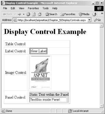 Example 5-6. DisplayControls.aspx<%@ Page Language="vb" %>
<html>
<head>
<title>Display Control Example</title>
<script runat="server">
Sub Page_Load( )
MyLabel.Text = "New Label"
MyImage.ImageUrl = "aspnetian.jpg"
End Sub
</script>
</head>
<body>
<h1>Display Control Example</h1>
<form runat="server">
<asp:table id="MyTable"
border="1"
cellpadding="5"
cellspacing="0"
runat="server">
<asp:tablerow runat="server">
<asp:tablecell colspan="2" runat="server">
Table Control
</asp:tablecell>
</asp:tablerow>
<asp:tablerow runat="server">
<asp:tablecell runat="server">
Label Control:
</asp:tablecell>
<asp:tablecell runat="server">
<asp:label id="MyLabel"
text="This is a Label Control"
borderstyle="solid"
bordercolor="Green"
runat="Server" />
</asp:tablecell>
</asp:tablerow>
<asp:tablerow runat="server">
<asp:tablecell runat="server">
Image Control:
</asp:tablecell>
<asp:tablecell runat="server">
<asp:image id="MyImage"
imageurl="image.jpg"
runat="Server" />
</asp:tablecell>
</asp:tablerow>
<asp:tablerow runat="server">
<asp:tablecell runat="server">
Panel Control:
</asp:tablecell>
<asp:tablecell runat="server">
<asp:panel id="MyPanel"
backcolor="lightblue"
bordercolor="Green"
borderwidth="1"
runat="server">
<asp:label id="MyLabel2"
text="Static Text within the Panel"
runat="Server"/>
<br>
<asp:textbox id="PanelTB"
text="TextBox inside Panel" runat="Server"/>
</asp:panel>
</asp:tablecell>
</asp:tablerow>
</asp:table>
</form>
</body>
</html>
5.4.3 Action ControlsAction controls allow users to perform some action on that page, such as navigating to a different URL, submitting a form, resetting a form's values, or executing a client script. Table 5-2 lists the action controls.
The simplified syntax of these controls is as follows: <asp:button id="MyButton" text="Click Me!!" runat="server"/> <asp:imagebutton id="MyImageButton" imageurl="aspnetian.jpg" runat="Server"/> <asp:linkbutton id="MyLinkButton" text="Click Me" runat="server"/> <asp:hyperlink id="MyHyperLink" text="Click Me" navigateurl="ActionControls.aspx" target="_blank" runat="server"/> The controls can then be accessed programmatically with code fragments like the following: MyButton.CommandName = "Sort" MyImageButton.CommandArgument = "Ascending" MyLinkButton.CommandName = "Filter" MyHyperLink.NavigateUrl = "http://dotnet.oreilly.com/"
The appearance of action controls when rendered to the browser is shown in Figure 5-3. The code used to generate this figure is shown in Example 5-7. Figure 5-3. Rendering of action controls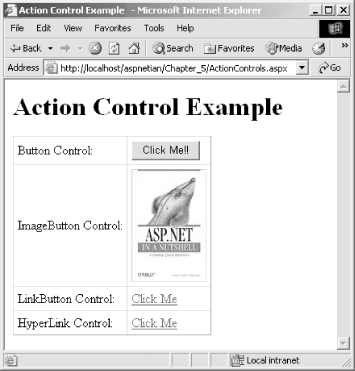 Example 5-7. ActionControls.aspx<%@ Page Language="vb" %>
<html>
<head>
<title>Action Control Example</title>
<script runat="server">
Sub Page_Load( )
MyButton.CommandName = "Sort"
MyImageButton.CommandArgument = "Ascending"
MyLinkButton.CommandName = "Filter"
MyHyperLink.NavigateUrl = " http://dotnet.oreilly.com/"
End Sub
</script>
</head>
<body>
<h1>Action Control Example</h1>
<form runat="server">
<asp:table id="MyTable"
border="1"
cellpadding="5"
cellspacing="0"
runat="server">
<asp:tablerow runat="server">
<asp:tablecell runat="server">
Button Control:
</asp:tablecell>
<asp:tablecell runat="server">
<asp:button id="MyButton" text="Click Me!!" runat="server"/>
</asp:tablecell>
</asp:tablerow>
<asp:tablerow runat="server">
<asp:tablecell runat="server">
ImageButton Control:
</asp:tablecell>
<asp:tablecell runat="server">
<asp:imagebutton id="MyImageButton"
imageurl="aspnetian.jpg" runat="Server"/>
</asp:tablecell>
</asp:tablerow>
<asp:tablerow runat="server">
<asp:tablecell runat="server">
LinkButton Control:
</asp:tablecell>
<asp:tablecell runat="server">
<asp:linkbutton id="MyLinkButton"
text="Click Me" runat="server"/>
</asp:tablecell>
</asp:tablerow>
<asp:tablerow runat="server">
<asp:tablecell runat="server">
HyperLink Control:
</asp:tablecell>
<asp:tablecell runat="server">
<asp:hyperlink id="MyHyperLink"
text="Click Me"
navigateurl="ActionControls.aspx"
target="_blank"
runat="server"/>
</asp:tablecell>
</asp:tablerow>
</asp:table>
</form>
</body>
</html>
5.4.4 Selection ControlsSelection controls allow the user to select one or more values from a list. They include both the CheckBox and RadioButton controls, which are designed to work in a group. The RadioButton control allows you to select only one option out of the group, whereas the CheckBox control allows you to select zero or more options. Table 5-3 lists the selection controls.
The simplified syntax of the selection controls is as follows: <asp:checkbox id="MyCheckBox1" text="Vanilla" runat="server"/> <asp:checkbox id="MyCheckBox2" text="Chocolate" runat="server"/> <asp:radiobutton id="MyRadioButton1" groupname="Group1" checked="True" text="Yes" runat="Server"/> <asp:radiobutton id="MyRadioButton2" groupname="Group1" text="No" runat="Server"/> <asp:listbox id="MyListBox" runat="server"> <asp:listitem value="Vanilla" selected="true">Vanilla</asp:listitem> <asp:listitem value="Chocolate">Chocolate</asp:listitem> <asp:listitem value="Strawberry">Strawberry</asp:listitem> </asp:listbox> <asp:dropdownlist id="MyDropDownList" runat="server"> <asp:listitem value="Single" selected="true">Single</asp:listitem> <asp:listitem value="Multiline">Multiline</asp:listitem> <asp:listitem value="Password">Password</asp:listitem> </asp:dropdownlist> <asp:checkboxlist id="MyCheckBoxList" repeatdirection="vertical" runat="server"> <asp:listitem value="Vanilla" text="Vanilla"/> <asp:listitem value="Chocolate" text="Chocolate"/> <asp:listitem value="Strawberry" text="Strawberry"/> </asp:checkboxlist> <asp:radiobuttonlist id="MyRadioButtonList" repeatdirection="Horizontal" runat="server"> <asp:listitem value="Female" text="Female" selected="true"/> <asp:listitem value="Male" text="Male"/> </asp:radiobuttonlist> The controls can then be referenced programmatically with code fragments like the following: MyCheckBox1.Checked = True MyRadioButton1.Checked = False MyListBox.SelectionMode = ListSelectionMode.Multiple MyDropDownList.SelectedIndex = 1 MyCheckBoxList.RepeatDirection = RepeatDirection.Horizontal MyRadioButtonList.RepeatLayout = RepeatLayout.Table The appearance of the selection controls when rendered to the browser is shown in Figure 5-4. The code used to generate this figure is shown in Example 5-8. Figure 5-4. Rendering of selection controls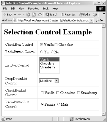 Example 5-8. SelectionControls.aspx<%@ Page Language="vb" %>
<html>
<head>
<title>Selection Control Example</title>
<script runat="server">
Sub Page_Load( )
MyCheckBox1.Checked = True
MyRadioButton1.Checked = False
MyListBox.SelectionMode = ListSelectionMode.Multiple
MyDropDownList.SelectedIndex = 1
MyCheckBoxList.RepeatDirection = RepeatDirection.Horizontal
MyRadioButtonList.RepeatLayout = RepeatLayout.Table
End Sub
</script>
</head>
<body>
<h1>Selection Control Example</h1>
<form runat="server">
<asp:table id="MyTable"
border="1"
cellpadding="5"
cellspacing="0"
runat="server">
<asp:tablerow runat="server">
<asp:tablecell runat="server">
CheckBox Control:
</asp:tablecell>
<asp:tablecell runat="server">
<asp:checkbox id="MyCheckBox1"
text="Vanilla" runat="server" />
<asp:checkbox id="MyCheckBox2"
text="Chocolate" runat="server" />
</asp:tablecell>
</asp:tablerow>
<asp:tablerow runat="server">
<asp:tablecell runat="server">
RadioButton Control:
</asp:tablecell>
<asp:tablecell runat="server">
<asp:radiobutton id="MyRadioButton1" groupname="Group1"
checked="True" text="Yes" runat="Server"/>
<asp:radiobutton id="MyRadioButton2" groupname="Group1"
text="No" runat="Server"/>
</asp:tablecell>
</asp:tablerow>
<asp:tablerow runat="server">
<asp:tablecell runat="server">
ListBox Control:
</asp:tablecell>
<asp:tablecell runat="server">
<asp:listbox id="MyListBox" runat="server">
<asp:listitem value="Vanilla"
selected="true">Vanilla</asp:listitem>
<asp:listitem value="Chocolate">Chocolate
</ asp:listitem>
<asp:listitem value="Strawberry">Strawberry
</ asp:listitem>
</asp:listbox>
</asp:tablecell>
</asp:tablerow>
<asp:tablerow runat="server">
<asp:tablecell runat="server">
DropDownList Control:
</asp:tablecell>
<asp:tablecell runat="server">
<asp:dropdownlist id="MyDropDownList" runat="server">
<asp:listitem value="Single"
selected="true">Single</asp:listitem>
<asp:listitem value="Multiline">Multiline
</ asp:listitem>
<asp:listitem value="Password">Password</asp:listitem>
</asp:dropdownlist>
</asp:tablecell>
</asp:tablerow>
<asp:tablerow runat="server">
<asp:tablecell runat="server">
CheckBoxList Control:
</asp:tablecell>
<asp:tablecell runat="server">
<asp:checkboxlist id="MyCheckBoxList"
repeatdirection="vertical" runat="server">
<asp:listitem value="Vanilla" text="Vanilla"/>
<asp:listitem value="Chocolate" text="Chocolate"/>
<asp:listitem value="Strawberry" text="Strawberry"/>
</asp:checkboxlist>
</asp:tablecell>
</asp:tablerow>
<asp:tablerow runat="server">
<asp:tablecell runat="server">
RadioButtonList Control:
</asp:tablecell>
<asp:tablecell runat="server">
<asp:radiobuttonlist id="MyRadioButtonList"
repeatdirection="Horizontal" runat="server">
<asp:listitem value="Female"
text="Female" selected="true"/>
<asp:listitem value="Male" text="Male"/>
</asp:radiobuttonlist>
</asp:tablecell>
</asp:tablerow>
</asp:table>
</form>
</body>
</html>
5.4.5 Databound ControlsDatabound controls render repetitive data and use templates for the customized rendering of data (the so-called lookless UI). For example, you can define separate templates for the header, body, and footer of a table of data. We'll discuss data binding in more detail in Chapter 7. Table 5-4 shows the databound controls.
Remember that DataGrid and DataList controls can be used with or without templates, but Repeater controls must have at least one ItemTemplate defined. You can also modify the appearance of DataGrids and DataLists by using a series of style properties, each of which ends with Style. These properties include HeaderStyle, ItemStyle, and FooterStyle. For more information on templates and styles, see Section 5.6 later in this chapter. The simplified syntax of the databound controls is as follows: <asp:datagrid id="MyDataGrid"
allowpaging="true"
allowsorting="true"
alternatingitemstyle-backcolor="LightSkyBlue"
backcolor="Blue"
forecolor="White"
cellpadding="2"
cellspacing="0"
headerstyle-backcolor="DarkBlue"
headerstyle-forecolor="Yellow"
pagerstyle-mode="NumericPages"
pagesize="5"
runat="server"/>
<asp:datalist id="MyDataList"
alternatingitemstyle-backcolor="LightSkyBlue"
backcolor="Blue"
bordercolor="Black"
cellpadding="2"
cellspacing="0"
forecolor="White"
headerstyle-backcolor="DarkBlue"
headerstyle-forecolor="Yellow"
repeatcolumns="1"
repeatdirection="vertical"
repeatlayout="table"
runat="server">
<template name="headertemplate">
Composers
</template>
<template name="itemtemplate">
<%# databinder.eval(container.dataitem, "name") %>
</template>
</asp:datalist>
<asp:repeater id="MyRepeater" runat="server">
<template name="headertemplate">
<table cellpadding="5" cellspacing="0">
<tr>
<td>Name<hr/></td>
<td>City<hr/></td>
</tr>
</template>
<template name="itemtemplate">
<tr>
<td><%# DataBinder.Eval(Container.DataItem, "name") %></td>
<td><%# DataBinder.Eval(Container.DataItem, "city") %></td>
</tr>
</template>
<template name="footertemplate">
</table>
</template>
</asp:repeater>
The controls can then be referenced programmatically with code fragments like: MyDataGrid.DataSource = CreateData( ) MyDataGrid.DataBind( ) MyDataList.DataSource = CreateData( ) MyDataList.DataBind( ) MyRepeater.DataSource = CreateData( ) MyRepeater.DataBind( ) The appearance of databound controls when rendered to the browser is shown in Figure 5-5. The code used to generate this figure is shown in Example 5-9. Example 5-9. DataboundControls.aspx<%@ Page Language="vb" %>
<%@ Import Namespace="System.Data" %>
<html>
<head>
<title>Databound Control Example</title>
<script runat="server">
Sub Page_Load( )
MyDataGrid.DataSource = CreateData( )
MyDataGrid.DataBind( )
MyDataList.DataSource = CreateData( )
MyDataList.DataBind( )
MyRepeater.DataSource = CreateData( )
MyRepeater.DataBind( )
End Sub
Function CreateData( ) As DataTable
Dim DT As New DataTable( )
Dim Row1, Row2, Row3, Row4 As DataRow
DT.Columns.Add(New DataColumn("name", _
System.Type.GetType("System.String")))
DT.Columns.Add(New DataColumn("city", _
System.Type.GetType("System.String")))
Row1 = DT.NewRow( )
Row1("name") = "W.A. Mozart"
Row1("city") = "Salzburg"
DT.Rows.Add(Row1)
Row2 = DT.NewRow( )
Row2("name") = "Nikolai Rimsky-Korsakov"
Row2("city") = "Tikhvin"
DT.Rows.Add(Row2)
Row3 = DT.NewRow( )
Row3("name") = "George Frideric Handel"
Row3("city") = "Halle"
DT.Rows.Add(Row3)
Row4 = DT.NewRow( )
Row4("name") = "J.S. Bach"
Row4("city") = "Eisenach"
DT.Rows.Add(Row4)
Return DT
End Function
</script>
</head>
<body>
<h1>Databound Control Example</h1>
<form runat="server">
<asp:table id="MyTable"
border="1"
cellpadding="5"
cellspacing="0"
runat="server">
<asp:tablerow runat="server">
<asp:tablecell runat="server">
DataGrid Control:
</asp:tablecell>
<asp:tablecell runat="server">
<asp:datagrid id="MyDataGrid"
allowpaging="true"
allowsorting="true"
alternatingitemstyle-backcolor="LightSkyBlue"
backcolor="Blue"
forecolor="White"
cellpadding="2"
cellspacing="0"
headerstyle-backcolor="DarkBlue"
headerstyle-forecolor="Yellow"
pagerstyle-mode="NumericPages"
pagesize="5"
runat="server"/>
</asp:tablecell>
</asp:tablerow>
<asp:tablerow runat="server">
<asp:tablecell runat="server">
DataList Control:
</asp:tablecell>
<asp:tablecell runat="server">
<asp:datalist id="MyDataList"
alternatingitemstyle-backcolor="LightSkyBlue"
backcolor="Blue"
bordercolor="Black"
cellpadding="2"
cellspacing="0"
forecolor="White"
headerstyle-backcolor="DarkBlue"
headerstyle-forecolor="Yellow"
repeatcolumns="1"
repeatdirection="vertical"
repeatlayout="table"
runat="server">
<headertemplate>
Composers
</headertemplate>
<itemtemplate>
<%# databinder.eval(container.dataitem, "name") %>
</itemtemplate>
</asp:datalist>
</asp:tablecell>
</asp:tablerow>
<asp:tablerow runat="server">
<asp:tablecell runat="server">
Repeater Control:
</asp:tablecell>
<asp:tablecell runat="server">
<asp:repeater id="MyRepeater" runat="server">
<headertemplate>
<table cellpadding="5" cellspacing="0">
<tr>
<td>Name<hr/></td>
<td>City<hr/></td>
</tr>
</headertemplate>
<itemtemplate>
<tr>
<td><%# DataBinder.Eval(Container.DataItem, _
"name") %></td>
<td><%# DataBinder.Eval(Container.DataItem, _
"city") %></td>
</tr>
</itemtemplate>
<footertemplate>
</table>
</footertemplate>
</asp:repeater>
</asp:tablecell>
</asp:tablerow>
</asp:table>
</form>
</body>
</html>
Figure 5-5. Rendering of databound controls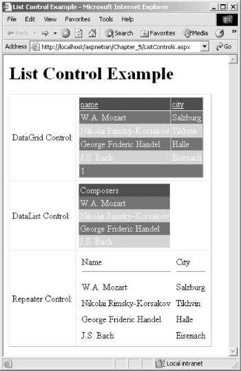 5.4.6 Rich ControlsThese high-level custom controls provide rich user interface and functionality. This release of ASP.NET includes two rich controls: the Calendar control and the AdRotator control. Table 5-5 lists the rich controls.
The simplified syntax of the rich controls is as follows: <asp:adrotator id="MyAdRotator" advertisementfile="ads.xml" runat="server" /> <asp:calendar id="MyCalendar" showdayheader="true" todaydaystyle-backcolor="yellow" todaydaystyle-forecolor="blue" runat="server"/> These controls can then be referenced programmatically with code fragments like: MyAdRotator.KeywordFilter = "Nutshell"
Dim ShortDate As String
ShortDate = MyCalendar.TodaysDate.ToString("D")
MyLabel.Text = "Today is " & ShortDate
The appearance of rich controls when rendered to the browser is shown in Figure 5-6. The code used to generate this figure is shown in Example 5-10. Figure 5-6. Rendering of rich controls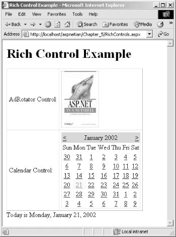 Example 5-10. RichControls.aspx<%@ Page Language="vb" %>
<html>
<head>
<title>Rich Control Example</title>
<script runat="server">
Sub Page_Load( )
MyAdRotator.KeywordFilter = "Nutshell"
Dim ShortDate As String
ShortDate = MyCalendar.TodaysDate.ToString("D")
MyLabel.Text = "Today is " & ShortDate
End Sub
</script>
</head>
<body>
<h1>Rich Control Example</h1>
<form runat="server">
<asp:table id="MyTable"
border="1"
cellpadding="5"
cellspacing="0"
runat="server">
<asp:tablerow runat="server">
<asp:tablecell runat="server">
AdRotator Control:
</asp:tablecell>
<asp:tablecell runat="server">
<asp:adrotator id="MyAdRotator"
advertisementfile="ads.xml"
runat="server" />
</asp:tablecell>
</asp:tablerow>
<asp:tablerow runat="server">
<asp:tablecell runat="server">
Calendar Control:
</asp:tablecell>
<asp:tablecell runat="server">
<asp:calendar id="MyCalendar"
showdayheader="true"
todaydaystyle-backcolor="yellow"
todaydaystyle-forecolor="blue"
runat="server"/>
</asp:tablecell>
</asp:tablerow>
</asp:table>
<asp:label id="MyLabel" runat="server"/>
</form>
</body>
</html>
5.4.7 Validation ControlsASP.NET removes the hassle of duplicating validation code, a common problem of performing data validation using classic ASP, by neatly encapsulating the standard validations into server controls. You can declaratively relate the validation control to the control whose value needs to be validated, using the ControlToValidate attribute. You can also attach multiple validation controls to a single control. The ASP.NET validation server controls provide server-side validation for all browsers and supply client-side validation via JavaScript for browsers that support JavasScript and DHTML. You can also write your own custom client and/or server-side validation functions, as you'll see in the code example for this section. One feature that most web programmers would like to have is a summary of the validation errors for the values entered into a page's controls. The ValidationSummary control provides this much-desired feature. Table 5-6 lists the validation controls.
The simplified syntax of the validation controls is as follows: <asp:comparevalidator id="cvCompare"
controltovalidate="value1"
controltocompare="value2"
operator="equal"
type="integer"
errormessage="Fields are not equal!"
display="dynamic"
runat="server"/>
<asp:customvalidator id="cvDate"
controltovalidate="year"
errormessage="Not a valid year!"
onservervalidate="servervalidation"
clientvalidationfunction="ClientValidate"
display="dynamic"
runat="server"/>
<asp:rangevalidator id="rvCompare"
controltovalidate="value"
minimumvalue="0"
maximumvalue="100"
type="integer"
errormessage="Value not in valid range!"
runat="server"/>
<asp:regularexpressionvalidator id="reZipCode"
controltovalidate="zipcode"
validationexpression="^\d{5}$|^\d{5}-\d{4}$"
errormessage="Not a valid Zip code!"
display="static"
runat="server"/>
<asp:requiredfieldvalidator id="rfvLogin"
controltovalidate="login"
display="static"
errormessage="Login cannot be blank!"
runat="server"/>
<asp:validationsummary id="vsSummary"
displaymode="bulletlist"
headertext="Page has the following errors: "
showsummary="true"
showmessagebox="false"
runat="server"/>
The controls can then be referenced programmatically with code fragments like: cvCompare.ControlToCompare = "Value3"
cvDate.ClientValidationFunction="ClientValidateLeapYear"
reZipCode.ValidationExpression="^\d{5}$|^\d{5}$"
rfvLogin.InitialValue = "SomeUser"
vsSummary.DisplayMode = ValidationSummaryDisplayMode.List
The appearance of validation controls that have detected invalid input when rendered to the browser is shown in Figure 5-7. The code used to generate this figure is shown in Example 5-11. Example 5-11. ValidationControls.aspx<%@ Page Language="vb" %>
<html>
<head>
<title>Validation Control Example</title>
<script language="javascript">
<!--
function ClientValidate(source, arguments)
{
//Declare variables.
var r, re;
//Create regular expression object.
re = new RegExp(/^[1-9][0-9][0-9][0-9]$/);
//Test for match.
r = re.test(arguments.Value);
//Return results.
arguments.IsValid = r;
}
-->
</script>
<script runat="server">
Sub Page_Load( )
vsSummary.DisplayMode = ValidationSummaryDisplayMode.List
End Sub
Sub ServerValidation (source As object, args _
As ServerValidateEventArgs)
Dim RegExVal As New _
System.Text.RegularExpressions.Regex("^\ d{4}$")
If RegExVal.IsMatch(args.Value) Then
args.IsValid = True
Else
args.IsValid = False
End If
End Sub
</script>
</head>
<body>
<h1>Validation Control Example</h1>
<form runat="server">
<asp:table id="MyTable"
border="1"
cellpadding="5"
cellspacing="0"
runat="server">
<asp:tablerow runat="server">
<asp:tablecell runat="server">
Compare Validator Control:
<br><br>
Enter two numbers to compare
</asp:tablecell>
<asp:tablecell runat="server">
<asp:textbox id="value1" runat="server"/><br>
<asp:textbox id="value2" runat="server"/><br>
<asp:comparevalidator id="cvCompare"
controltovalidate="value1"
controltocompare="value2"
operator="equal"
type="integer"
errormessage="Fields are not equal!"
display="dynamic"
runat="server"/>
</asp:tablecell>
</asp:tablerow>
<asp:tablerow runat="server">
<asp:tablecell runat="server">
CustomValidator Control:
<br><br>
Enter a 4-digit year
</asp:tablecell>
<asp:tablecell runat="server">
<asp:textbox id="year" runat="server"/><br>
<asp:customvalidator id="cvDate"
controltovalidate="year"
errormessage="Not a valid year!"
onservervalidate="servervalidation"
clientvalidationfunction="ClientValidate"
display="dynamic"
runat="server"/>
</asp:tablecell>
</asp:tablerow>
<asp:tablerow runat="server">
<asp:tablecell runat="server">
RangeValidator Control:
<br><br>
Enter an integer between 0 and 100
</asp:tablecell>
<asp:tablecell runat="server">
<asp:textbox id="value" runat="server"/><br>
<asp:rangevalidator id="rvCompare"
controltovalidate="value"
minimumvalue="0"
maximumvalue="100"
type="integer"
errormessage="Value not in valid range!"
runat="server"/>
</asp:tablecell>
</asp:tablerow>
<asp:tablerow runat="server">
<asp:tablecell runat="server">
RegularExpressionValidator Control:
<br><br>
Enter a valid 5 or 9-digit zip code
</asp:tablecell>
<asp:tablecell runat="server">
<asp:textbox id="zipcode" runat="server"/><br>
<asp:regularexpressionvalidator id="reZipCode"
controltovalidate="zipcode"
validationexpression="^\d{5}$|^\d{5}-\d{4}$"
errormessage="Not a valid Zip code!"
display="static"
runat="server"/>
</asp:tablecell>
</asp:tablerow>
<asp:tablerow runat="server">
<asp:tablecell runat="server">
RequiredFieldValidator Control:
<br><br>
Enter a login name
</asp:tablecell>
<asp:tablecell runat="server">
<asp:textbox id="login" runat="server"/><br>
<asp:requiredfieldvalidator id="rfvLogin"
controltovalidate="login"
display="static"
errormessage="Login cannot be blank!"
runat="server"/>
</asp:tablecell>
</asp:tablerow>
<asp:tablerow runat="server">
<asp:tablecell runat="server">
ValidationSummary Control:
</asp:tablecell>
<asp:tablecell runat="server">
<asp:validationsummary id="vsSummary"
displaymode="bulletlist"
headertext="Page has the following errors: "
showsummary="true"
showmessagebox="false"
runat="server"/>
</asp:tablecell>
</asp:tablerow>
<asp:tablerow runat="server">
<asp:tablecell colspan="2" runat="server">
<asp:button text="submit" runat="server"/>
</asp:tablecell>
</asp:tablerow>
</asp:table>
<asp:label id="MyLabel" runat="server"/>
</form>
</body>
</html>
Figure 5-7. Rendering of validation controls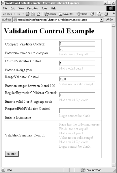 5.4.8 Mobile ControlsThe mobile controls, which were available as a separate download as the Microsoft Mobile Internet Toolkit in ASP.NET 1.0, but are integrated into the .NET Framework Version 1.1, provide specialized functionality for building ASP.NET applications that target mobile devices such as PDAs and cell phones. Table 5-7 lists the mobile controls. Some controls, such as the AdRotator, Calendar, Label, Panel, and TextBox controls, whose functions are largely the same as their standard server control counterparts (with the exception of rendering), are omitted for brevity.
Mobile Web Forms, and some of the mobile controls (as noted in Table 5-7), support pagination, which automatically separates the content of a given form or control into smaller chunks for easier display on smaller form factors such as cell phones. To activate pagination for a Mobile Web Form, set the Paginate property of the desired form to true. The appearance of a List control when rendered to a PocketPC emulator is shown in Figure 5-8, and, after clicking the SelectionList link, Figure 5-9, which shows the rendering of a Label, SelectionList, and Command control on the PocketPC. The code used to generate this figure is shown in Example 5-12. Example 5-12. MobileControls.aspx<%@ Register TagPrefix="mobile" Namespace="System.Web.UI.MobileControls" Assembly="System.Web.Mobile" %>
<%@ Page Inherits="System.Web.UI.MobileControls.MobilePage"
Language="vb" %>
<HEAD>
<title>Mobile Control Example</title>
<script runat="server">
Protected Sub List1_Click(source As Object, _
e As ListCommandEventArgs)
Select Case e.ListItem.Value
Case 2
ActiveForm = Form2
Case 3
ActiveForm = Form3
Case 4
ActiveForm = Form4
End Select
End Sub
Protected Sub Command1_Click(source As Object, e As EventArgs)
If Not SelectionList1.Selection.Value = "4" Then
Label1.Text = "You run as Admin too often!"
Else
Label1.Text = "Excellent!"
End If
End Sub
</script>
</HEAD>
<body xmlns:mobile="http://schemas.microsoft.com/Mobile/WebForm">
<h1>Mobile Control Example</h1>
<mobile:Form id="Form1" Runat="server">
<mobile:Label id="Label2" runat="server">Choose a sample:</mobile:Label>
<mobile:List id="List1" OnItemCommand="List1_Click" runat="server" Decoration="Numbered">
<Item Value="2" Text="SelectionList Sample"></Item>
<Item Value="3" Text="PhoneCall Sample"></Item>
<Item Value="4" Text="TextView Sample"></Item>
</mobile:List>
</mobile:Form>
<mobile:Form id="Form2" runat="server">
<mobile:Label id="Label1" runat="server">How often do you run Windows as Admin?</mobile:Label>
<mobile:SelectionList id="SelectionList1" runat="server">
<Item Value="0" Text="Always"></Item>
<Item Value="1" Text="Often"></Item>
<Item Value="2" Text="Sometimes"></Item>
<Item Value="3" Text="Rarely"></Item>
<Item Value="4" Text="Never"></Item>
</mobile:SelectionList>
<mobile:Command id="Command1" OnClick="Command1_Click" runat="server">Submit</mobile:Command>
</mobile:Form>
<mobile:Form id="Form3" runat="server">
<mobile:PhoneCall id="PhoneCall1" runat="server" PhoneNumber="(000)555-1234"
AlternateUrl="http://www.aspnetian.com">Call Mom</mobile:PhoneCall>
</mobile:Form>
<mobile:Form id="Form4" runat="server">
<mobile:TextView id="TextView1" runat="server" Wrapping="Wrap">When, in
the course of human events, it becomes necessary for one people to dissolve the
political bonds which have connected them with another, and to assume among the
powers of the earth, the separate and equal station to which the laws of nature
and of nature's God entitle them, a decent respect to the opinions of mankind
requires that they should declare the causes which impel them to the separation.
<br><br>We hold these truths to be self-evident, that all men are created equal,
that they are endowed by their Creator with certain unalienable rights, that
among these are life, liberty and the pursuit of happiness. That to secure these
rights, governments are instituted among men, deriving their just powers from the
consent of the governed. That whenever any form of government becomes destructive
to these ends, it is the right of the people to alter or to abolish it, and to
institute new government, laying its foundation on such principles and organizing
its powers in such form, as to them shall seem most likely to effect their safety
and happiness.</mobile:TextView>
</mobile:Form>
</body>
Figure 5-8. Initial rendering of mobile controls on PocketPC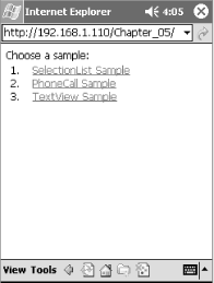 Figure 5-9. Rendering of mobile controls on PocketPC after clicking link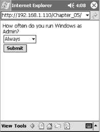 Figure 5-10 shows the rendered output of the PhoneCall control on the Openwave Phone Simulator (available at http://www.openwave.com/). Figure 5-11 shows the result of activating the PhoneCall control. The code used to generate these figures is shown in Example 5-13. Figure 5-10. Initial rendering of PhoneCall control on Openwave Phone Simulator (image courtesy Openwave Systems Inc.)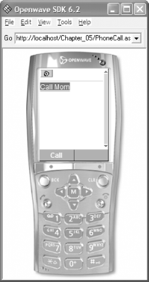 Example 5-13. PhoneCall.aspx<%@ Register TagPrefix="mobile" Namespace="System.Web.UI.MobileControls" Assembly="System.Web.Mobile" %>
<%@ Page Inherits="System.Web.UI.MobileControls.MobilePage"
Language="vb" %>
<HEAD>
<title>PhoneCall Control Example</title>
</HEAD>
<body xmlns:mobile="http://schemas.microsoft.com/Mobile/WebForm">
<mobile:Form id="Form1" Runat="server">
<mobile:PhoneCall id="PhoneCall1" runat="server" PhoneNumber="(000)555-1234"
AlternateUrl="http://www.aspnetian.com">Call Mom</mobile:PhoneCall>
</mobile:Form>
</body>
Figure 5-11. Rendering of activated PhoneCall control on Openwave Phone Simulator (image courtesy Openwave Systems Inc.)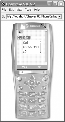
 |
| [ Team LiB ] |
|
