|
|
< Day Day Up > |
|
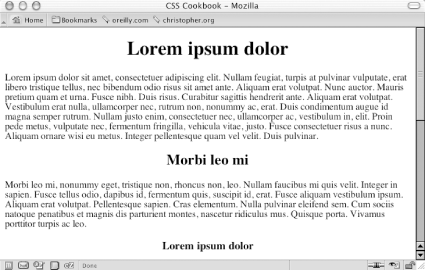
Recipe 2.3 Centering Elements on a Web PageProblemYou want to center parts of a web page, as in Figure 2-5. Figure 2-5. The headline text centered SolutionTo center text in a block-level element, use the text-align property: h1, h2, h3 {
text-align:center;
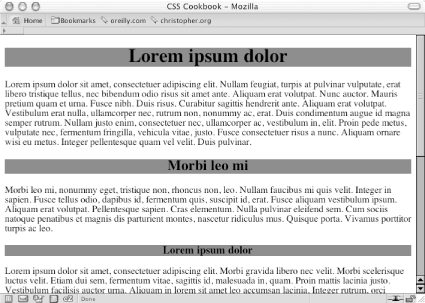
}DiscussionBy using text-align, you can center text inside block-level elements. However, in this example, the heading takes up the entire width of the body element, and if you don't apply a background color to the element, you probably won't even notice this is happening. The gray background color in Figure 2-6 shows the actual width of the centered elements. Figure 2-6. The actual width of the elements shown by the gray background color An alternative approach is to use margins to center text within its container: h1, h2, h3 {
margin-left: auto;
margin-right: auto;
}When you set the margin-left and margin-right properties to auto, you center the element inside its parent element. However, older but still popular browsers won't render the presentation correctly. So, workarounds are needed for individual situations. Recipe 2.3.3.1 TablesTo center a table, place the table as the child of a div element: <div class="center"> <table width="50%" border="1" cellpadding="30"> <tr> <td>This is the first cell</td> <td>This is the second cell</td> </tr> <tr> <td>This is the third cell, it's under the first cell</td> <td>This is the fourth cell, it's under the second cell.</td> </tr> </table> </div> Then write the following CSS rule: .center {
text-align: center;
}
.center table {
width: 50%;
margin-left: auto;
margin-right: auto;
text-align: left;
}Although setting both sides of the margin to auto works in newer generations of browsers, it doesn't work in Internet Explorer 5 for Windows or Netscape Navigator 4. To catch those two browsers and tell them to "do the right thing," the center class selector uses the text-align technique. However, if that were all you did, the contents of the table cells would be centered as well. To counteract that effect, use a descendent selector, .center table, to align the contents in the table cell elements. Note that if you use th elements in an HTML table, the content inside those cells is centered by default. Setting the text-align property to a value of left in the descendent selector .center table doesn't counter that effect. To left-align the content inside th, use this CSS rule: th {
hext-align: left;
}To save a line or two of CSS code, you might want to incorporate the shorthand version of the margin property, as shown here (although this works in most browsers, it fails in Internet Explorer 5 for Macintosh): .center table {
margin: 0 auto;
text-align: left;
}Recipe 2.3.3.2 ImagesIf you want to center an image, wrap a div element around the img element first. This technique is required because an img element, like em and strong, is inline. It rests in the flow of the web page instead of marking off space like the p or blockquote block-level elements do. The markup looks like this: <div class="flagicon"><img src="flag.gif" alt="Flag " width="160 " height="60" /></div> And the CSS rule looks like this: .flagicon {
text-align: center;
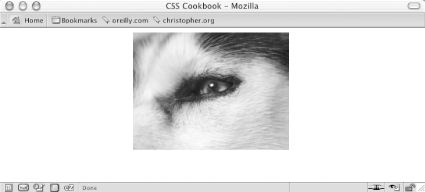
}To center elements with fixed widths, such as images, first set the value of the parent's padding-left property to 50%. Then determine half of the width of the element you are centering and set it as a negative value in the margin-left property. That prevents the element's left side from resting on the 50% line caused by its padding and makes it slide into the middle of the page. The markup for an image in a web page using this technique looks something like this: <img src="wolf.jpg" width="256" height="192" alt="Photo of wolf."> The CSS rule to produce the result shown in Figure 2-7 looks like this: body {
padding-left: 50%;
}
img {
/* equal to the negative of half its width */
margin-left: -138px;
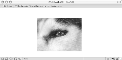
}Figure 2-7. The image centered without the deprecated center element Recipe 2.3.3.3 Vertical centeringWith the element centered horizontally, you can take this technique one step further and center the image (or any other element) vertically as well. The difference with this method is that it uses the position property to make this work. The markup is the same as that used for the image element in the previous example, but this time the CSS rule is for just one selector (see Figure 2-8): img {
position: absolute;
top: 50%;
left: 50%;
margin-top: -96px;
margin-left: -138px;
height: 192px;
width: 256px;
}Figure 2-8. The image centered horizontally and vertically on the web page With absolute positioning, you take the element out of the normal flow of the document and place it wherever you want. If you want to center both text and an image (or other images) instead of just one image, enclose all the content with a div element: <div id="centerFrame"> <p>Epsum factorial non deposit quid pro quo hic escorol. Olypian quarrels et gorilla congolium sic ad nauseum. Souvlaki ignitus carborundum e pluribus unum. Defacto lingo est igpay atinlay.</p> <img src="wolf.jpg" width="256" height="192" alt="Photo of wolf." /> </div> Then in the CSS rule, remove the height property and adjust the negative value of the top margin to compensate for the additional elements on the page: #centerFrame {
position: absolute;
top: 50%;
left: 50%;
/* adjust negative value until content is centered */
margin-top: -150px;
margin-left: -138px;
width: 256px;
}Keep the amount of content that you want centered short. If you have numerous images and long amounts of HTML text, users with small resolutions will have to scroll the page to see your centered content. See AlsoChapter 7 for information on multicolumn layouts, which deal with the position of elements in a web page; the CSS 2.1 specification for text-align at http://www.w3.org/TR/CSS21/text.html#propdef-text-align. |
|
|
< Day Day Up > |
|