|
|
< Day Day Up > |
|
Recipe 6.6 Sample Design: An Elegant CalendarGreat for organization, calendars enable us to schedule lunches, remember birthdays, and plan honeymoons. As designers, we can think of all those months, dates, and appointments as tabular data. If you display your calendar as an HTML table, chances are the table looks rather plain, and if it contains numerous events then it probably looks somewhat convoluted as well. In this design, we use CSS to create a calendar that is more legible than what you could create using vanilla HTML. First, take a look at Figure 6-7, which shows the markup for the calendar without styles. Figure 6-7. The calendar without styles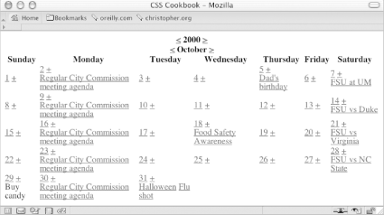 Next, look at the markup itself to see how it's set up. As you learned in Recipe 6.1, the cellspacing attribute needs to be set in the table element: <table cellspacing="0"> Now, set the first three rows of table headers, th, containing the year, month, and days, in their own rows within their own table headers: <tr> <th colspan="7" id="year"> <a href="year.html?previous"><</a> 2000 <a href="year.html?next">></a> </th> </tr> <tr> <th colspan="7" id="month"> <a href="month.html?previous"><</a> October <a href="month.html?next">></a> </th> </tr> <tr id="days"> <th>Sunday</th> <th>Monday</th> <th>Tuesday</th> <th>Wednesday</th> <th>Thursday</th> <th>Friday </th> <th>Saturday</th> </tr> The first date is October 1, which in this calendar falls on a Sunday. To signify that Sundays and Saturdays are days of the weekend, use a class selector in the td element. In each date of the month there is a link on the date itself (which would, in theory, take the user to a detailed listing of the day) as well as a link to add more events to the day. Wrap these two links in a div element so that when new events are added there is a clear division between the two sections in the table cell: <tr> <td class="weekend"> <div> <a href="1.html" class="date">1</a> <a href="add.html" class="addevent">+</a> </div> </td> The next date, October 2, has an event listed. The event is marked up as a link and placed below the div containing the date and the addevent links (because October 2 is a weekday, the weekend class isn't applied to the td element): <td>
<div>
<a href="2.html" class="date">2</a>
<a href="add.html" class="addevent">+</a>
</div>
<a href="16.html?id=1" class="event">Regular City
Commission meeting agenda</a>
</td>The rest of the markup follows a similar structure: <td>
<div>
<a href="3.html" class="date">3</a>
<a href="add.html" class="addevent">+</a>
</div>
</td>
<td>
<div>
<a href="4.html" class="date">4</a>
<a href="add.html" class="addevent">+</a>
</div>
</td>
<td>
<div>
<a href="5.html" class="date">5</a>
<a href="add.html" class="addevent">+</a>
</div>
<a href="5.html?id=1" class="event">Dad's birthday</a>
</td>
<td>
<div>
<a href="6.html" class="date">6</a>
<a href="add.html" class="addevent">+</a>
</div>
</td>
<td class="weekend">
<div>
<a href="7.html" class="date">7</a>
<a href="add.html" class="addevent">+</a>
</div>
<a href="7.html?id=1" class="event">FSU at UM</a>
</td>
</tr>
[...]
<tr>
<td class="weekend">
<div>
<a href="29.html" class="date">29</a>
<a href="add.html" class="addevent">+</a>
</div>
<div class="event">Buy candy</div>
</td>
<td>
<div>
<a href="30.html" class="date">30</a>
<a href="add.html" class="addevent">+</a>
</div>
<a href="16.html?id=1" class="event">Regular City
Commission meeting agenda</a>
</td>
<td>
<div>
<a href="31.html" class="date">31</a>
<a href="add.html" class="addevent">+</a>
</div>
<a href="31.html?id=1" class="event">Halloween</a>
<a href="31.html?id=2" class="event">Flu shot</a>
</td>
<td>
<div class="emptydate"> </div>
</td>
<td>
<div class="emptydate"> </div>
</td>
<td>
<div class="emptydate"> </div>
</td>
<td class="weekend">
<div class="emptydate"> </div>
</td>
</tr>
</table>Figure 6-8. Underline decoration of the links removed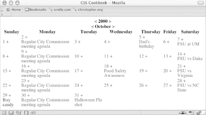 With the calendar marked up, you can begin setting up the styles. First, apply the styles to the table and links. The width of the table is set to 100% and the border model (see Recipe 6.2) is set to collapse, the common model web designers are used to and most browsers get right in their CSS implementations; the underline decoration is turned off (see Figure 6-8): table {
width: 100%;
border-collapse: collapse;
}
td a:link, td a:visited {
text-decoration: none;
}Next, set up the styles for the first three rows of the table. The rows are marked with ID selectors because you want the styles to show up only once in the document. Stylize these rows in a straightforward manner using the monospace font for the heading font and then decreasing the font sizes, with the month sized the largest (see Figure 6-9): #year {
font-family: monospace;
font-size: 1.5em;
padding: 0;
margin: 0;
}
#month {
font-family: monospace;
font-size: 2em;
padding: 0;
margin: 0;
}
#days {
background-color: black;
color: white;
font-family: monospace;
width: 75px;
}Figure 6-9. Styling the first three rows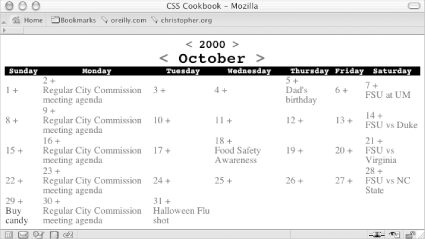 Now it's time to stylize the dates and add event links in each cell. To reproduce the box date effect seen in most calendars, place a border to the right and bottom of the text and float the content to the left. You want the add event links to be close to the dates. Floating the link to the right means the link will be positioned next to the date of the following day. By floating the add event link to the left, you are telling the user that the plus sign means add an event for that particular day (see Figure 6-10): .date {
border-right: 1px solid black;
border-bottom: 1px solid black;
font-family: monospace;
text-decoration: none;
float: left;
width: 1.5em;
height: 1.5em;
background-color: white;
text-align: center;
}
.addevent {
display: block;
float: left;
width: 1em;
height: 1em;
text-align: center;
background-color: #666;
color: white;
font-weight: bold;
text-decoration: none
}Figure 6-10. Styles introduced to the date and add event links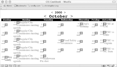 Now it's time to look at how the event listings can be stylized. Because the previous links are floated, you need to create a visible break and move the events below the date. Setting the clear property to both achieves this visual break. The clear property is used to indicate which sides of an element should not be positioned next to a floated element. In this case, you don't want the left side to run next to the date and add event links. However, just in case the design changes in the future and the dates are positioned on the opposite side, use a value of both instead of left. Next, change the display of the link to block and place padding on the bottom (see Figure 6-11). You're making these changes to prevent multiple events in a table cell from running into each other. Also, the padding acts as a nice visual buffer, allowing the eye to easily discern between two events: .event {
clear: both;
padding-left: 1em;
padding-bottom: .75em;
display: block;
}Figure 6-11. Event links treated like block-level elements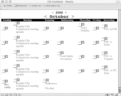 To each table cell, apply a width of 14%. You're using 14% because 7 (representing the seven sections of the calendar, or days of the week) goes into 100 (representing 100% of the viewport) approximately 14 times. Also, place a white border on all sides of the cell and position all the content to the top with the vertical-align property (see Figure 6-12): td {
width: 14%;
background-color: #ccc;
border: 1px solid white;
vertical-align: top;
}Figure 6-12. The content in each of the cells moved to the top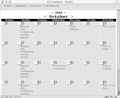 Make the background color of the weekend dates darker than that used for the weekday dates (see Figure 6-13): .weekend {
background-color: #999;
}Figure 6-13. The weekend days marked with a darker gray background color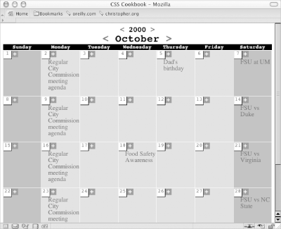 Slightly gray-out the look of the remaining days in the calendar (see Figure 6-14): .emptydate {
border-right: 1px solid #666;
border-bottom: 1px solid #666;
font-family: monospace;
text-decoration: none;
float: left;
width: 1.5em;
height: 1.5em;
background-color: #ccc;
text-align: center;
}Figure 6-14. Empty dates for the next month stylized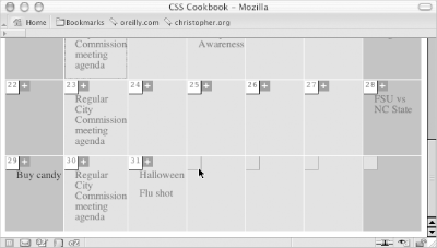 For the current day (in this example the current day is the 27th), place a two-pixel black border around the box: #today {
border: 2px solid black;
}And with that, the calendar is complete, as shown in Figure 6-15. Figure 6-15. The current date in the calendar with a darker border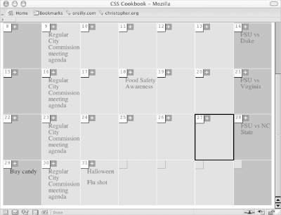 |
|
|
< Day Day Up > |
|