|
|
< Day Day Up > |
|
12.1 ListsIn a sense, almost anything that isn't narrative text can be considered a list. The U.S. Census, the Solar System, my family tree, a restaurant menu, all the friends you've ever hadall can be represented as a list, or perhaps as a list of lists. These many variations make lists fairly important, which is why it's something of a shame that list styling in CSS isn't more sophisticated. The simplest (and best-supported) way to affect a list's styles is to change its marker type. The marker of a list item is, for example, the "bullet" shown next to each item in an unordered list. In an ordered list, the marker could be a letter, number, or a symbol from some other counting system. You can even replace the markers with images. All of these are accomplished using the different list-style properties. 12.1.1 Types of ListsIn order to change the type of marker used for a list's items, you use the property list-style-type.
That's quite a few keywords, I know; many of them were introduced in CSS2 but were then dropped in CSS2.1. Table 12-1 lists the keywords that exist in CSS2.1.
Table 12-2 lists those keywords that were introduced in CSS2 but do not appear in CSS2.1.
A user agent should treat any value it does not recognize as decimal. The list-style-type property, as well all other list-related properties, can be applied only to an element that has a display of list-item, but CSS doesn't distinguish between ordered and unordered list items. Thus, you might be able to set an ordered list to use discs instead of numbers. In fact, the default value of list-style-type is disc, so you might theorize that without explicit declarations to the contrary, all lists (ordered or unordered) will use discs as the marker for each item. This would be logical, but, as it turns out, it's up to the user agent to decide. Even if the user agent doesn't have a predefined rule such as ol {list-style-type: decimal;}, it may prohibit ordered markers from being applied to unordered lists, and vice versa. You can't count on this, so be careful. For the CSS2 values such as hebrew and georgian, the CSS2 specification doesn't specify exactly how these counting systems work, nor how user agents should deal with them. This uncertainty resulted in a lack of widespread implementation, which is why the values in Table 12-2 do not appear in CSS2.1. If you want to suppress the display of markers altogether, then none is the value you seek. none causes the user agent to refrain from putting anything where the marker would ordinarily be, although it does not interrupt the counting in ordered lists. Thus, the following markup would have the result shown in Figure 12-1: ol li {list-style-type: decimal;}
li.off {list-style-type: none;}
<ol>
<li>Item the first
<li class="off">Item the second
<li>Item the third
<li class="off">Item the fourth
<li>Item the fifth
</ol>
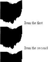
Figure 12-1. Switching off list-item markers list-style-type is inherited, so if you want to have different styles of markers in nested lists, you'll likely need to define them individually. You may also have to explicitly declare styles for nested lists because the user agent's style sheet may already have defined them. For example, assume that a user agent has the following styles defined: ul {list-style-type: disc;}
ul ul {list-style-type: circle;}
ul ul ul {list-style-type: square;}
If this is the case (and it's likely that it will be), you will have to declare your own styles to overcome the user agent's styles. Inheritance won't be enough in such a case. 12.1.2 List Item ImagesSometimes, a regular marker just won't do. You might prefer to use an image for each marker, which is possible with the property list-style-image.
Here's how it works: ul li {list-style-image: url(ohio.gif);}
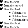
Yes, it's really that simple. One simple url value, and you're putting images in for markers, as you can see in Figure 12-2. Figure 12-2. Using images as markers Of course, you should exercise care in the images you use, as the example shown in Figure 12-3 makes painfully clear: ul li {list-style-image: url(big-ohio.gif);}
Figure 12-3. Using really big images as markers It's generally a good idea to provide a fallback marker type. Do this just in case your image doesn't load, gets corrupted, or is in a format that some user agents can't display. Therefore, you should always define a backup list-style-type for the list: ul li {list-style-image: url(ohio.png); list-style-type: square;}
The other thing you can do with list-style-image is set it to the default value of none. This is good practice because list-style-image is inherited so any nested lists will pick up the image as the marker, unless you prevent that from happening: ul {list-style-image: url(ohio.gif); list-style-type: square;}
ul ul {list-style-image: none;}
Since the nested list inherits the item type square but has been set to use no image for its markers, squares are used for the markers in the nested list, as shown in Figure 12-4. Figure 12-4. Switching off image markers in sublists
12.1.3 List-Marker PositionsThere is one other thing you can do to influence the appearance of list items under CSS2.1, and that's decide whether the marker appears outside or inside the content of the list item. This is accomplished with list-style-position.
If a marker's position is set to outside (the default), it will appear the way list items always have on the Web. Should you desire a slightly different appearance, though, you can pull the marker in toward the content by setting the value to be inside. This causes the marker to be placed "inside" the list item's content. The exact way this happens is undefined, but Figure 12-5 shows one possibility: li.first {list-style-position: inside;}
li.second {list-style-position: outside;}
Figure 12-5. Placing the markers inside and outside list items 12.1.4 List Styles in ShorthandFor brevity's sake, you can combine the three list-style properties into a convenient single property: list-style.
For example: li {list-style: url(ohio.gif) square inside;}
As you can see in Figure 12-6, all three values are applied to the list items. Figure 12-6. Bringing it all together The values for list-style can be listed in any order, and any of them can be omitted. As long as one is present, the rest will fill in their default values. For instance, the following two rules will have the same visual effect: li.norm {list-style: url(img42.gif);}
li.odd {list-style: url(img42.gif) disc outside;} /* the same thing */
They will also override any previous rules in the same way. For example: li {list-style-type: square;}
li.norm {list-style: url(img42.gif);}
li.odd {list-style: url(img42.gif) disc outside;} /* the same thing */
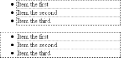
The result will be the same as that seen in Figure 12-6 because the implied list-style-type value of disc for the rule li.norm will override the previous declared value of square, just as the explicit value of disc overrides it in rule li.odd. 12.1.5 List LayoutNow that we've looked at the basics of styling list markers, let's consider how lists are laid out in various browsers. We'll start with a set of three list items devoid of any markers and not yet placed within a list, as shown in Figure 12-7. Figure 12-7. Three list itemsThe border around the list items shows them to be, essentially, like a block-level element. Indeed, the value list-item is defined to generate a block box. Now let's add markers, as illustrated in Figure 12-8. Figure 12-8. Markers are addedThe distance between the marker and the list item's content is not defined by CSS, and CSS2.1 does not provide a way to affect that distance. Interestingly, CSS2 does, which is a subject briefly covered in the sidebar List-Marker Positioning. With the markers outside the list items' content, they don't affect the layout of other elements, nor do they really even affect the layout of the list items themselves. They just hang a certain distance from the edge of the content, and wherever the content edge goes, the marker will follow. The behavior of the marker works much as though the marker were absolutely positioned in relation to the list-item content, something like position: absolute; left: -1.5em;. When the marker is inside, it acts like an inline element at the beginning of the content. Just to be different, if for no other good reason, Internet Explorer for Windows extends the content area of the list items to enclose the bullets, as illustrated in Figure 12-9. This does not change the overall situation with list styling, although it can make a difference in situations where authors apply borders to list items. Figure 12-9. List borders and bullets in IE/WinSo far, you have yet to add an actual list container; in other words, there is neither a ul nor an ol element represented in the figures. You can add one to the mix, as shown in Figure 12-10 (it's represented by a dashed border). Figure 12-10. Adding a list element Like the list items, the list element is a block box, one that encompasses its descendant elements. As you can see, however, the markers are not only placed outside the list item contents, but also outside the content area of the list element. The usual "indentation" you expect from lists has not yet been specified. Most browsers, as of this writing, accomplish the indentation of list items by setting either padding or margins for the containing list element. For example, the user agent might apply a rule such as this one: ul, ol {margin-left: 40px;}
This is the rule employed by Internet Explorer and Opera (see Figure 12-10). Most Gecko-based browsers, on the other hand, use a rule like this: ul, ol {padding-left: 40px;}
Neither is incorrect, but the discrepancy can lead to problems if you want to eliminate the indentation of the list items. Figure 12-11 shows the difference between the two approaches. Figure 12-11. Margins and padding as indentation devices
For authors who want to change the indentation distance of lists, I strongly recommend that you specify both padding and margins. This will lead to cross-browser compatibility. For example, if you want to use padding to indent a list, use this rule: ul {margin-left: 0; padding-left: 1em;}
If you prefer margins, write something like this instead: ul {margin-left: 1em; padding-left: 0;}
In either case, remember that the markers will be placed relative to the contents of the list items, and may therefore "hang" outside the main text of a document, or even beyond the edge of the browser window.
|
|
|
< Day Day Up > |
|