|
|
< Day Day Up > |
|
6.1 Indentation and Horizontal AlignmentLet's start with a discussion of how you can affect the horizontal positioning of text within a line. Think of these basic actions as the same types of steps you might take to create a newsletter or write a report. 6.1.1 Indenting TextIndenting the first line of a paragraph on a web page is one of the most sought after text-formatting effects. (Eliminating the blank line between paragraphs, which is discussed in Chapter 7, is a close second.) Some sites create the illusion of indented text by placing a small transparent image before the first letter in a paragraph, which shoves over the text. Other sites use the utterly nonstandard SPACER tag. Thanks to CSS, there's a better way to indent text, called text-indent.
Using text-indent, the first line of any element can be indented by a given lengtheven if that length is negative. The most common use for this property is, of course, to indent the first line of paragraphs: p {text-indent: 3em;}
This rule will cause the first line of any paragraph to be indented three ems, as shown in Figure 6-1. Figure 6-1. Text indenting In general, you can apply text-indent to any block-level element. You can't apply it to inline elements, nor can you use it on replaced elements such as images. However, if you have an image within the first line of a block-level element, like a paragraph, it will be shifted over with the rest of the text in the line.
You can also set negative values for text-indent, a technique that leads to a number of interesting effects. The most common use is a "hanging indent," where the first line hangs out to the left of the rest of the element: p {text-indent: -4em;}
Be careful when setting a negative value for text-indent: the first three words ("This is a") may be chopped off by the left edge of the browser window. In order to avoid display problems, I recommend you use a margin or some padding to accommodate the negative indentation: p {text-indent: -4em; padding-left: 4em;}
Negative indents can, however, be used to your advantage. Consider the following example, demonstrated in Figure 6-2, which adds a floated image to the mix: p.hang {text-indent: -25px;}
<img src="star.gif" style="width: 60px; height: 60px;
float: left;" alt="An image of a five-pointed star."/>
<p class="hang"> This paragraph has a negatively indented first
line, which overlaps the floated image that precedes the text. Subsequent
lines do not overlap the image, since they are not indented in any way.</p>
Figure 6-2. A floated image and negative text-indenting By using this simple technique, you can implement all sorts of interesting designs: div {width: 400px;}
Any unit of length, including percentage values, may be used with text-indent. In the following case, the percentage refers to the width of the parent element of the element being indented. In other words, if you set the indent value to 10%, the first line of an affected element will be indented by 10% of its parent element's width, as shown in Figure 6-3: p {text-indent: 10%;}
<div>
<p>This paragraph is contained inside a DIV, which is 400px wide, so the
first line of the paragraph is indented 40px (400 * 10% = 40). This is
because percentages are computed with respect to the width of the element.</p>
</div>
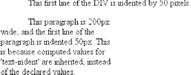
Figure 6-3. Text-indenting with percentages Note that this indentation only applies to the first line of an element, even if you insert line breaks. Because the paragraph is only 200 pixels wide, its first line is indented by 50 pixels (as shown in Figure 6-4). In this case, 10% is the inherited value for text-indent: div {width: 500px; text-indent: 10%;}
p {width: 200px;}
<div>
This first line of the DIV is indented by 50 pixels.
<p>
This paragraph is 200px wide, and the first line of the paragraph
is indented 50px. This is because computed values for 'text-indent'
are inherited, instead of the declared values.
</p>
</div>
Figure 6-4. Inherited text-indenting
6.1.2 Horizontal AlignmentEven more basic than text-indent is the property text-align, which affects how the lines of text in an element are aligned with respect to one another. The first three values are pretty straightforward, but the fourth and fifth have a few complexities.
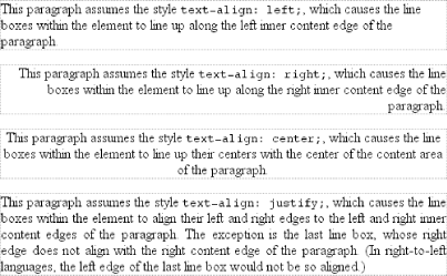
The quickest way to understand how these values work is to examine Figure 6-5. Figure 6-5. Behaviors of the text-align property Obviously, the values left, right, and center cause the text within elements to be aligned exactly as described. Since text-align applies only to block-level elements, such as paragraphs, there's no way to center an anchor within its line without aligning the rest of the line (nor would you want to, since that would likely cause text overlap). For Western languages, which are read from left to right, the default value of text-align is left. The text aligns on the left margin and has a ragged right margin (otherwise known as "left-to-right" text). Languages such as Hebrew and Arabic default to right since they are read right to left. As expected, center causes each line of text to be centered within the element. Although you may be tempted to believe that text-align: center is the same as the <CENTER> element, it's actually quite different. <CENTER> affected not only text, but also centered whole elements, such as tables. text-align does not control the alignment of elements, only their inline content. Figure 6-5 illustrates this clearly. The actual elements are not shifted from one side to the other. Only the text within them is affected.
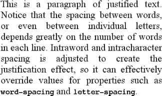
The last horizontal alignment property is justify, which raises some issues of its own. In justified text, both ends of a line of text are placed at the inner edge of the parent element, as Figure 6-6 shows. Then, the spacing between words and letters is adjusted so that each line is precisely the same length. Justified text is common in the print world (for example, in this book), but under CSS, a few extra considerations come into play. Figure 6-6. Justified text The user agentnot CSSdetermines how justified text should be stretched out to fill the space between the left and right edges of the parent. Some browsers, for example, might add extra space only between words, while others might distribute the extra space between letters. Other user agents may reduce space on some lines, thus mashing the text together a bit more than usual. All of these possibilities will affect the appearance of an element, and may even change its height, depending on how many lines of text result from the user agent's justification choices. CSS also doesn't specify how hyphenation should be handled.[1] Most justified text uses hyphenation to break long words across two lines, thus reducing the space between words and improving the appearance of lines. However, since CSS defines no hyphenation behavior, user agents are unlikely to perform any automatic hyphenation. As a result, justified text looks much less attractive under CSS than it does in print, especially when elements become so narrow that only a few words can fit on each line. You can still use narrow design elements, of course, but be aware of the drawbacks.
|
|
|
< Day Day Up > |
|