|
|
< Day Day Up > |
|
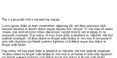
8.1 Basic Element BoxesAs we discussed in Chapter 7, all document elements generate a rectangular box called the element box, which describes the amount of space that an element occupies in the layout of the document. Therefore, each box influences the position and size of other element boxes. For example, if the first element box in the document is an inch tall, then the next box will begin at least an inch below the top of the document. If the first element box is changed and made to be two inches tall, every following element box will shift downward an inch, and the second element box will begin at least two inches below the top of the document, as shown in Figure 8-1. Figure 8-1. How one element affects all elements By default, a visually rendered document is composed of a number of rectangular boxes that are distributed such that they don't overlap each other. Also, within certain constraints, these boxes take up as little space as possible, while still maintaining a sufficient separation to make clear which content belongs to which element.
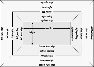
In order to fully understand how margins, padding, and borders are handled, you must clearly understand the box model (also explained in the previous chapter). For reference, I'll include the box model diagram from the last chapter (see Figure 8-2). Figure 8-2. The CSS box model 8.1.1 Width and HeightAs Figure 8-2 illustrates, the width of an element is defined to be the distance from the left inner edge to the right inner edge, and the height is the distance from the inner top to the inner bottom.
One important note about these two properties: they don't apply to inline nonreplaced elements. For example, if you try to declare a height and width for a hyperlink, CSS-conformant browsers must ignore those declarations. Assume that the following rule applies: a:link {color: red; background: silver; height: 15px; width: 60px;}
You'll end up with red links on a silver background whose height and width are determined by the content of the links. They will not be 15 pixels tall by 60 pixels wide. In the course of this chapter, we'll keep the discussion simple by assuming that the height of an element is always calculated automatically. If an element is eight lines long, and each line is an eighth of an inch tall, then the height of the element is one inch. If it's 10 lines tall, then the height is 1.25 inches. In either case, the height is determined by the content of the element, not by the author. It's rarely the case that elements in the normal flow have a set height.
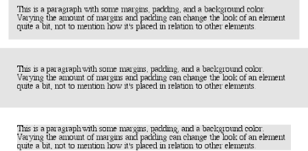
8.1.2 Margins Versus PaddingElement boxes provide only small amounts of space between elements. There are three ways to generate additional space around elements: you can add padding, margins, or a combination of padding and margins. Under certain circumstances, the choice doesn't really matter. If an element has a background, however, your choice is already made, because the background will extend into the padding but not the margin. Thus, the amount of padding and margin you assign to a given element will influence where the background of the element will end. If you set background colors for the elements involved, as illustrated in Figure 8-3, the difference becomes clear. The elements with padding have extra background, as it were, whereas those with margins do not. Figure 8-3. Paragraphs with different margins and padding, with backgrounds to illustrate the differences In the end, deciding how to set margins and padding is up to the designer, who has to balance the various possibilities against the intended effect and pick the best alternative. In order to be able to make these choices, of course, it helps to know which properties you can use. |
|
|
< Day Day Up > |
|