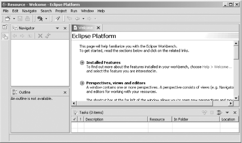
13.1 A Look at Eclipse 3.0
At this
point, Eclipse 3.0 looks a lot like Eclipse 2.1, as you can see in
Figure 13-1.

As we're going to see, some new buttons, menu
choices, and views have appeared, but fundamentally, Eclipse 2.0
users will have no difficulty slipping right into this new version of
Eclipse.
 |
On the other hand, the Eclipse team has been experimenting with the
look of views, editors, and perspectives in Eclipse 3.0, and
there's no guarantee that Eclipse 3.0 will keep
looking like Figure 13-1.
Some of the changes the Eclipse team is contemplating include
rounding view tabs instead of the square ones currently in use, only
presenting a single editor tab at once instead of stacking them (you
can reach other editor tabs with arrow buttons), and displaying icons
for perspectives at top right, not at left.
|
|
|
