| [ Team LiB ] |
|
7.7 Data Binding and the Use of TemplatesAlthough all web controls can be data bound, only DataGrid, DataList, and Repeater use a template to control the display of data items. In this section, we show you how to perform simple data binding with some common web controls and how to use an HTML template to provide fully customized data-bound controls. In ASP.NET, data binding between a control and its data source simply means that the data is copied from the source and placed onto the control upon the call to the DataBind( ) method. This is different than data binding in Windows Forms, where a link is maintained between the control and the data source. We cover Windows Forms and data binding in the next chapter. In its simplest form, data binding is the act of binding a control to a data source. Previously, data binding required that an ADO recordset be a data source, which is not too flexible. There was no way to bind, for example, an array or a collection of objects to a control. With ASP.NET, the whole data-binding business is revamped. The only requirement to make your data source bindable to web controls is that your data source implements the System.Collections.ICollection interface. In other words, a bindable data source is a collection of homogeneous objects that the web controls can obtain data items from. Although it is possible to write your own data classes that implement the ICollection interface and bind them to web controls, numerous classes exist that do this for you, such as Array, ArrayList, DataView, HashTable, Queue, SortedList, and Stack. All you have to do is put your data in these forms, and you can bind your data to web controls. Here is the simplest form of data binding. In the form file, all we have are two list boxes with ids list0 and list1: <asp:listbox id="list0" runat="server"></asp:listbox> <asp:listbox id="list1" runat="server"></asp:listbox> In the Page_Load event handler in the code-behind source file, we construct the data sources of type Array, which implement the ICollection interface we mentioned earlier, and then bind the list controls with the data sources: int[] myArray0 = new int[7] { 1, 2, 3, 5, 7, 11, 13 };
string[] myArray1 = new string[7] {
"Monday",
"Tuesday",
"Wednesday",
"Thursday",
"Friday",
"Saturday",
"Sunday"
};
list0.DataSource = myArray0;
list0.DataBind( );
list1.DataSource = myArray1;
list1.DataBind( );
Figure 7-7 shows the output of this page. Figure 7-7. Data binding with data from arrays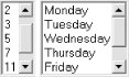 Most of the time, we tend to bind data from data sources that come from a database. The next example pulls data from the Categories table of the familiar NorthWind database. We can still use the asp:listbox control, but this time, we specify the item's property we want for the text, as well as the value property of the list box. We did not have to do this for the previous example because the items that the list box binds to are of simple types (int and string). If we were to have an array of objects, we would have to specify the property we want to bind to datavaluefield and datatextfield the way we do in the following example: <asp:listbox id=ListBox1 runat="server"
datavaluefield="CategoryID"
datatextfield="CategoryName">
</asp:listbox>
Again, in the code-behind source file, we have the code to construct the data source and to bind the data source to the list control. Note that because we are using ADO.NET to get the data from the database, we must have references to System.Data and System.Data.OleDb namespaces. The DefaultView property of class Table is of type DataView, which implements the ICollection interface: System.Data.DataSet m_ds = new System.Data.DataSet( );
String sConn =
"provider=SQLOLEDB;server=(local);database=NorthWind;Integrated Security=SSPI";
String sSQL =
"select * from Categories";
System.Data.OleDb.OleDbDataAdapter da =
new System.Data.OleDb.OleDbDataAdapter(sSQL, sConn);
da.Fill(m_ds, "Categories");
ListBox1.DataSource = m_ds.Tables["Categories"].DefaultView;
ListBox1.DataBind( );
Figure 7-8 shows the output for this example. Figure 7-8. Data binding with data from a database 7.7.1 DataGridThe DataGrid control takes data binding a step further by allowing more than one property of the bound item to be displayed. This section's example shows you how to control the binding of data columns to the grid, as well as how to customize the look and feel of the DataGrid using style. By default, the DataGrid automatically binds all columns of the data source in the order that they come from the database. Sometimes this is not the behavior you would want. To fully control what columns bind and in which order you want the binding to happen, switch off the autogeneratecolumns attribute of the DataGrid, and provide the columns property, as shown in the following sample: <asp:DataGrid id=DataGrid1 runat="server"
ForeColor="Black"
autogeneratecolumns=false>
<columns>
<asp:boundcolumn datafield=CategoryID
headertext="ID" readonly=True/>
<asp:boundcolumn datafield=CategoryName
headertext="Category" />
<asp:boundcolumn datafield=Description
headertext="Description" />
</columns>
<SelectedItemStyle backcolor="#ffcc99" font-bold=True/>
<AlternatingItemStyle BackColor="Gainsboro"/>
<FooterStyle BackColor="Silver" ForeColor="White"/>
<ItemStyle BackColor="White"/>
<HeaderStyle BackColor="Navy" Font-Bold="True" ForeColor="White"/>
</asp:DataGrid>
Figure 7-9 shows the result of this example. Figure 7-9. DataGrid data binding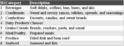 In addition to using asp:boundcolumn to bind a column of the DataGrid to a column of the data source, you can also use asp:buttoncolumn to insert a column with buttons that generate notifications. You can handle these notifications to perform predefined tasks such as selecting the item, removing it, and adding it to the shopping basket. You can also have asp:hyperlinkcolumn insert links to other pages in a column, asp:editcommandcolumn control editing of the selected row of data, or asp:templatecolumn customize the display of your column of data. There are a number of styles that you use to control the visual formatting of your DataGrid control. The HeaderStyle and FooterStyle, as the names imply, control the style for the header and the footer of the DataGrid. The ItemStyle, AlternatingItemStyle, SelectedItemStyle, and EditItemStyle are used for each type of items in the list. The PagerStyle controls the visual appearance and layout of the paging interface. The code-behind source file for binding data to the DataGrid is similar to that of the previous example. Basically, we bind the set of the DataSource property of the DataGrid to the DefaultView of the Categories table and perform the binding with the DataBind method: DataGrid1.DataSource = m_ds.Tables["Categories"].DefaultView; DataGrid1.DataBind( ); 7.7.2 DataListUnlike the DataGrid control, where the data binding is still in a tabular form, the DataList control allows to you lay out the list in any way[10] through the use of HTML templates.
Within a DataList tag, you can customize a number of templates. The templates that can be customized include:
Specific tags are used to set up the style for each type of items you want to display. Similar to the previous list, you also have ItemStyle, SelectedItemStyle, and so on. In the following example, we only show you one template, the ItemTemplate, which is applied to all items in the list. In this template, we use Web Form data-binding syntax to bind two properties of the data item, the CategoryID and CategoryName fields. In this simple template, the CategoryID will always be shown with Verdana font in size 10. You can also control the flow of the DataList by setting attributes such as repeatcolumns, repeatdirection (vertical, horizontal), or repeatlayout (flow, table): <asp:DataList id=DataList1 runat="server"
repeatcolumns=3
repeatdirection=Horizontal>
<AlternatingItemStyle BackColor="Gainsboro"/>
<ItemTemplate>
<font face=Verdana size=10>
<%# DataBinder.Eval(Container.DataItem, "CategoryID") %>
</font>
<%# DataBinder.Eval(Container.DataItem, "CategoryName") %>
</ItemTemplate>
</asp:DataList>
The code behind the data binding is shown here: DataList1.DataSource = m_ds.Tables["Categories"].DefaultView; DataList1.DataBind( ); Figure 7-10 shows the output of this DataList data-binding example. Figure 7-10. DataList data binding with template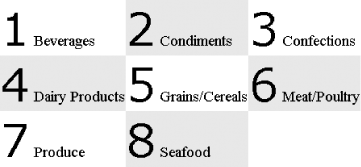 7.7.3 RepeaterThe ASP.NET Repeater control is completely driven by an HTML template to repeatedly display each of the data items bound to it. When the page renders, the Repeater control loops through all the records in the data source and generates HTML to display the record according to the HTML template. This is as free-form as you can get for data binding. You can have templates to generate bulleted lists, numbered lists, comma-separated lists, and tabs. Unlike the DataGrid or DataList that use an HTML table to control the layout of the data, the Repeater control does not add any HTML of its own. You can specify the layout however you want using the templates described below. There are only five templates in the Repeater control:
We will use two of these templates to control the display of the item and its separator. Again, we bind two fields of each item to the template. The end result is a comma-separated list of URLs that link another Web Form to display more detailed information about the clicked category. As you can see, we also use Web Form data-binding tags, <%# and %>, to perform the binding. The CategoryID fills the cat parameter of the query string to the fictitious DisplayCategory.aspx Web Form, and the CategoryName is the display text for the anchor tag. You could also replace the anchor tag and comma with graphical images to make your page more visually appealing: <asp:Repeater id=Repeater1 runat="server">
<ItemTemplate>
<A HREF="http://YourURL/DisplayCategory.aspx?cat=
<%# DataBinder.Eval(Container.DataItem, "CategoryID") %>"
><%# DataBinder.Eval(Container.DataItem, "CategoryName") %>
</A>
</ItemTemplate>
<SeparatorTemplate>, </SeparatorTemplate>
</asp:Repeater>
Figure 7-11 shows the result of using the data repeater to bind data. Figure 7-11. Data binding using repeater and template As with the other controls, the Repeater needs to be bound to a data source: Repeater1.DataSource = m_ds.Tables["Categories"].DefaultView; Repeater1.DataBind( ); As you can see, using a template to bind data to these list-bound controls can be very simple, yet powerful. However, you should be aware of how the generated HTML will look. You should not have complicated, bloated templates that will result in unappealing, large files. In web application development, the page size is directly proportional to the response time the customer experiences. |
| [ Team LiB ] |
|