| [ Team LiB ] |
|
2.2 Using Standard Control FeaturesThe Control class provides uniform management of all the standard facets of a control, including visual features such as color, caption, and typeface, dynamic features such as event handling and accessibility, and other standard behaviors such as layout management. There are two ways of using most of these features: at design time in the Windows Forms designer and at runtime from code. The Windows Forms designer allows most of the features of a control to be configured visually at design time using the Properties tab. (Also, certain common operations can be performed directly with the mouse; for example, the position of a control can be adjusted by dragging it.) However, this visual editing simply causes the designer to generate code. It just writes a class that creates control objects and manipulates their properties. Unlike earlier Windows development environments, .NET doesn't have dialog template resourceseverything is done in code. (The strings used in a form can be stored as resources, though, to support localization.) For example, dropping a button onto a form in the designer causes the following code to be added to the form's class definition for projects written in C#: private System.Windows.Forms.Button button1;
...
private void InitializeComponent()
{
...
this.button1 = new System.Windows.Forms.Button();
...
this.button1.Location = new System.Drawing.Point(8, 8);
this.button1.Name = "button1";
this.button1.TabIndex = 0;
this.button1.Text = "button1";
...
}
The corresponding code for projects written in VB is: Private WithEvents Button1 As System.Windows.Forms.Button Private Sub InitializeComponent() Me.Button1 = New System.Windows.Forms.Button() Me.SuspendLayout() ' 'Button1 ' Me.Button1.Location = New System.Drawing.Point(8, 8) Me.Button1.Name = "Button1" Me.Button1.TabIndex = 0 Me.Button1.Text = "Button1" ... End Sub So using the designer is functionally equivalent to writing the code by hand, although it is rather more convenient. The mechanisms through which we use controls are the methods, properties, and events that they expose (just as with any other component in .NET). The Windows Forms designer is effectively just a code generation mechanism. Because the programming model provided by the Control class is fundamentally important whether you use the forms designer or not, the following sections concentrate on this model. The following sections deal with the various aspects of a control that can be managed through the standard properties on the Control class. We will start by looking at how to set a control's size and position. Next, we will see how to control its appearance. Finally, we will see how to make our controls respond to input from the user. 2.2.1 Location, Location, LocationVisual components must occupy some space on the screen if they are to be visible. The Control class allows us to have complete control over the location and size of our UI elements, but it is also possible to get the Windows Forms framework to do some of the work for us. So first we will look at how to set the size and position of a visual component manually, and then we will see how to exploit automatic layout. 2.2.1.1 Position and sizePosition and size are fundamental features of all controls. We turn out to be spoiled for choice here, because Control provides several different representations of this information. For example, there is a Location property that allows the position of the top-left corner of the control to be set in screen coordinates as a Point (a value type containing a two-dimensional coordinate). The designer uses Location to position controls, as shown above. But we can also set the dimensions individuallythe following code is equivalent to what the Forms designer produced in the previous example: this.button1.Left = 8; this.button1.Top = 8; Control also provides Right and Bottom properties, although these are read-only because it is ambiguous whether changing these should leave the Left and Top properties as they are, thus changing the size, or whether they should move the control. Note that these properties define the control's position relative to its container. For example, when a form is moved, all the controls inside that form move with it, but the value of their Location (and associated properties) does not change. The size can also be set in various ways. The control will choose a default size for itself in its constructor, and it is best to use the constructor if possible, because resizing the control after creation is slightly slower. This is why the designer doesn't generate any code to set the button's size. But if we wish to set the size ourselves (maybe the default size is inappropriate), we can either set the Width and Height properties individually, or we can set the Size property: this.button1.Size = new Size(100, 50); The Size type is a value type similar to the Point type, but it is always used to denote something's size. We can also use the following code, which is functionally equivalent to the previous example: this.button1.Width = 100; this.button1.Height = 50; If we want to set both the position and the size, we can do so in one go with the SetBounds method: this.button1.SetBounds(8, 8, 100, 50); (The four parameters are equivalent to the Left, Top, Width, and Height properties.) It doesn't matter which of the various techniques you use to change a control's size and positionthey are all equivalent, so you can use whichever is most convenient. (As it happens, they all end up calling the same internal method in the current implementation of the .NET Framework.) Alternatively, you may decide to let the automatic layout facilities of Windows Forms set some of these properties. 2.2.1.2 Automatic layoutA control's size and position does not necessarily need to be set manually. It is possible for these properties to be controlled (or influenced) by automatic layout, using the Dock and Anchor properties. The Dock property allows a control's position and size to be managed by its containing window. This property is set to one of the six values in the DockStyle enumeration. The default value is None, which disables docking, but if any of the Top, Bottom, Left, or Right values is used, the control will attach itself to the relevant edge of the window, much like a docking toolbar. Setting it to Fill causes the control to fill the containing window completely. The effect of each option is illustrated in Figure 2-2. With docking enabled, the control's Location property does not need to be set, because it will always be at the edge of the window, wherever that may be. Figure 2-2. DockStyles in action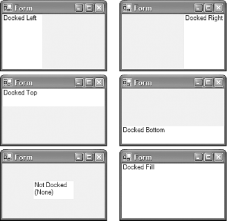 For the Left and Right docking styles, the Height property is managed automatically (it will be the same as the containing window). Likewise for the Top and Bottom docking styles, the Width property is determined by the containing window. If Fill is specified, the Width and the Height properties are both set by the containing window, so none of the position or size properties need to be set. (This is the only layout mode for which all aspects of the control's size and position are managed automatically.) Docking is not the only way of automatically arranging the contents of a window. A control may instead use its Anchor property to cause its size, position, or both to be updated when its containing window is resized. (Note that the Anchor property is used only if the Dock property is set to None.) This property is set with any combination of the flags in the AnchorStyles enumeration, which are Top, Bottom, Left, and Right. When the containing window is resized, the edges of the control specified in the Anchor property are kept a constant distance from the same edge of the window. The default is Top, Left, which means controls stay put as the window is resized, but changing its value to Top, Right causes the control to move with the righthand side of the window during resizing. If Top, Left, Right were specified, both the left and right edges of the control would follow the window edges, causing the control to be resized with the window. AnchorStyles also defines a None value to indicate none of the above. In this case, the control remains the same size, but as its container is resized, the control moves half of the distance that it is resized by. This allows controls to remain centered as the container resizes. Anchoring makes it very easy to produce dialogs that can be usefully resized. (This was very tedious with classic Windows programmingits dialog handling was not designed to perform dynamic layout.) Dialogs that have some central feature containing potentially large amounts of information (like the file list in the standard Open and Save File dialogs) can make this item resize as the window is resized, while any controls around the edge of the feature simply move with the window edges to accommodate it. This style of resizing can improve the usability of certain kinds of dialog considerably. It is easy to achieve with the Anchor property. Note that anchoring doesn't manage our position and size for us completely. We must still specify the initial position and size of each control; it will simply move and resize them for us thereafter. 2.2.2 AppearanceHaving gotten our control where we want it, next we want to make sure it looks how it should. We can determine the color of our UI elements. We can set the text and fonts they use. Some controls can have an image associated with them, and all controls can modify the appearance of the mouse pointer while it is over them. 2.2.2.1 ColorColor is managed by the ForeColor and BackColor properties. These are both of type Color, a value type defined in the System.Drawing namespace that allows the color to be specified in various ways. You can use known system colors, e.g., System.Drawing.SystemColors.ActiveCaption; if the user has customized her system colors, these color values will reflect those customizations. Alternatively you can specify standard web colors such as Color.LemonChiffon or Color.GoldenRod. Or you can just define custom colors from their RGB values, e.g., Color.FromArgb(255, 192, 192). (The "A" stands for Alphaa color's alpha value specifies transparency, but most controls don't honor transparent colors properly, so here we just use the default, i.e., a non-transparent color.) 2.2.2.2 TextThe Control class defines two properties relating to text: Text and Font. The Text property is a string containing basic text associated with a control. Most controls have a sensible use for this property (e.g., the contents of an edit box, the text in a label, or the caption on a button), but because not all controls display text, the property is simply ignored where it is not appropriate. The text's font is controlled by the Font property, which is a System.Drawing.Font object. The Font class has properties that allow all the normal font characteristics to be set, e.g., the typeface name (Name), emphasis (Bold, Italic, and Underline), and size (Size or SizeInPoints; both of these properties represent the size, but they do so in different units. Size is in design units, the units in which control positions and dimensions are specified. SizeInPoints is in points, a unit of measurement commonly used for defining font sizes.)
Note that all the properties of a font object are read-only. This means that you cannot change a control's font to be bold in the obvious way. For example, the statement: ctl.Font.Bold = true; will not compile. If you want to change the font, you must create a new font object, even if you want it to be almost identical to the existing font. (While inconvenient, this does reflect the underlying reality that changing to a different font is a fairly expensive operation, even if the new font is similar to the original.) If you are only changing one or more of the emphasis properties, there is a Font constructor that takes a prototype font and a FontStyle value. The FontStyle enumeration lets you specify any combination of Bold, Italic, Strikeout, and Underline, or just Regular if you want none of these. If you want to change anything else, you must use the more long-winded approach of reading all the existing font's properties, and then using these (modified appropriately) to create a new font. 2.2.2.3 ImagesThe BackgroundImage property allows an object of type Image (a bitmap or a metafile) to be set as the background of a control. If the image is too small to fill the control, it will be tiled to fill the space available. The Control class does not provide a property for a foreground image. However, there are several controls that support foreground images (Button, CheckBox, RadioButton, Label, and PictureBox), and these all allow the foreground image to be set with a property called Image, also of type Image. Several bitmap formats are supported. As well as standard Windows BMP and ICO files, the GIF, TIFF, JPEG, and PNG formats are also supported. Even animated bitmaps (for the formats that support animation) can be used. 2.2.2.4 Mouse cursorsIf the Cursor property is set, it causes the mouse cursor's appearance to change while it is over the control. The property is of type System.Windows.Forms.Cursor, and the easiest way to obtain an instance of this class is to choose one of the standard cursor types defined by the Cursors class. The Cursors class exposes all the standard cursor types, e.g., Cursors.WaitCursor or Cursors.AppStarting. You can also define a custom cursor. The Cursor class provides various constructors, one of which just takes the name of a CUR file. However, you will usually want to compile a cursor resource into the executable and use that rather than shipping separate cursor files with your program. The following C# code will obtain a cursor from a resource compiled into the executable: myCtl.Cursor = new Cursor(typeof(MyForm), "MyCursor.cur"); or in VB: myCtl.Cursor = New Cursor(GetType(MyForm), "MyCursor.cur") The first parameter must be a Type object for a type defined in the assembly that contains the cursor resource. In this case, we are using a type called MyForm, but it doesn't matter which class is used so long as it is in the same assembly as the resource. (It is just used by Cursor to determine which file the resource is stored in.) The second parameter must match the name of the cursor file that is being compiled into the component. If you are using Visual Studio .NET, a cursor file can be built into the assembly as a resource by adding it as an item to the project, and then setting that item's Build Type to Embedded Resource on the Properties tab. If you are not using Visual Studio. NET, you can simply tell the C# or VB compiler to embed the file as a resource by adding a /res:MyCursor.cur command-line switch. 2.2.3 Handling InputWe have seen how to arrange our components on the screen as we see fit, and to make their appearance meet our needs. But this would be a pointless exercise if our programs were unable to respond to the user, so next we will examine the three sources of user input: mouse input, keyboard input, and interaction through accessibility aids. We will also look at Windows Forms' validation features, which provide a way of checking that the input supplied by the user actually makes sense to the application. 2.2.3.1 Mouse InputMouse input is dealt with at two different levels: we can either be notified of the low-level events such as movement and button state changes, or we can be notified of higher-level concepts such as a click. (There is also special support for drag and drop, but we will deal with this later.) Two of the high-level mouse events are Click and DoubleClick. These are simple events that pass no special information, so they use the standard EventHandler delegate type in C#. As with all events raised by the Control class, the first parameter is the control object that raised the event, and for these particular events, the second parameter is always EventArgs.Empty (i.e., it is in effect unused). Handling these events is therefore straightforward. Example 2-1 shows the kind of C# code that the Visual Studio .NET Forms designer would generate to handle a Click event, while Example 2-2 shows the VB code generated by the Visual Studio .NET Forms designer. Example 2-1. Handling the Click event in C#private System.Windows.Forms.Button myButton;
...
private void InitializeComponent()
{
... myButton created and initialized in usual fashion ...
// Attach Click handler
myButton.Click += new EventHandler(myButton_Click);
... further initialization as usual ...
}
private void myButton_Click(object sender, System.EventArgs e)
{
System.Windows.Forms.MessageBox.Show(
"Please do not click this button again");
}
Example 2-2. Handling the Click event in VBFriend WithEvents myButton As System.Windows.Forms.Button
Private Sub InitializeComponent()
Me.myButton = New System.Windows.Forms.Button()
' ...further initialization as usual ...
End Sub
Private Sub myButton_Click(ByVal sender As Object, _
ByVal e As System.EventArgs) Handles myButton.Click
MsgBox("Please do not click this button again.")
End Sub
The DoubleClick event works in exactly the same way. Note that there is no significance to the name of the handler function in either C# or VB. There is a convention (used by the Forms Designer in Visual Studio .NET) that these names are of the form controlName_EventName, but this is not a requirementthe function name can be anything, it merely has to have the correct signature. The control simply calls whichever function we choose to initialize the delegate with in C#, or whatever method with the correct signature that has been designated as an event handler using the Handles keyword. The other high-level mouse events are MouseEnter, MouseLeave, and MouseHover. The first two are raised when the mouse pointer enters or leaves the area of the screen occupied by the control, and the last is raised if the pointer remains stationary over the control for more than about half a second. Note that between every MouseEnter/MouseLeave pair, you will never get more than one MouseHover event. Even if the mouse enters the control, hovers for a bit, moves a bit, and hovers again for a bit, the control remembers that it has already given you the hover event and won't give you a second one. As with the Click event, these all use the standard simple EventHandler, and supply no information other than the reference to the control raising the event (the sender parameter). Sometimes you will need to monitor mouse activity in more detail than this, so the Control class also provides a set of more low-level events. The MouseMove event is raised whenever the cursor is over the control and is moving. Button presses are handled by the MouseDown and MouseUp events, mouse movement is reported through the MouseMove event, and wheel rotation is indicated with the MouseWheel event. These events all share a special event handler type called MouseEventHandler, which is similar to the standard EventHandler, except the final parameter is a MouseEventArgs. The MouseEventArgs class provides properties that describe what the user just did with the mouse. These properties are predictable, if a little inconsistent. For example, there is a Button property that indicates which button's state just changed for the MouseDown and MouseUp events, but for the MouseMove event, it indicates what combination of buttons is currently pressed, while for the MouseWheel event it is always MouseButtons.None, regardless of what buttons may be pressed at the time. There is a Clicks property, which is either 1 or 2 to indicate a single- or double-click in the MouseDown event, and is otherwise always 0. The X and Y properties are always used to indicate the current position of the mouse, relative to the top-left corner of the control. There is also a property that is used only during the MouseWheel event. The Delta property indicates in which direction and how far the wheel was moved. At the time this book went to press, its value was always either 120 or -120, but it is possible that future wheel devices will provide more detailed input, so the values could be smaller. You should bear this in mind if you handle these events, or else your application will not behave correctly with such an input device. One strategy is to scale the effect of your responseso if you are scrolling a window, smaller Delta values should scroll the window less far. An alternative approach is to keep a cumulative total and only respond to these events once the total is larger than 120. Note that most of the built-in controls deal with this event for you, including any forms with the AutoScroll property enabled, so you only need to handle it if you need to do something unusual with the mouse wheel.
Note that the MouseWheel event is delivered to whichever control has the focus, even if the mouse is not over the control, whereas the other events are only delivered either when the pointer is over the control or was dragged out of the control. If a button is pressed while the cursor is over the control, the cursor is automatically captured until the button is released. This means that MouseMove events will be delivered while the button is held down even if the cursor leaves the control. It also guarantees that for every MouseDown event, a matching MouseUp event will be received, even if the mouse is moved away from the control before the button is released. (If you were used to working in the Win32 world, where this had to be done by hand, you are entitled to give a small cheer at this stage.) The .NET platform also makes certain guarantees about the order in which mouse events occur. Figure 2-3 shows the states that a control can be in with respect to mouse input, and which events it can raise in any given state. Figure 2-3. Mouse events state diagram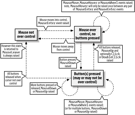 2.2.3.2 Drag and dropThe Control class supports participating in Windows drag-and-drop operations, both as a source and as a target. To act as a drop target, a control's AllowDrop property must be set to true. By default, this property is false, so if the user attempts to drag an item onto the control, the "no entry" cursor will be displayed, and no drag-and-drop events will be raised. But if this flag is set, the control will raise certain events whenever an item is dragged over it. The handlers for these events can then decide whether the mouse cursor should indicate that the control is a valid drop target. When the mouse first moves over the control during a drag operation (e.g., if a file is dragged from a Windows Explorer window), the control will raise the DragEnter event. This event, whose type is DragEventHandler, supplies a DragEventArgs object, which can be used to examine the item being dragged, and to determine whether the control would accept it if it were dropped. This is achieved by setting the Effect property on the DragEventArgs, which determines the kinds of drop the control is prepared to accept, (e.g., Copy, Link, or Move). By default, the Effect property is set to DragDropEffects.None, so unless your DragEnter handler changes it, the control will not behave as a potential drop target even if AllowDrop is true. The following C# code sets up a control to accept a copy of any kind of object: // In form initialization...
targetCtl.AllowDrop = true;
targetCtl.DragEnter +=
new DragEventHandler(targetCtl_DragEnter);
targetCtl.DragDrop +=
new DragEventHandler(targetCtl_DragDrop);
...
private void targetCtl_DragEnter(object sender, DragEventArgs e)
{
// Accept anything, so long as it is being copied
e.Effect = DragDropEffects.Copy;
}
private void targetCtl_DragDrop(object sender, DragEventArgs e)
{
MessageBox.Show("You dropped something");
}
The corresponding VB code is: ' In form initialization...
targetCtl.AllowDrop = True
...
Private Sub targetCtl_DragEnter(sender As Object, e As DragEventArgs) _
Handles targetCtl.DragEnter
' Accept anything, so long as it is being copied
e.Effect = DragDropEffects.Copy
End Sub
Private Sub targetCtl_DragDrop(sender As Object, e As DragEventArgs) _
Handles targetCtl.DragDrop
MsgBox("You dropped something")
End Sub
The DragEnter event handler has indicated that it is happy to be the target for a copy operation. This means that if the user drops an object on the control, the control will raise its DragDrop event. This event will only ever be raised if the control has explicitly changed the DragEventArgs.Effect property to something other than None during either the DragEnter or the DragMove event. And these events will only be raised if the AllowDrop property is true. Most applications are slightly pickier about what they accept than this code, because they want to know if they can actually do anything with the object before deciding to receive it. You can find out about the nature of the object being dragged from the DragEventArgs.Data property. This property is an IDataObject interface that allows us to find out which formats the object can present itself in. Most drag-and-drop objects are able to present themselves in several different waysfor example, selected text dragged from an Internet Explorer window can be accessed through IDataObject as (among other things) plain text, RTF, and HTML. The following variation on the previous C# code makes the control receptive only to drop objects in one of these three formats. If a suitable object is dropped, it will be displayed in whichever of these three formats the object supports: private void targetCtl_DragEnter(object sender, DragEventArgs e)
{
// Only accept the object if we can access it
// in a format we understand
if (e.Data.GetDataPresent(DataFormats.Text) ||
e.Data.GetDataPresent(DataFormats.Rtf) ||
e.Data.GetDataPresent(DataFormats.Html))
{
e.Effect = DragDropEffects.Copy;
}
}
private void targetCtl_DragDrop(object sender, DragEventArgs e)
{
if (e.Data.GetDataPresent(DataFormats.Text))
{
string text = (string) e.Data.GetData(DataFormats.Text);
MessageBox.Show(text, "As Text");
}
if (e.Data.GetDataPresent(DataFormats.Rtf))
{
string text = (string) e.Data.GetData(DataFormats.Rtf);
MessageBox.Show(text, "As RTF");
}
if (e.Data.GetDataPresent(DataFormats.Html))
{
string text = (string) e.Data.GetData(DataFormats.Html);
MessageBox.Show(text, "As HTML");
}
}
The corresponding VB code is: Private Sub targetCtl_DragEnter(sender As Object, e As DragEventArgs) _
Handles targetCtl.DragEnter
' Only accept the object if we can access it
' in a format we understand
If e.Data.GetDataPresent(DataFormats.Text) Or _
e.Data.GetDataPresent(DataFormats.Rtf) Or _
e.Data.GetDataPresent(DataFormats.Html) Then
e.Effect = DragDropEffects.Copy
End If
End Sub
Private Sub targetCtl_DragDrop(sender As Object, e As DragEventArgs) _
Handles targetCtl.DragDrop
If e.Data.GetDataPresent(DataFormats.Text) Then
Dim text As String = CStr(e.Data.GetData(DataFormats.Text))
MessageBox.Show(text, "As Text")
End If
If e.Data.GetDataPresent(DataFormats.Rtf) Then
Dim text As String = CStr(e.Data.GetData(DataFormats.Rtf))
MessageBox.Show(text, "As RTF")
End If
If e.Data.GetDataPresent(DataFormats.Html) Then
Dim text As String = CStr(e.Data.GetData(DataFormats.Html))
MessageBox.Show(text, "As HTML")
End If
End Sub
If you add these event handlers to a control in a project of your own, you will find that if you attempt to drag a file onto the control from Windows Explorer, the control will refuse to accept it. This is because Windows Explorer does not present its files in any of the three formats this code happens to accept. But if you drag in selected text from IE or Word, it will appear in all three formats, while text dragged from Visual Studio .NET will appear as just plain text and RTF. This code illustrates the use of standard formats defined in the DataFormats type. This type contains static fields for each of the predefined formats recognized by the framework. These fields are strings containing the names of the formats; e.g., DataFormats.Html is simply the string constant "HTML Format". But you can pass other strings to IDataObject.GetDataPresent; a nonstandard string will be interpreted as the name of a custom format. This nonstandard string might be a custom format defined by some other application you wish to interact with. Or it could be your own custom format that you have designed to associate the information you choose with your data. Custom formats local to your application can be useful if you are acting as both a source and a target, because they let you associate any data you want with a drag-and-drop operation. (See below for using the DoDragDrop method to initiate a drag-and-drop operation). Sometimes you may want to change whether your target accepts a particular object continuously as the mouse moves, rather than just when it first moves over your control. For example, you might want only certain areas of the control to be a target. (This is particularly common for user-drawn controls.) If this is the case, the DragOver event is useful, because it is raised repeatedly while the cursor is dragging an object over your control. You can modify the Effect property each time this event is raised to indicate whether your object will accept a drop right now. The DragEventArgs object provides X and Y properties to indicate the position of the mouse, and a KeyState property indicating the current state of modifier keys (Shift, Ctrl, and Alt), which may be useful in determining whether the control should accept an object at any particular instant. Sometimes it is useful to know when a control has stopped being considered a potential drop targetmaybe the user cancelled the drag by hitting Escape, or has simply moved the mouse cursor away from the control. This is useful if your control changes its appearance while it is a potential drop target (e.g., Windows Explorer highlights EXE files when you drag other files over them). You'd want such a control to set its appearance back to normal when it ceases to be a target. The Control class provides a DragLeave event that is raised when this happens. This event uses the standard simple EventHandler delegate type, rather than the DragEventHandler used by all the other drag-and-drop events. This is because the event is raised to inform you that you are no longer involved in this drag-and-drop operation, so providing you with a DragEventArgs object would be pointless. The Control class also provides the DoDragDrop method, which allows a control to act as the source of a drag-and-drop operation. The simplest way to use this method is to pass the information to be dragged either as a String, a Bitmap, or a Metafile (these are all classes provided by the .NET Framework), along with a set of DragDropEffect flags indicating what kinds of drag operations are permitted. (The flags passed here will be reflected in the DragEventArgs.Effects property seen by drop targets.) The following C# code (the VB code would be almost identical, except for slight syntactic differences) will allow a string to be dragged into any application that allows text to be dropped into it (e.g., Microsoft Word): // MouseDown event handler for some control
private control_MouseDown(object sender, MouseEventArgs e)
{
control.DoDragDrop("Hello, world!", DragDropEffects.Copy);
}
When you use String, Bitmap, or Metafile objects like this in a drag-and-drop operation, the framework automatically presents them using the appropriate data formats (such as DataFormats.Text and DataFormats.UnicodeText for String, or DataFormats.MetafilePict and DataFormats.EnhancedMetafile for Metafile). This is convenient, but not very flexible. A more powerful approach is to use the DataObject class, which lets you start drag-and-drop operations with objects that can present themselves in as many different data formats as you like, including custom formats. It is used as follows: DataObject obj = new DataObject();
MyType t = new MyType("Hello!");
obj.SetData("My custom format", t);
obj.SetData("Hello!");
obj.SetData(bmpMyBitmap);
myControl.DoDragDrop(obj, DragDropEffects.Copy);
The corresponding VB code is: Dim obj As New DataObject()
Dim t As New MyType("Hello!")
obj.SetData("My custom format", t)
obj.SetData("Hello!")
obj.SetData(bmpMyBitmap)
myControl.DoDragDrop(obj, DragDropEffects.Copy)
Any number of data formats, standard or custom, can be attached to a single DataObject. Here, we are passing some data in a custom formatan instance of some class MyTypeas well as providing some standard formats by passing a String and a Bitmap. The control on which DoDragDrop was called can raise events to notify us of the progress of the drag operation. The GiveFeedback event is raised repeatedly during the operation, and it uses the GiveFeedbackEventHandler delegate type. The GiveFeedbackEventHandler delegate passes a GiveFeedbackEventArgs object, which allows the Effect property to be changed (e.g., this might change between DragDropEvent.Copy and DragDropEvent.Move according to which modifier keys are pressed). It also allows the mouse cursors to be changed. By default, the standard system drag-and-drop cursors are used, but setting the GiveFeedbackEventArgs.UseDefaultCursors property to false disables this, allowing the source control to set the cursor itself. It can do this by modifying the Cursor.Current static property. The source control also repeatedly raises the QueryContinueDrag event to allow the operation to be cancelled if necessary. The QueryContinueDrag event uses the QueryContinueDragEventHandler delegate, which supplies a QueryContinueDragEventArgs object. QueryContinueDragEventArgs allows the drag to be cancelled or completed by setting its Action property to either DragAction.Cancel, or DragAction.Drop. For convenience, it also provides the current state of the modifier keys through its KeyState property, and an EscapePressed flag indicating whether the user has attempted to cancel the drag by pressing escape. 2.2.3.3 Keyboard inputOf course, not all input comes from the mouse. As you would expect, Windows Forms also provides extensive support for handling keyboard input. There are three events associated with keyboard input. Two of these, KeyDown and KeyUp, provide information for each individual key that is pressed. The third, KeyPress, deals with character-level input from the keyboard. For example, if the user holds down the Shift key and presses the A key, there will be a KeyDown and a KeyUp event for each key. But because this combination of keys corresponds to only a single character, a capital A, there will be just one KeyPress event. If the user presses and releases only the Shift key, there will be no KeyPress event at all, just a KeyDown and a KeyUp. Keyboard autorepeat is reflected through these messages. Each time a character is repeated, an extra KeyDown and (unless the current keys held down don't generate characters, e.g., just the Shift key is pressed) an extra KeyPress are raised. However, a KeyUp event is raised only when the key really is released. The KeyUp and KeyDown events both use the KeyEventHandler delegate. As always, the first parameter of the event handler function is the control raising the event, but the second parameter is a KeyEventArgs object. The KeyEventArgs class describes the key being pressed, using an entry from the Keys enumeration, which defines a value for every key on the keyboard. KeyEventArgs presents this information in a variety of ways: the KeyCode property is the Keys value for the key being pressed, and the KeyData property is the same value but with any modifier keys added. (So for Shift-A, for example, KeyCode would be Keys.A, but KeyData would be Keys.A|Keys.Shift or Keys.A Or Keys.Shift). The modifier keys themselves are presented individually through the Alt, Control, and Shift properties, or combined through the Modifiers property. For example, consider the following C# code: // for debug output
using System.Diagnostics;
...
private void InitializeComponent()
{
...
myControl.KeyDown += new KeyEventHandler
(myControl_OnKeyDown);
...
}
...
private void myControl_OnKeyDown(object sender, KeyEventArgs e)
{
string dbg = string.Format("KeyCode: {0}, KeyData {1}",
e.KeyCode, e.KeyData);
Debug.WriteLine(dbg);
}
or the following VB code: ' for debug output
Imports System.Diagnostics
...
Private Sub myControl_OnKeyDown(sender As Object, e As KeyEventArgs) _
Handles myControl.KeyDown
Dim dbg As String = String.Format("KeyCode: {0}, KeyData {1}", _
e.KeyCode, e.KeyData)
Debug.WriteLine(dbg)
End Sub
As an aside, this code illustrates a couple of interesting features of the .NET Framework Class Library. The Debug class, which is defined in the System.Diagnostics namespace, lets us send output to the debugger. In Visual Studio .NET, anything we print with Debug.WriteLine will appear in the Output window. (And in non-debug builds, the compiler is smart enough to omit these calls.) To build the debug output string we are using the System.String (in C# this corresponds to the string and in VB to the String data types) class's Format method to build a string in a style similar to the C printf function. The numbers in braces refer to parameters following the string. Because all data in the CLR has type information associated with it, the Format method can discover that it has been passed parameters whose types are both of type Keys. So rather than displaying numbers, the debug output will actually show the enumeration members by name. For example, for a Shift-A key press, we would see the following debug output: KeyCode: ShiftKey. KeyData: ShiftKey, Shift KeyCode: A. KeyData: A, Shift The first line is for the Shift key. Notice that the KeyCode property just contains the key that was pressed. The KeyData property is a little surprising. As mentioned above, it contains both the key code and any modifier keys. The surprising thing is that there are two values in the Keys enumeration to represent the Shift keyone as a modifier (Keys.Shift) and one as a key press (Keys.ShiftKey). The second line is for the second event, raised when the A key is pressed. Again, the KeyCode property describes the single key for which this event was raised, but the KeyData member shows it in conjunction with the modifiers. The KeyPress event's type is KeyPressHandler, which supplies a KeyPressEventArgs object. This supplies a KeyChar property (of type char), which is the character value of the key press. Both KeyPressArgs and KeyPressEventArgs have a bool or Boolean member called Handled. Setting this to true when handling the KeyPress event prevents the default handling of the key press; e.g., this blocks input to a text box. It appears to have no effect for the KeyDown or KeyUp events. It is possible to read the state of the Shift, Ctrl, and Alt keys without handling these messages. This is particularly useful for handling certain mouse events, because their behavior is often changed by the use of these modifier keys. For example, when selecting items from a list, any previous selection is usually cleared each time the user clicks, unless he is holding down the Shift key. The Control class provides a static property called ModifierKeys that allows the current state of these keys to be read at any time. (It returns a value of type Keys, but this only contains some combination of Keys.Shift, Keys.Control, and Keys.Alt.) This means it is not necessary to handle keyboard events just to read the state of the modifier keys. 2.2.3.4 AccessibilityWindows has a technology called Active Accessibility that supports accessibility aids (programs designed to enable people with disabilities to use computers more effectively). It provides programs such as screen readers and speech interpreters with a programming interface that lets them find and interact with user interface elements. All the standard Windows controls provide accessibility information automatically, as do their .NET counterparts, so if a user interface consists entirely of standard controls, these will already expose information to accessibility aids, such as their screen location and any text they contain, as well as provide programmatic ways to perform the operations they support (e.g., clicking on a button). For some applications, this built-in accessibility is not sufficientaccessibility aids cannot automatically pick up certain visual cues such as the juxtaposition of controls or the contents of bitmaps. Such user interfaces may need to be annotated with extra textual hints if they are to be usable through accessibility aids, so the Control class has features that enable the standard basic support to be extended. This is important for nonstandard user interface elements such as custom controls. It may also be necessary to extend the basic support to make complex forms usable, even if all the individual controls on those forms are standard. The name and role can be specified by setting the control's AccessibleName and AccessibleRole properties. AccessibleName is just a string, whereas the AccessibleRole property uses an enumeration type, also called AccessibleRole, that defines values for all the standard roles listed by the Active Accessibility API. Sometimes the name and role are not sufficient to describe the purpose of a control (e.g., there is a further visual cue, such as a bitmap that would normally be used to infer the button's purpose, or its position relative to other controls). Consider a simple application whose user interface is show in Figure 2-4. This program is an example of a Chi Squared test being used in some hypothetical study to determine whether there is any correlation between where programmers place the { character in their source code and whether they use spaces or tabs for indentation. (The Chi Squared test is a very common kind of statistical toolit determines the likelihood that two properties are connected. A discussion of the details is beyond the scope of this book, but suffice it to say that you simply plug in figures for how your sample population breaks down, and it returns the probability that such figures could have emerged by chance without there being some underlying connection.) Figure 2-4. Application with potential accessibility problems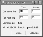 Anyone who is familiar with simple Chi Squared tests will instantly recognize the layout and know what information is expected. And it will not take long for someone unfamiliar with them to realize that the first text box should contain the number of people surveyed who put their { on the same line as their function declarations and also use tabs to indent code, while the next box should contain the number of people who put the { on the same line as the declaration, but who use spaces to indent their code, and so on. The problem with this example is it relies on the user being able to see the layout in order to work out what each textbox is for. This is unfortunate because it is difficult for accessibility aids to deduce the role of a text box from its position, so it might be hard for a visually impaired user to use this program. Fortunately, we can control the information available to an accessibility aid, so we can adapt this program to be useful without relying on the information implicit in the visual layout of the form. To understand how we can make such programs accessible, it is important to understand exactly what information is available to accessibility aids. Controls present certain properties to accessibility clients. (Accessibility clients are any programs that read accessibility information. This includes all accessibility aids, the accessibility explorer supplied in the Accessibility SDK, and may even include automated test software.) The most important of these are the name, role, and optional values, because they supply the same information that visual cues provide. For example, the two buttons on the form in Figure 2-4 would have the names Close and Calculate, respectively, and both would have the role AccessibleRole.PushButton. (Buttons don't have values.) For a text box control, the role is AccessibleRole.Text and the value is simply the text in the field, but it is less obvious where its name comes from. By default, a text box takes its name from the nearest label control in the tab order. For many applications, this is perfect: a text box usually has a label indicating its purpose, and it is usually just before it in the tab order to make sure that any accelerator key assigned to the label ends up moving the focus to the text box. But for this application, this default behavior is not good enough. Multiple text boxes end up picking up the same name (for instance, there are two named "{ on next line"), and in any case, these names are not particularly informative. So this application should name these controls explicitly. This can be done by setting the AccessibleName property; doing so in the designer adds the following code in C#: this.textBoxAY.AccessibleName = "Same line and Spaces"; or this code in VB: Me.textBoxAY.AccessibleName = "Same line and Spaces" Accessibility clients will now be given this text as the name of the control. This should be done for all controls where the default name is not appropriate. In this example, that would mean all the text boxes, and also the label controls showing the output (the ones in bold in Figure 2-4). In addition to having a name, all controls have a role, which can be set by the AccessibleRole property. Its value is one of those listed in the AccessibleRole enumeration type, which defines values for all the standard roles listed by the Active Accessibility API. For the standard controls, the default value of the role is usually appropriate, but sometimes it might need to be modifiedfor example, a button might bring up a menu when clicked, so its role should be AccessibleRole.ButtonMenu, not the default AccessibleRole.PushButton. Sometimes the name and role are not sufficient to describe the purpose of a control. In this case, the control can also supply a textual description, which is set by the AccessibleDescription property. You would normally try to keep the control's name short because it would typically be read out by default by a screen reader. So the description is the appropriate place for a more verbose description. Controls also indicate their default action, i.e., what would happen if the control were to be clicked right now. For example, the standard checkbox control sets this property according to its current state: if it is unchecked, a click on the control checks the box, so its default action is Check, whereas if it is currently checked, its default action is Uncheck. Buttons set this value to Press, and some controls (e.g., text boxes) have no default action. You can supply your own string by setting the AccessibleDefaultActionDescription property. To control any of the other accessibility features (e.g., the value property or the screen area the control claims to occupy) there is a more powerful but slightly more cumbersome mechanism. Each control has an AccessibleObject property, providing access to an object of type AccessibleObject. This object is the liaison between the control and the Active Accessibility APIit is through this object that all accessibility properties are presented. You will not normally use AccessibleObject on a standard control, but for custom controls it may be necessary, particularly if it can supply meaningful values for the Value property. (Value is a text string representing the control's value; for a text box this property is the text in the control, for example.) It is even possible to supply your own AccessibleObject. The object is created on demand, using the control's CreateAccessibilityInstance method; custom controls can override this and supply their own objects, which must derive from AccessibleObject. For example, if you wish to perform your own hit testing for accessibility, you must supply your own AccessibleObject. It is also necessary to do this if you wish to supply your own setting for the State property. (State contains some combination of the flags in the AccessibleStates enumeration, which defines values such as Checked and Pressed. It is a read-only property, so you must provide your own AccessibleObject implementation to modify it.) The Control class also supports a property called IsAccessible. According to the documentation, if this is false, the control will not be visible to accessibility clients. However, this property is ignored. It is a relic from an older version of the Windows Forms framework that, for some reason, was not removed before the first public release. All controls are visible to accessibility clients, regardless of their IsAccessible setting. As well as allowing accessibility clients to navigate through the controls in a window, the Active Accessibility API also provides a notification framework, so that accessibility clients can know when certain events happen, such as when the focus changes, or when the appearance of a control changes. Again, most of the work here is done automaticallyall the built-in control types raise the appropriate events on your behalf. However, you can raise these events manually, by calling the protected AccessibleNotifyClients method on the Control class. This requires you to derive from Control, but because you would normally only need to raise accessibility events manually from a custom control, this is not normally a problem. Alternatively, you can retrieve the control's AccessibleObject and cast it to Control.ControlAccessibleObjectthe accessibility object is of this type unless you supply your own. This provides a NotifyClients method that does the same thing as AccessibleNotifyClients. 2.2.3.5 ValidationWe have now seen the various ways of getting input from the user. But the Windows Forms framework can go further than thisit can help us verify that the input we are given is correct, and if it is not, to alert the user. It is common for an application to want to apply constraints to fields on a form. This might be as simple as requiring that a particular field is not blank, or it might be a little more sophisticated, such as checking that a field's contents match some pattern, or do not exceed certain limits. Windows Forms has support for such validation, and it also supplies a mechanism for providing visual notification of errors. These two mechanisms can be used independently of each other. This is useful because the validation architecture can be a little too simple for some applications. In particular, once an error has been detected, it can impose unreasonable restrictions on what the user can do until the problem is fixed. (It effectively enforces modal behavior for offending datayou must fix the input before you are allowed to do anything else.) The error-reporting mechanism is rather more flexible than this. There are two events directly connected with validation. The Validating event is raised when a control is asked to validate its contents, and the Validated event is raised after its contents have been successfully validated. If the contents are not acceptable, the handler for the Validating event can indicate this, causing the validation process to fail. The handler is of type CancelEventHandler, and this passes a CancelEventArgs object. Setting the Cancel flag to true on this object causes the validation process to fail, and the Validated event will not be raised. Note that the control may have its own internal rules for validation, which apply in addition to any rules you write in your Validating event handler. So even if you don't cause the Validation event to fail, the Validated event might not be raised. So what causes a control to be validated in the first place? Validation is always managed by the ContainerControl in which the control lives, which is typically (but not always) the Form. We can ask a container to validate the control with the input focus by calling its Validate method. However, this is usually done automatically as a result of a focus change eventwhenever a new control is given the focus, its parent container checks to see if its CausesValidation property is true (which is the default). If this property is true, the container automatically checks to see if there is some other control on the form that requires validation and, if so, validates it. (This only ever validates a single control; nothing will ever cause all the fields to be validated at once.). In fact, the CausesValidation property performs two functions. Not only is it used when a control acquires the focus to decide whether validation needs to occur, it is also used to determine whether the control that just lost the focus should be validated. The Validating and Validated events are raised only on controls whose CausesValidation property is true, and when the focus moves to a control that also has its CausesValidation property set to true. This raises an interesting scenario: what happens if the focus is on a control that requires validation (CausesValidation is true, and it has a handler attached to the Validating event) and the focus is then moved to a control for which CausesValidation is false? The newly selected control will not cause validation to occur, so is the original control simply forgotten about? Fortunately not, because in this case, the ContainerControl remembers that there is a control that has not yet been validated, and will deal with it next time validation occurs (i.e., when something calls Validate on the container, or when the focus moves to a control whose CausesValidation property is true). This dual-purpose nature of CausesValidation means that the ContainerControl will only ever validate a single child control during a validation operation. There will never be a list of controls pending validation. To be validated, a control's CausesValidation flag must be true, which also ensures that any pending validation is performed before it acquires the focus, so there can never be more than one control waiting for validation at any time. If the Validate method is called when there is no control pending validation, the active control will be validated instead, unless its CausesValidation flag is false, in which case nothing will happen. If nested containers are in use (e.g., you are using a user controlsee Chapter 5 for details), validation is slightly more complex. Once the control has been validated, its containing parent is also validated, and if there is further nesting, validation continues up the chain, stopping when the container that initiated validation is reached. (A container that starts a validation operation will never validate itself, it will only validate one of its child controls.) So, what happens if our control is not valid, and we fail the Validating event by setting the Cancel property to true in the CancelEventArgs object? When the relevant control is validated (e.g., the Validate method is called explicitly, or the focus is moved away from the control), validation will now fail. This will cause the focus to remain with the control, indicating to the user that something is wrong. The user will not be able to move away from the control without modifying it so that it validates correctly. If the user is unable to work out what is wrong with the control's contents, she will never be able to move the focus away from the control! (There is an emergency escape routethe user can still access any controls whose CausesValidation property is set to false.) This simple approach to validation may be sufficientif the nature of the error in the user input is sufficiently obvious, simply keeping the focus on the offending item will be enough to prompt the user into fixing it. However, this will not always be the case, so the framework provides a class to be used in this situation. The ErrorProvider class provides feedback to the user that something is wrong with her input. Here is a slightly more useful version of the validation code written in C#: private ErrorProvider errorProvider =
new ErrorProvider();
...
private void textbox_Validating(object sender, CancelEventArgs e)
{
string errText = "";
if (textbox.Text.Length == 0)
{
e.Cancel = true;
errText = "This field must not be empty";
}
errorProvider.SetError(textbox, errText);
}
Here is the corresponding Visual Basic code: Private errProvider As New ErrorProvider()
Private Sub textbox_Validating(sender As Object, e As CancelEventargs) _
Handles textbox.Validating
Dim errText As String = ""
If textbox.Text.Length = 0 Then
e.Cancel = True
errText = "This field must not be empty"
End If
errProvider.SetError(textbox, errText)
End Sub
If the user tries to leave this field with its contents empty, it will fail validation, and the focus will remain with the field. But in addition, the field will now have an indicator next to it. (By default, this is an exclamation mark inside a small red circle, but you can supply your own icon if you wish.) If the user moves the mouse over this or clicks it, the error text will appear in a tool tip. Once some error text has been set on an error provider, it stays there until it is explicitly removed, so once your control has been validated successfully, you must clear any errors you set by passing an empty string to ErrorProvider.SetError. In this example, we deal with this by always calling SetError in the Validating event handler, passing an empty string if validation succeeds. Another approach is to handle the Validated event and clear the error text there. Remember that validation will only be applied to controls that have had the focus at some point. If you initialize your form with invalid data (e.g., you leave fields blank, and those fields must be filled in), automatic validation will not detect this unless the user happens to move the focus into the invalid fields. If you need to make sure that the user fills in several initially blank fields, you will need to add code to check this yourself. And more generally, any form-wide constraints must be checked manually; for example, if there are integrity constraints that require two or more fields to be consistent with each other, the automatic validation architecture cannot help here. The ErrorProvider class can still be used to provide feedback though. It is able to provide error indicators on several controls simultaneously, which is useful in these situations. It is important to make sure your form cannot enter a state in which it can never be validated. For example, opening a modal dialog that requires a field to correspond to information in a database is dangerous if the relevant table might ever be empty. The user might not be able to close the dialog to populate the table.[1] Even if the table is not empty, the user might want to use some other part of your UI to find out what he should type, but won't be able to. Once a control has the focus, if it fails the Validating event, any attempt to click anywhere else will fail by default, because the focus will not leave the invalid field. As mentioned above, you can work around this by setting the CausesValidation property to false on any buttons that you want to be accessible while a field is failing validation. (Note that by default this property is true.) For example, if your control has a Cancel button, it should almost certainly have this flag set to false; otherwise, the user will not be able to dismiss a form she cannot fill in. Also, if the user might need to use certain parts of the UI to get the information she needs to fill in the form correctly, it is vital that the CausesValidation properties are set to false, because otherwise they will be inaccessible when the user needs them most.
|
| [ Team LiB ] |
|
