| [ Team LiB ] |
|
12.5 ASP.NET Data BindingASP.NET data binding differs dramatically from Windows Forms data binding. The key difference is that ASP.NET data binding takes place on the server side when the page is loaded. However, there is no mechanism to apply the data binding to the rendered HTML page that is sent to the user. Thus, there is no way to implement synchronized controls or editable data objects (although this can be simulated). ASP.NET binding is strictly one-way; data can flow from a DataSet into a control but not vice versa. Because of a web application's stateless nature, ASP.NET data binding is less powerful than Windows Forms data binding. However, ASP.NET makes up for the loss by including several advanced template-based controls, such as the DataGrid, DataList, and Repeater. These controls have a much more customizable interface and offer many features the Windows DataGrid doesn't. The data binding process in an ASP.NET page works like this:
It helps to think of ASP.NET data binding as a quick and flexible way to populate controls with information from a database. It can't create the same sort of "record-browsers" that are possible with Windows Forms because there is no synchronization method for the controls. To implement functionality similar to what is available in Windows Forms, you have to handle control events and continuously post back the page whenever a selection changed. 12.5.1 List BindingASP.NET list binding works with the ListBox, DropDownList, CheckBoxList, and RadioButtonList web controls, and the HtmlSelect server-side HTML control (which represents the HTML <select> element). The syntax required is similar to Windows Forms list binding, but the DisplayMember property is replaced with the equivalent DataTextField property. The ValueMember property is replaced with the equivalent DataValueField property. The DataValueProperty property is typically much more important for web programmers than the ValueMember property is for Windows programmers, because there is no way to access the original data source of a control (for example, the original DataSet used to fill the control) during a postback. Here's an example that binds data to a list control when a page is first loaded. Figure 12-9 shows the page. private void Page_Load(object sender, System.EventArgs e)
{
string connectionString = "Data Source=localhost;" +
"Initial Catalog=Northwind;Integrated Security=SSPI";
string SQL = "SELECT * FROM Customers";
// Create ADO.NET objects.
SqlConnection con = new SqlConnection(connectionString);
SqlCommand com = new SqlCommand(SQL, con);
SqlDataAdapter adapter = new SqlDataAdapter(com);
DataSet ds = new DataSet("Northwind");
// Execute the command.
try
{
con.Open();
adapter.Fill(ds, "Customers");
}
finally
{
con.Close();
}
// Display the results.
lstContactName.DataSource = ds.Tables["Customers"];
lstContactName.DataTextField = "ContactName";
lstContactName.DataValueField = "CustomerID";
lstContactName.DataBind();
}
One important difference with this data-binding code is that you must call the DataBind( ) method of the ListBox to activate the binding. It's at this point that the information is copied from the DataTable to the list control. If you omit this step, the page is rendered without any information in the ListBox. Alternatively, you can call the DataBind( ) method of the web page, which triggers the DataBind( ) method of every contained control. Figure 12-9. A data-bound web control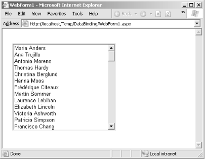 If you look at the source code for this HTML page, you'll see that it includes names and ID hidden values. The following code is the shortened HTML markup for the list control. <select name="lstContactName" id="lstContactName">
<option value="ALFKI">Maria Anders</option>
<option value="ANATR">Ana Trujillo</option>
<option value="ANTON">Antonio Moreno</option>
<option value="AROUT">Thomas Hardy</option>
<option value="BERGS">Christina Berglund</option>
<option value="BLAUS">Hanna Moos</option>
<option value="BLONP">Frédérique Citeaux</option>
<!-- Other items omitted. -->
</select>
On a postback, you can retrieve the text of the selected item from the ListBox.SelectedItem.Text property and the value attribute from the ListBox.SelectedItem.Value property. 12.5.2 ASP.NET Templated Data ControlsASP.NET does a lot with its small set of advanced data-binding controls: the DataList, DataGrid, and Repeater, which are outlined in Table 12-5. These controls allow you to provide repeating lists or grids that can display more than one column of information at a time. These controls also give you the ability, through templates, to incorporate any other ASP.NET controls, such as a TextBox, Label, and so on. You can bind these controls to a field in the current row using embedded data-binding expressions in the .aspx markup code.
The full range of features of these three controls is beyond the scope of this book. The remainder of this chapter presents an example of how you can implement a simple data-bound DataList control with basic selection ability. For more information about ASP.NET data binding, refer to ASP.NET In a Nutshell by G. Andrew Duthie and Matthew MacDonald, or Programming ASP.NET by Jesse Liberty and Dan Hurwitz, both of which are available from O'Reilly. 12.5.3 The DataListThe DataList works using templates. A template is a block of HTML that allows you to define the content and formatting for part of a control. For example, you might create an item template to define how each item in the list should be formatted, and what data should be inserted. This item template is reused for each DataRow in a DataTable. You must enter template information manually in script form. This means you have to modify the user interface code in the .aspx portion of your web page. Currently, Visual Studio .NET doesn't include any wizards or tools that can automate this task. For example, the .aspx markup for a blank DataList is shown next. The item template is defined, but no content has been added. <asp:DataList id=listCustomers runat="server"> <ItemTemplate></ItemTemplate> </asp:DataList> To transform this into a more useful control, you need to define the exact HTML tags and controls that should be used for every item. To do this, you use data-binding expressions, which identify the fields that will be displayed from the database. Data binding expressions are enclosed and delimited by special characters: <%# and %>. Here's a simple example that shows a DataList displaying the CustomerID field: <asp:DataList id=listCustomers runat="server">
<ItemTemplate>
<%# DataBinder.Eval(Container.DataItem, "CustomerID") %>
</ItemTemplate>
</asp:DataList>
If you execute this code and examine the rendered HTML code, you'll discover a simple list of customer ID values delimited inside an HTML table: <table id="listCustomers" cellspacing="0" border="0" style="border-collapse:collapse;"> <tr><td>ALFKI</td></tr> <tr><td>ANATR</td></tr> <tr><td>ANTON</td></tr> <tr><td>AROUT</td></tr> <tr><td>BERGS</td></tr> <tr><td>BLAUS</td></tr> <!-- Other entries omitted. --> </table> You can also define a more appealing display format and combine several pieces of information: <asp:DataList id=listCustomers runat="server">
<ItemTemplate>
<font face="Verdana" size="2"><b>
<%# DataBinder.Eval(Container.DataItem, "CustomerID") %>
<%# DataBinder.Eval(Container.DataItem, "CompanyName") %>
</b></font><br>
<font face="Verdana" size="1"> Contact Title:
<%# DataBinder.Eval(Container.DataItem, "ContactTitle") %><br>
Contact Name:
<%# DataBinder.Eval(Container.DataItem, "ContactName") %><br>
Address:
<%# DataBinder.Eval(Container.DataItem, "Address") %>
</font><br><br>
</ItemTemplate>
</asp:DataList>
Figure 12-10 shows the rendered output. Figure 12-10. DataList output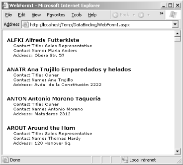 12.5.4 Templates and StylesThe item template isn't the only template offered by the DataList control. To further specify formatting, you can add up to seven different templates, as described in Table 12-6.
Templates aren't the only way to configure the appearance of the DataList. You can also use styles. Styles define a broad range of formatting information that applies to all the content in a given template. For example, you can configure the appearance of a header template by using a header style. Each style has a significant amount of associated information, allowing you to set background and foreground colors, borders, fonts, and alignment. Every template has a corresponding style. The available DataList styles are:
A simple style tag looks like a single tag, with a number of formatting-related attributes. Each attribute corresponds to a property of the TableItemStyle class, which inherits most of its properties from the Style class. Both classes are found in the System.Web.UI.WebControls namespace. <asp:DataList id=listCustomers runat="server">
<HeaderStyle Font-Bold="True" ForeColor="White" BackColor="#A55129">
<ItemTemplate>
<!-- Content omitted. -->
</ItemTemplate>
</asp:DataList>
You can configure styles using .aspx code (as with templates), or you can configure them using the Properties Window in Visual Studio .NET, which adds the corresponding information to your code automatically. In fact, you can even use a built-in wizard that allows you to choose a DataList "theme" and sets multiple related style properties. To use this feature, click the Auto Format link at the bottom of the Properties Window when the DataList is selected. The next example shows a DataList that displays the same information but uses multiple templates and styles to apply the more exotic formatting shown in Figure 12-11. All styles inherit basic appearance properties (such as color and font) from the containing control (in this case, the DataList). In addition, the styles used for alternating items, selected items, and edited items all inherit the formatting you apply to the item style. Figure 12-11. Advanced DataList formatting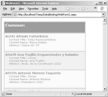 <asp:DataList id=listCustomers runat="server"
BorderColor="#DEBA84" BorderStyle="None" CellSpacing="2"
BackColor="#DEBA84" CellPadding="3" GridLines="Both"
BorderWidth="1px">
<!-- Define templates. -->
<ItemTemplate>
<font face="Verdana" size="2"><b>
<%# DataBinder.Eval(Container.DataItem, "CustomerID") %>
<%# DataBinder.Eval(Container.DataItem, "CompanyName") %>
</b></font><br>
<font face="Verdana" size="1"> Contact Title:
<%# DataBinder.Eval(Container.DataItem, "ContactTitle") %><br>
Contact Name:
<%# DataBinder.Eval(Container.DataItem, "ContactName") %><br>
Address:
<%# DataBinder.Eval(Container.DataItem, "Address") %>
</font><br><br>
</ItemTemplate>
<HeaderTemplate>
<h2>Customers</h2>
</HeaderTemplate>
<FooterTemplate>
<br>This list provided on <%# System.DateTime.Now %>
</FooterTemplate>
<!-- Define styles. -->
<HeaderStyle Font-Bold="True" ForeColor="White" BackColor="#A55129" />
<ItemStyle Font-Size="Smaller" Font-Names="Verdana" ForeColor="#8C4510"
BackColor="#FFF7E7" />
<AlternatingItemStyle BackColor="#FFE0C0" />
<FooterStyle ForeColor="#8C4510" BackColor="#F7DFB5" />
</asp:DataList>
These styles and templates provide fine-grained control over every aspect of the DataList's appearance, which is almost the exact opposite of data binding frameworks in the past.  |
| [ Team LiB ] |
|