|
|
< Day Day Up > |
|
7.2 Block-Level ElementsBlock-level elements can behave in sometimes predictable, sometimes surprising ways. The handling of element placement along the horizontal and vertical axes can differ, for example. In order to fully understand how block-level elements are handled, you must clearly understand a number of boundaries and areas. They are shown in detail in Figure 7-2. Figure 7-2. The complete box model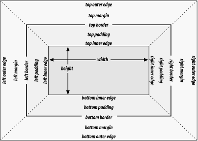 In general, the width of an element is defined to be the distance from the left inner edge to the right inner edge, and the height is the distance from the inner top to the inner bottom. Both of these properties can be applied to an element. The various widths, heights, padding, and margins all combine to determine how a document is laid out. In most cases, the height and width of the document are automatically determined by the browser and are based on the available display region and other factors. Under CSS, of course, you can assert more direct control over the way elements are sized and displayed. You can select different effects for horizontal and vertical layouts, so we'll tackle them separately. 7.2.1 Horizontal FormattingHorizontal formatting is often more complex than you'd think. Part of the complexity has to do with how width affects the width of the content area, not the entire visible element box. Consider the following example: <p style="width: 200px;">wideness?</p> This line of code will make the paragraph's content 200 pixels wide. If you gave the element a background, this would be quite obvious. However, any padding, borders, or margins you specify are added to the width value. Suppose you do this: <p style="width: 200px; padding: 10px; margin: 20px;">wideness?</p> The visible element box is now 220 pixels wide since you've added 10 pixels of padding to the right and left of the content. The margins will now extend another 20 pixels to both sides for an overall element box width of 260 pixels. Understanding the hidden additions to width is critical. Most users think that width refers to the width of the visible element box, and that if they declare an element to have padding, borders, and a width, the value they supply for the width will be the distance from the outer left border edge to the outer right border edge. This is not the case in CSS. Keep it firmly in mind to avoid confusion later.
Almost as simple is the rule that says that the sum of the horizontal components of a block-level element box in the normal flow always equals the width of the parent. Take two paragraphs within a div whose margins have been set to be 1em. The content width (the value of width) of the paragraph, plus its left and right padding, borders, and margins, always add up to the width of the div's content area. Let's say the width of the div is 30em, making the sum total of the content width, padding, borders, and margins of each paragraph 30em. In Figure 7-3, the "blank" space around the paragraphs is actually their margins. If the DIV had any padding, there would be even more blank space, but that isn't the case here. I'll discuss padding soon. Figure 7-3. Element boxes are as wide as the width of their parent element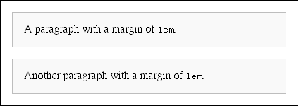 7.2.1.1 Horizontal propertiesThe "seven properties" of horizontal formatting are: margin-left, border-left, padding-left, width, padding-right, border-right, and margin-right. These properties relate to the horizontal layout of block-level boxes and are diagrammed in Figure 7-4. Figure 7-4. The "seven properties" of horizontal formatting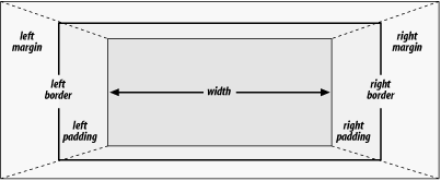 The values of these seven properties must add up to the width of the element's containing block, which is usually the value of width for a block element's parent (since block-level elements nearly always have block-level elements for parents). Of these seven properties, only three may be set to auto: the width of the element's content and the left and right margins. The remaining properties must be set either to specific values or default to a width of zero. Figure 7-5 shows which parts of the box can take a value of auto and which cannot. Figure 7-5. Horizontal properties that can be set to auto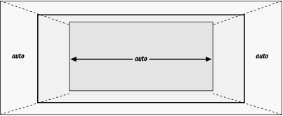 width must either be set to auto or a nonnegative value of some type. When you do use auto in horizontal formatting, different effects can occur.
7.2.1.2 Using autoIf you set width, margin-left, or margin-right to a value of auto, and give the remaining two properties specific values, then the property that is set to auto determines the length required to make the element box's width equal to the parent element's width. In other words, let's say the sum of the seven properties must equal 400 pixels, no padding or borders are set, the right margin and width are set to 100px, and the left margin is set to auto. The left margin will be 200 pixels wide: p {margin-left: auto; margin-right: 100px;
width: 100px;} /* 'auto' left margin evaluates to 200px */
In a sense, auto can be used to make up the difference between everything else and the required total. However, what if all three of these properties are set to 100px and none of them are set to auto? In the case where all three properties are set to something other than autoor, in CSS terminology, when these formatting properties have been overconstrainedthen margin-right is always forced to be auto. This means that if both margins and the width are set to 100px, then the right margin will be reset by the user agent to auto. The right margin's width will then be set according to the rule that one auto value "fills in" the distance needed to make the element's overall width equal that of its containing block. Figure 7-6 shows the result of the following markup: p {margin-left: 100px; margin-right: 100px;
width: 100px;} /* right margin forced to be 200px */
Figure 7-6. Overriding the margin-right setting
If both margins are set explicitly, and width is set to auto, then the value of width will be set to whatever value is needed to reach the required total (which is the content width of the parent element). The results of the following markup are shown in Figure 7-7: p {margin-left: 100px; margin-right: 100px; width: auto;}
Figure 7-7. Automatic width The case shown in Figure 7-7 is the most common case since it is equivalent to setting the margins and not declaring anything for the width. The result of the following markup is exactly the same as that shown in Figure 7-7: p {margin-left: 100px; margin-right: 100px;} /* same as before */
7.2.1.3 More than one autoNow let's see what happens when two of the three properties (width, margin-left, or margin-right) are set to auto. If both margins are set to auto, as shown in the code below, then they are set to equal lengths, thus centering the element within its parent, as you can see in Figure 7-8: p {width: 100px; margin-left: auto; margin-right: auto;}
Figure 7-8. Setting an explicit width Setting both margins to equal lengths is the correct way to center elements as opposed to using text-align. (text-align applies only to the inline content of a block-level element, so setting an element to have a text-align of center shouldn't center it.)
Another way of sizing elements is to set one of the margins and the width to auto. The margin set to be auto is reduced to zero: p {margin-left: auto; margin-right: 100px;
width: auto;} /* left margin evaluates to 0 */
The width is then set to the value necessary to make the element fill its containing block. Finally, what happens when all three properties are set to auto? The answer is simple: both margins are set to zero, and the width is made as wide as possible. This result is the same as the default situation, when no values are explicitly declared for margins or the width. In such a case, the margins default to zero and the width defaults to auto. Note that since horizontal margins do not collapse, the padding, borders, and margins of a parent element can affect its children. The effect is indirect in that the margins (and so on) of an element can induce an offset for child elements. The results of the following markup are shown in Figure 7-9 Figure 7-9: div {padding: 30px; background: silver;}
p {margin: 20px; padding: 0; background: white;}
Figure 7-9. Offset is implicit in the parent's margins and padding 7.2.1.4 Negative marginsSo far, this probably all seems rather straightforward, and you may be wondering why I said things could be complicated. There's another side to margins: the negative side. That's right, it's possible to set negative values for margins. Setting negative margins results in some interesting effects, assuming that the user agent supports negative margins at all.
Remember that the total of the seven horizontal properties always equals the width of the parent element. As long as all properties are zero or greater, an element can never be wider than its parent's content area. However, consider the following markup, depicted in Figure 7-10: div {width: 400px; border: 3px solid black;}
p.wide {margin-left: 10px; width: auto; margin-right: -50px; }
Figure 7-10. Wider children through negative margins Yes indeed, the child element is wider than its parent! This is mathematically correct:
The 440px is the evaluation of width: auto, which is the number needed to balance out the rest of the values in the equation. Even though it leads to a child element sticking out of its parent, the specification hasn't been violated because the values of the seven properties add up to the required total. It's a semantic dodge, but it's valid behavior. Now, let's add some borders to the mix: div {width: 400px; border: 3px solid black;}
p.wide {margin-left: 10px; width: auto; margin-right: -50px;
border: 3px solid gray;}
The resulting change will be a reduction in the evaluated width of width:
If you were to introduce padding, then the value of width would drop even more. Conversely, it's possible to have auto right margins evaluate to negative amounts. If the values of other properties force the right margin to be negative in order to satisfy the requirement that elements be no wider than their containing block, then that's what will happen. Consider: div {width: 400px; border: 3px solid black;}
p.wide {margin-left: 10px; width: 500px; margin-right: auto;
border: 3px solid gray;}
The equation will work out like this:
The right margin will evaluate to -116px. Even if you'd given it another value, this would be the case because of the rule stating that if an element's dimensions are overconstrained, the right margin is reset to whatever is needed to make the numbers work out correctly. (Except in right-to-left languages, where the left margin would be overruled.) Let's consider another example, illustrated in Figure 7-11, where the left margin is set to be negative: div {width: 400px; border: 3px solid black;}
p.wide {margin-left: -50px; width: auto; margin-right: 10px;
border: 3px solid gray;}
Figure 7-11. Setting a negative left margin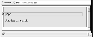 With a negative left margin, not only does the paragraph spill beyond the borders of the div, but it also spills beyond the edge of the browser window itself!
7.2.1.5 PercentagesWhen it comes to percentage values for the width, padding, and margins, the same basic rules apply. It doesn't really matter whether the values are declared with lengths or percentages. Percentages can be very useful. Suppose you want an element's content to be two-thirds the width of its containing block, the right and left padding to be 5% each, the left margin to be 5%, and the right margin to take up the slack. That would be written something like: <p style="width: 67%; padding-right: 5%; padding-left: 5%; margin-right: auto; margin-left: 5%;">playing percentages</p> The right margin would evaluate to 18% (100% - 67% - 5% - 5% - 5%)the width of the containing block. Mixing percentages and length units can be tricky, however. Consider the following example: <p style="width: 67%; padding-right: 2em; padding-left: 2em; margin-right: auto; margin-left: 5em;">mixed lengths</p> In this case, the element's box can be defined like this:
If you assume that the right margin evaluates to zero, then the containing block must be 27.272727em wide. Any wider than that, and the right margin will evaluate to a positive value. Any narrower, and the right margin will be a negative value. The situation gets even more complicated if you start mixing length values, like this: <p style="width: 67%; padding-right: 15px; padding-left: 10px; margin-right: auto; margin-left: 5em;">more mixed lengths</p> And, to make things more complex, borders cannot have percentage widths, only lengths. The bottom line is, it isn't possible to create a fully flexible element layout based solely on percentages unless you're willing to avoid using borders. 7.2.1.6 Replaced elementsSo far, we've been dealing with the horizontal formatting of nonreplaced block-level elements in the normal flow of text. Block-level replaced elements are a bit simpler to manage. All of the rules given for nonreplaced blocks hold true, with one exception: if width is left as auto, then the width of the element is the content's intrinsic width. The image in the following example will be 20 pixels wide because that's the width of the original image: <img src="smile.png" style="display: block; width: auto; margin: 0;"> If the actual image were 100 pixels instead, then it would be laid out as 100 pixels wide. It's possible to override this rule by assigning a specific value to width. Suppose you modify the previous example to show the same image three times, each with a different width value: <img src="smile.png" style="display: block; width: 25px; margin: 0;"> <img src="smile.png" style="display: block; width: 50px; margin: 0;"> <img src="smile.png" style="display: block; width: 100px; margin: 0;"> This is illustrated in Figure 7-12. Figure 7-12. Changing replaced element widths Note that the height of the elements also increases. When a replaced element's width is changed from its intrinsic width, the value of height is scaled to match, unless height has been set to an explicit value of its own. The reverse is also true: if height is set, but width is left as auto, then the width is scaled proportionately to the change in height. Now that you're thinking about height, let's move on to the vertical formatting of block-level normal-flow elements. 7.2.2 Vertical FormattingLike horizontal formatting, the vertical formatting of block-level elements has its own set of interesting behaviors. The default height of an element is determined by its content. Height is also affected by the width of the content; the skinnier a paragraph becomes, the taller it has to be in order to contain all of the inline content within it. In CSS, it is possible to set an explicit height on any block-level element. If you do this, the resulting behavior depends on several other factors. Assume that the specified height is greater than that needed to display the content: <p style="height: 10em;"> In this case, the extra height has a visual effect somewhat like extra padding. But suppose the height is less than what is needed to display the content: <p style="height: 3em;"> When that happens, the browser is supposed to provide a means of viewing all content without increasing the height of the element box. The browser may add a scrollbar to the element, as shown in Figure 7-13. Figure 7-13. Heights that don't match the element's content heightIn a case where the content of an element is taller than the height of its box, the actual behavior of a user agent will depend on the value of (and its support for) the property overflow. This is covered in Chapter 10. Under CSS1, user agents can ignore any value of height other than auto if an element is not a replaced element (such as an image). In CSS2 and CSS2.1, the value of height cannot be ignored, except in one specific circumstance involving percentage values. We'll talk about that in a moment. Just as with width, height defines the content area's height, not the height of the visible element box. Any padding, borders, or margins on the top or bottom of the element box are added to the value for height. 7.2.2.1 Vertical propertiesAs was the case with horizontal formatting, vertical formatting also has seven related properties: margin-top, border-top, padding-top, height, padding-bottom, border-bottom, and margin-bottom. These properties are diagrammed in Figure 7-14. Figure 7-14. The "seven properties" of vertical formatting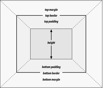 The values of these seven properties must equal the height of the element's containing block. This is usually the value of height for a block-level element's parent (since block-level elements nearly always have block-level elements for parents). Only three of these seven properties may be set to auto: the height of the element's content and the top and bottom margins. The top and bottom padding and borders must be set to specific values or else they default to a width of zero (assuming no border-style is declared). If border-style has been set, then the width of the borders is set to be the vaguely defined value medium. Figure 7-15 provides an illustration for remembering which parts of the box may have a value of auto and which may not. Figure 7-15. Vertical properties that can be set to auto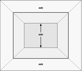 Interestingly, if either margin-top or margin-bottom are set to auto for a block element in the normal flow, they automatically evaluate to 0. A value of 0 unfortunately prevents easy vertical centering of normal-flow elements in their containing blocks. It also means that if you set the top and bottom margins of an element to auto, they are effectively reset to 0 and removed from the element box.
height must be set to auto or to a nonnegative value of some type. 7.2.2.2 Percentage heightsYou already saw how length-value heights are handled, so let's spend a moment on percentages. If the height of a block-level, normal-flow element is set to a percentage, then that value is taken as a percentage of the height of the containing block. Given the following markup, the resulting paragraph will be 3em tall: <div style="height: 6em;"> <p style="height: 50%;">Half as tall</p> </div> Since setting the top and bottom margins to auto will give them zero height, the only way to vertically center the element would be to set them both to 25%. However, in cases where the height of the containing block is not explicitly declared, percentage heights are reset to auto. If you changed the previous example so that the height of the div is auto, the paragraph will now be exactly as tall as the div itself: <div style="height: auto;"> <p style="height: 50%;">NOT half as tall; height reset to auto</p> </div> These two possibilities are illustrated in Figure 7-16. (The spaces between the paragraph borders and the div borders are the top and bottom margins on the paragraphs.) Figure 7-16. Percentage heights in different circumstances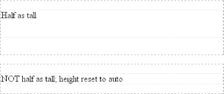 7.2.2.3 Auto heightsIn the simplest case, a block-level, normal-flow element with height: auto is rendered just high enough to enclose the line boxes of its inline content (including text). auto height sets a border on a paragraph and assumes no paddingexpect the bottom border to go just under the bottom line of text and the top border to go just above the top line of text. If an auto-height, block-level, normal-flow element has only block-level children, then its default height will be the distance from the top of the topmost block-level child's outer border edge to the bottom of the bottommost block-level child's outer bottom border edge. Therefore, the margins of the child elements will "stick out" of the element that contains them. (This behavior is explained in the next section.) However, if the block-level element has either top or bottom padding, or top or bottom borders, then its height will be the distance from the top of the outer top margin edge of its topmost child to the outer bottom margin edge of its bottommost child: <div style="height: auto; background: silver;"> <p style="margin-top: 2em; margin-bottom: 2em;">A paragraph!</p> </div> <div style="height: auto; border-top: 1px solid; border-bottom: 1px solid; background: silver;"> <p style="margin-top: 2em; margin-bottom: 2em;">Another paragraph!</p> </div> Both of these behaviors are demonstrated in Figure 7-17. Figure 7-17. Auto heights with block-level children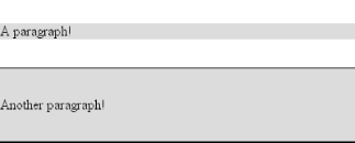 If you changed the borders to padding in the previous example, the effect on the height of the div would be the same: it would still enclose the paragraph's margins within it. 7.2.2.4 Collapsing vertical marginsOne other important aspect of vertical formatting is the collapsing of vertically adjacent margins. Collapsing behavior applies only to margins. Padding and borders, where they exist, are never collapsed by anything. An unordered list, where list items follow one another, is a perfect example of margin collapsing. Assume that the following is declared for a list that contains five items: li {margin-top: 10px; margin-bottom: 15px;}
Each list item has a 10-pixel top margin and a 15-pixel bottom margin. When the list is rendered, however, the distance between adjacent list items is 15 pixels, not 25. This happens because, along the vertical axis, adjacent margins are collapsed. In other words, the smaller of the two margins is eliminated in favor of the larger. Figure 7-18 shows the difference between collapsed and uncollapsed margins. Figure 7-18. Collapsed versus uncollapsed margins Correctly implemented user agents collapse vertically adjacent margins, as shown in the first list in Figure 7-18, where there are 15-pixel spaces between each list item. The second list shows what would happen if the user agent didn't collapse margins, resulting in 25-pixel spaces between list items. Another word to use, if you don't like "collapse," is "overlap." Although the margins are not really overlapping, you can visualize what's happening using the following analogy. Imagine that each element, such as a paragraph, is a small piece of paper with the content of the element written on it. Around each piece of paper is some amount of clear plastic, which represents the margins. The first piece of paper (say an h1 piece) is laid down on the canvas. The second (a paragraph) is laid below it and then slid up until the edge of one of the piece's plastic touches the edge of the other's paper. If the first piece of paper has half an inch of plastic along its bottom edge, and the second has a third of an inch along its top, then when they slide together, the first piece's plastic will touch the top edge of the second piece of paper. The two are now done being placed on the canvas, and the plastic attached to the pieces is overlapping. Collapsing also occurs where multiple margins meet, such as at the end of a list. Adding to the earlier example, let's assume the following rules apply: ul {margin-bottom: 15px;}
li {margin-top: 10px; margin-bottom: 20px;}
h1 {margin-top: 28px;}
The last item in the list has a bottom margin of 20 pixels, the bottom margin of the ul is 15 pixels, and the top margin of a succeeding h1 is 28 pixels. So once the margins have been collapsed, the distance between the end of the li and the beginning of the h1 is 28 pixels, as shown in Figure 7-19. Figure 7-19. Collapsing in detail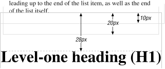 Now, recall the examples from the previous section, where the introduction of a border or padding on a containing block would cause the margins of its child elements to be contained within it. You can see this behavior in operation by adding a border to the ul element in the previous example: ul {margin-bottom: 15px; border: 1px solid;}
li {margin-top: 10px; margin-bottom: 20px;}
h1 {margin-top: 28px;}
With this change, the bottom margin of the li element is now placed inside its parent element (the ul). Therefore, the only margin collapsing that takes place is between the ul and the h1, as illustrated in Figure 7-20. Figure 7-20. Collapsing (or not) with borders added to the mix 7.2.2.5 Negative marginsNegative margins do have an impact on vertical formatting, and they affect how margins are collapsed. If negative vertical margins are set, then the browser should take the absolute maximum of both margins. The absolute value of the negative margin is then subtracted from the positive margin. In other words, the negative is added to the positive, and the resulting value is the distance between the elements. Figure 7-21 provides two concrete examples. Figure 7-21. Examples of negative vertical margins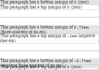 Notice the "pulling" effect of negative top and bottom margins. This is really no different from the way that negative horizontal margins cause an element to push outside of its parent. Consider: p.neg {margin-top: -50px; margin-right: 10px;
margin-left: 10px; margin-bottom: 0;
border: 3px solid gray;}
<div style="width: 420px; background-color: silver;
padding: 10px; margin-top: 50px; border: 1px solid;">
<p class="neg">
A paragraph.
</p>
A div.
</div>
As you see in Figure 7-22, the paragraph has simply been pulled upward by its negative top margin. Note also that the content of the div that follows the paragraph in the markup has also been pulled upward 50 pixels. Figure 7-22. The effects of a negative top marginThe negative bottom margin makes the paragraph look like it's been pulled upward. Compare the following markup to the situation shown in Figure 7-23: p.neg {margin-bottom: -50px; margin-right: 10px;
margin-left: 10px; margin-top: 0;
border: 3px solid gray;}
<div style="width: 420px; margin-top: 50px;">
<p class="neg">
A paragraph.
</p>
</div>
<p>
The next paragraph.
</p>
Figure 7-23. The effects of a negative bottom margin What's really happening in Figure 7-23 is that the elements following the div are placed according to the location of the bottom of the div. As you can see, the end of the div is actually above the visual bottom of its child paragraph. The next element after the div is the appropriate distance from the bottom of the div. This is expected, given the rules you used. Now let's consider an example where the margins of a list item, an unordered list, and a paragraph are all collapsed. In this case, the unordered list and paragraph are assigned negative margins: li {margin-bottom: 20px;}
ul {margin-bottom: -15px;}
h1 {margin-top: -18px;}
The larger of the two negative margins (-18px) is added to the largest positive margin (20px), yielding 20px - 18px = 2px. Thus, there are only two pixels between the bottom of the list item's content and the top of the h1's content, as you can see in Figure 7-24. Figure 7-24. Collapsing margins and negative margins, in detail One area of unresolved behavior is that if elements overlap each other due to negative margins, it's hard to tell which elements are on top. You may also have noticed that none of the examples in this section use background colors. If they did, their content might be overwritten by the background color of a following element. This is expected behavior since browsers usually render elements in order from beginning to end, and so a normal-flow element that comes later in the document can be expected to overwrite an earlier element, assuming the two end up overlapping. 7.2.3 List ItemsList items have a few special rules of their own. They are typically preceded by a marker, such as a small dot or a number. This marker isn't actually part of the list item's content area, so effects like those illustrated in Figure 7-25 are common. Figure 7-25. The content of list items CSS1 says very little about the placement and effects of these markers with regard to the layout of a document. CSS2 introduced properties specifically designed to address this issue, such as marker-offset. However, a lack of implementations and changes in thinking caused this to be dropped from CSS2.1, and it is likely that a different way of defining the distance between the content and the marker will be introduced in future versions of CSS. Therefore, the placement of markers is largely beyond the control of authors (at least as of this writing).
The marker attached to a list item element can be either outside the content of the list item or treated as an inline marker at the beginning of the content, depending on the value of the property list-style-position. If the marker is brought inside, then the list item will interact with its neighbors exactly like a block-level element, as illustrated in Figure 7-26. Figure 7-26. Markers inside and outside the list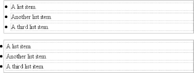 If the marker stays outside the content, then it is placed some distance from the left content edge of the content (in left-to-right languages). No matter how the list's styles are altered, the marker stays the same distance from the content edge. Occasionally, the markers may be pushed outside of the list element itself, as you can see in Figure 7-26. |
|
|
< Day Day Up > |
|